


打开包含单选按钮组的对话框的输入的无障碍模式
我们需要实现一个由一个按钮或只读输入框组成的新组件,用来打开一个对话框。触发控件显示一个文本摘要,该摘要来自两个所选值(每个值都属于不同的类别)。
对话框包含两个小型单选组,允许用户在每个类别中各自选一个值。组合后的选择将反映在触发控件上。下方给出一个简化示例:
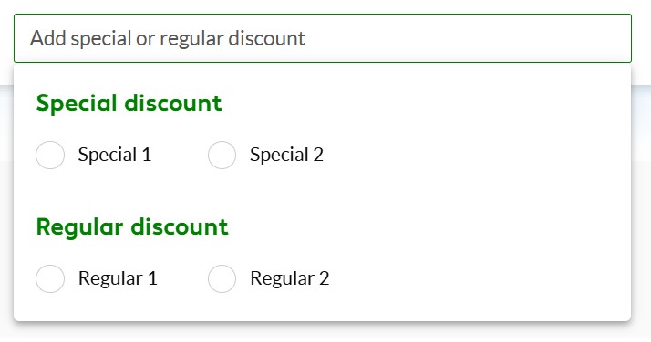
从无障碍性角度,我们需要在这些约束条件下确定最合适的ARIA模式,因为视觉设计是固定且不可修改的。
我的初步想法是在触发控件上使用 role="combobox" 与 aria-haspopup="dialog"。然而,交互涉及跨越多个独立类别的值选择,而不是从选项列表中选择单一值。这可能与combobox模式并不完全一致,且会让辅助技术感到困惑。
另一种思路是避免使用combobox角色,而是将触发控件视为带有 aria-haspopup="dialog" 的按钮,对话框中包含用于选择的表单控件。
问题是:在这些约束下,哪种方法更能真实地反映实际的交互模型并提供最合适的无障碍语义?
解决方案
这是一个复杂且有趣的问题。
最简单且可访问性最高的路径通常是 disclosure模式。这通常意味着类似手风琴的功能,而不是一个浮动窗口,但它允许你保留单选按钮的原生语义,同时使用相对简单、受良好支持的UI模式。
你也可以使用 combobox模式,但实现起来有点棘手。 combobox角色 确实允许弹出层具有dialog角色,但你会遇到在完成选择后如何关闭弹出层的问题。如果走这条路,我强烈建议使用一个 "Apply" 按钮。否则,如果在某人做出选择后尝试关闭弹出层,对仅能用键盘操作的用户将会带来问题。下面我已经做了一个示例,你可以在下方看到。
使用 alert dialog 模式或 dialog modal 模式也可能是一个选项,取决于具体的用法,但你在走这条路时需要小心。将这些模式用于在表单中间显示输入,可能会被误用ARIA规范。这种模式应当用于向用户传达重要信息,而不仅仅是隐藏和显示内容。
据我所知,这些是你可选的最佳方案。建议先采用disclosure模式,因为这是最可访问的选项,其次是combobox模式。
// 1. Grab the elements from the DOM
const combobox = document.getElementById('combo-input');
const dialog = document.getElementById('radio-dialog');
const radioButtons = dialog.querySelectorAll('input[type="radio"]');
const applyBtn = document.getElementById('apply-btn');

// 2. Open Dialog Function
function openDialog() {
  combobox.setAttribute('aria-expanded', 'true');
  dialog.classList.remove('hidden');

  // Focus Management: Move focus to the checked radio, or the first one
  const checkedRadio = dialog.querySelector('input[type="radio"]:checked');
  if (checkedRadio) {
    checkedRadio.focus();
  } else {
    radioButtons[0].focus();
  }
}

// 3. Close Dialog Function
function closeDialog() {
  combobox.setAttribute('aria-expanded', 'false');
  dialog.classList.add('hidden');
  combobox.focus();
}

// 4. Toggle Logic for the Combobox
function toggleDialog() {
  const isExpanded = combobox.getAttribute('aria-expanded') === 'true';
  if (isExpanded) {
    closeDialog();
  } else {
    openDialog();
  }
}

// 5. Event Listeners for Combobox Opening/Closing
combobox.addEventListener('click', toggleDialog);

combobox.addEventListener('keydown', (e) => {
  if (e.key === 'Enter' || e.key === ' ') {
    e.preventDefault();
    toggleDialog();
  }
});

// 6. Apply Button Logic (Replaces the auto-close behavior)
applyBtn.addEventListener('click', () => {
  // Find which radio is currently checked
  const checkedRadio = dialog.querySelector('input[type="radio"]:checked');

  // If one is checked, update the combobox value
  if (checkedRadio) {
    combobox.value = checkedRadio.value;
  }

  // Close the dialog and return focus
  closeDialog();
});

// 7. Accessibility & UX Enhancements
dialog.addEventListener('keydown', (e) => {
  if (e.key === 'Escape') {
    closeDialog();
  }
});

document.addEventListener('click', (e) => {
  if (!combobox.contains(e.target) && !dialog.contains(e.target)) {
    const isExpanded = combobox.getAttribute('aria-expanded') === 'true';
    if (isExpanded) {
      closeDialog();
    }
  }
});
/* Basic reset and font styling */
body {
  font-family: system-ui, sans-serif;
  padding: 2rem;
}

.combobox-wrapper {
  position: relative;
  width: 300px;
}

label {
  display: block;
  margin-bottom: 0.5rem;
  font-weight: bold;
}

/* Combobox Input Styling */
#combo-input {
  width: 100%;
  padding: 0.75rem;
  font-size: 1rem;
  cursor: pointer;
  border: 1px solid #ccc;
  border-radius: 4px;
}

#combo-input:focus {
  outline: 2px solid #005fcc;
  outline-offset: 2px;
}

/* Dialog Styling */
#radio-dialog {
  position: absolute;
  top: 100%; /* Positions it directly below the input */
  left: 0;
  width: 100%;
  margin-top: 0.5rem;
  padding: 1rem;
  background: white;
  border: 1px solid #ccc;
  border-radius: 4px;
  box-shadow: 0 4px 6px rgba(0,0,0,0.1);
  z-index: 10;
}

/* Utility to hide the dialog */
.hidden {
  display: none;
}

/* Screen reader only class for the heading */
.sr-only {
  position: absolute;
  width: 1px;
  height: 1px;
  padding: 0;
  margin: -1px;
  overflow: hidden;
  clip: rect(0, 0, 0, 0);
  border: 0;
}

/* Radio Button Layout */
.radio-label {
  display: block;
  margin-bottom: 0.5rem;
  cursor: pointer;
}

/* Apply Button Styling */
.apply-button {
  margin-top: 1rem;
  width: 100%;
  padding: 0.5rem;
  background-color: #005fcc;
  color: white;
  border: none;
  border-radius: 4px;
  font-size: 1rem;
  cursor: pointer;
  font-weight: bold;
}

.apply-button:hover {
  background-color: #004ba3;
}

.apply-button:focus {
  outline: 2px solid #005fcc;
  outline-offset: 2px;
}
<!DOCTYPE html>
<html lang="en">
<head>
  <meta charset="UTF-8">
  <title>Accessible Combobox Dialog</title>
  <link rel="stylesheet" href="style.css">
</head>
<body>

  <div class="combobox-wrapper">
    <label for="combo-input">Select your favorite fruit:</label>

    <input
      type="text"
      id="combo-input"
      role="combobox"
      aria-expanded="false"
      aria-haspopup="dialog"
      aria-controls="radio-dialog"
      readonly
      placeholder="Choose an option..."
    >

    <div id="radio-dialog" role="dialog" aria-labelledby="dialog-title" class="hidden">
      <h3 id="dialog-title" class="sr-only">Fruit Options</h3>

      <div role="radiogroup" aria-labelledby="dialog-title">
        <label class="radio-label">
          <input type="radio" name="fruit" value="Apple"> Apple
        </label>
        <label class="radio-label">
          <input type="radio" name="fruit" value="Banana"> Banana
        </label>
        <label class="radio-label">
          <input type="radio" name="fruit" value="Cherry"> Cherry
        </label>
      </div>

      <button id="apply-btn" class="apply-button">Apply Selection</button>
    </div>
  </div>

</body>
</html>
相关文章





