


使用Seaborn绘制的图,在成对的数据点之间用线段连接,以显示数值差异
我用Python的 seaborn做了下面这个图:
我现在拥有的图是:
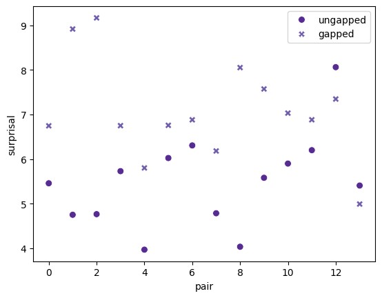
通过下面这段代码得到:
plot = sns.scatterplot(data=by_sent_type, s=50)
plot.set(xlabel="pair", ylabel="surprisal")
by_sent_type数据框看起来是这样的:
    ungapped    gapped
0   5.459486  6.748071
1   4.753202  8.918435
2   4.767165  9.168628
3   5.731389  6.751871
...
我希望在x 轴上,未连通的值与带间隙的值之间的每一对之间都画一条线,并显示它们的数值差。就像这样(前几条是随手画的,显示数值的位置无关紧要):
我想要的图:
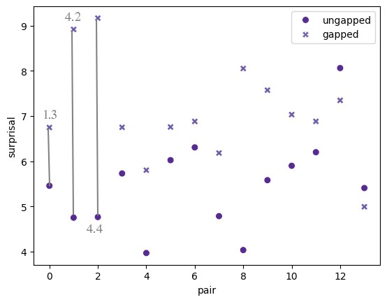
有办法用seaborn实现吗?或者也许我需要的是完全不同类型的图表,坦白说我对数据可视化的最佳实践并不太了解。欢迎给出任何建议。
解决方案
你可以在散点图之上使用 Axes.vlines 来实现这条线:
import seaborn as sns

plot = sns.scatterplot(data=by_sent_type, s=50)
plot.set(xlabel='pair', ylabel='surprisal')
plot.vlines(
    x=by_sent_type.index,
    ymin=by_sent_type['ungapped'],
    ymax=by_sent_type['gapped'],
    color='grey',
)
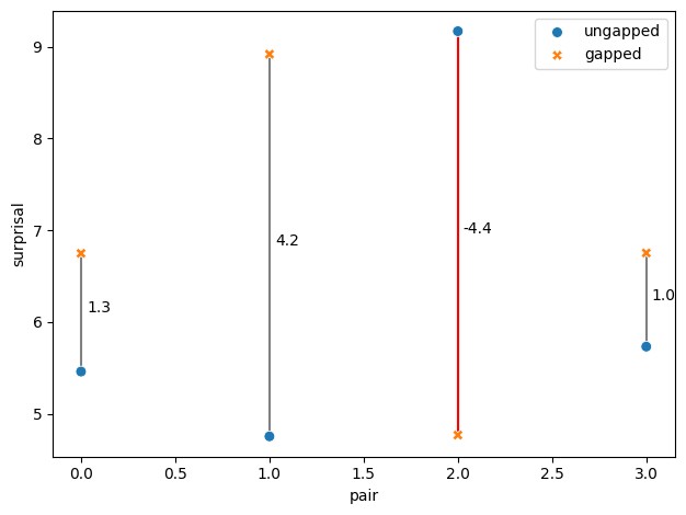
输出:
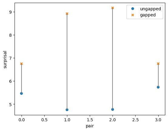
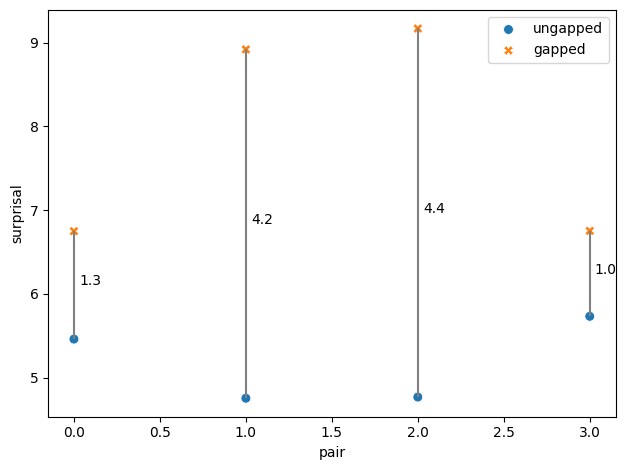
如果你需要标签,不幸的是,你需要循环:
for i, u, g in zip(
    by_sent_type.index, by_sent_type['ungapped'], by_sent_type['gapped']
):   # efficient looping
    plot.annotate(
        f'{g-u:.1f}',
        (i, (u + g) / 2),
        xytext=(5, 0),
        textcoords='offset pixels',
    )
输出:
而且,为了娱乐,如果你想根据带间隙/非带间隙线的方向来调整颜色,可以使用 numpy.where:
plot.vlines(
    x=by_sent_type.index,
    ymin=by_sent_type['ungapped'],
    ymax=by_sent_type['gapped'],
    color=np.where(
        by_sent_type['ungapped'] < by_sent_type['gapped'], 'grey', 'red'
    ),
    zorder=-1,
)
输出:
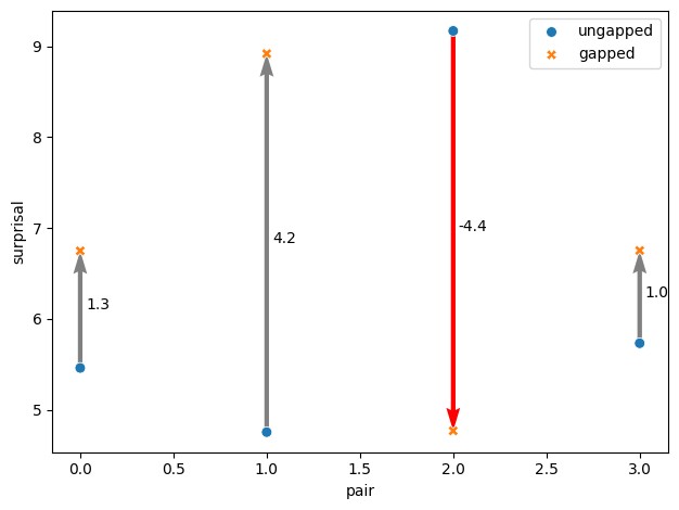
你也可以使用 Axes.quiver 来绘制箭头:
u = by_sent_type['ungapped']
g = by_sent_type['gapped']

plot.quiver(
    by_sent_type.index,  # X arrow start
    u,                   # Y arrow start
    np.zeros_like(u),    # delta X (0 here since we want vertical lines)
    g-u,                 # delta Y
    scale_units='xy',
    scale=1,
    color=np.where(u<g, 'grey', 'red'),
    zorder=-1,
)
输出:
站内所有文章版权归属LeftHeroAI导航站,无授权禁止任何主体转载、抄袭、复制内容,亦不得私自架设镜像站点。一经侵权,本站将通过法律途径追责。
相关文章






汇集全球数千款 AI 工具,每日持续更新,配套 AI 开发学习资源,轻松用 AI 提升工作效率。快捷键 Ctrl+D/⌘+D 一键收藏本站。