


在两个不同的图中对齐seaborn的箱线图和stripplot(条带图),并设置箱体宽度
我有一个数据集,包含不同类别的模拟值和实验值(温度、设计)。我想创建两张图,用来比较模拟值和实验值,1)温度(两种条件——暖和冷)和2)设计(5个版本)。箱线图的宽度和散点的宽度在两张图中应保持一致。这可以通过 "width" 和 "jitter" 实现。
设计箱线图的宽度是默认宽度,以便把所有2*5 = 10个箱线图放进同一张图中。温度箱线图的宽度也相应地进行了调整。因此只有设计的散点落在箱线图内,温度的散点则位于箱外。
如何改变温度图中散点的位置?
import pandas as pd
import matplotlib
import matplotlib.pyplot as plt
import seaborn as sns
import numpy as np
from numpy import random

n = 200

value = np.random.rand(n).tolist()
design = np.random.choice([1,2,3,4,5], size=n)
temp = np.random.choice([-100.0, 100.0], size=n)
indices = np.random.choice(['exp', 'sim'], size=n)

frame_scatter = {"design": design, "temp": temp, 'Measured_Value': value}
frame_scatter = pd.DataFrame(data=frame_scatter, index=indices)
frame_scatter.index.name = 'Index_Name'

single_box = 0.16
custom_width_box= {
    'design': [single_box * 5, [0.2, 0.5, 0.8, 1.0, 1.2]],
    'temp': [single_box * 2, [1.0, 1.2]],
}

categories = ['temp', 'design']
for c_category in categories:
    plt.Figure(figsize=(6.4, 4.8), dpi=400)
    palette = ['r', 'g']
    c_ax = sns.boxplot(data=frame_scatter, x=c_category, y='Measured_Value', hue="Index_Name",
                       showfliers=False, palette=palette, boxprops={'alpha': 0.4}, width=custom_width_box[c_category][0])

    sns.stripplot(data=frame_scatter, x=c_category, y='Measured_Value', hue='Index_Name', palette=palette, dodge=True, ax=c_ax, jitter=custom_width_box[c_category][0]/3)
    handles, labels = c_ax.get_legend_handles_labels()
    c_ax.legend(handles=[(handles[0], handles[2]), (handles[1], handles[3])], labels=['exp', 'sim'], loc='upper left', handlelength=4, handler_map={tuple: matplotlib.legend_handler.HandlerTuple(ndivide=None)})
    plt.grid()
    plt.show()
解决方案
问题在于 stripplot 在设置自定义箱宽时不会自动调整位置。jitter 参数是相对于默认箱宽进行缩放的,而不是你的自定义宽度。因此温度的点最终会位于箱子之外。
直接跳过 stripplot,自行绘制散点。遍历你的类别,基于实际的箱宽计算每个点应该放在哪儿,添加一些随机噪声后再进行散点。
import pandas as pd
import matplotlib.pyplot as plt
import seaborn as sns
import numpy as np

n = 200
value = np.random.rand(n).tolist()
design = np.random.choice([1,2,3,4,5], size=n)
temp = np.random.choice([-100.0, 100.0], size=n)
indices = np.random.choice(['exp', 'sim'], size=n)

frame_scatter = {"design": design, "temp": temp, 'Measured_Value': value}
frame_scatter = pd.DataFrame(data=frame_scatter, index=indices)
frame_scatter.index.name = 'Index_Name'

frame_scatter = frame_scatter.reset_index()

single_box = 0.16
custom_width_box = {
    'design': [single_box * 5, [0.2, 0.5, 0.8, 1.0, 1.2]],
    'temp': [single_box * 2, [1.0, 1.2]],
}

categories = ['temp', 'design']
palette = ['r', 'g']

for c_category in categories:
    fig, c_ax = plt.subplots(figsize=(6.4, 4.8), dpi=400)

    box_width = custom_width_box[c_category][0]

    sns.boxplot(data=frame_scatter, x=c_category, y='Measured_Value', hue="Index_Name",
                showfliers=False, palette=palette, boxprops={'alpha': 0.4}, width=box_width, ax=c_ax)

    unique_cats = sorted(frame_scatter[c_category].unique())
    for i, cat in enumerate(unique_cats):
        for j, idx in enumerate(['exp', 'sim']):
            subset = frame_scatter[(frame_scatter[c_category] == cat) & (frame_scatter['Index_Name'] == idx)]
            if len(subset) > 0:
                x_offset = (j - 0.5) * (box_width / 2.5)
                x_pos = i + x_offset
                y_vals = subset['Measured_Value'].values
                x_jitter = x_pos + np.random.normal(0, box_width / 15, len(y_vals))
                c_ax.scatter(x_jitter, y_vals, color=palette[j], alpha=0.6, s=30, zorder=3)

    c_ax.legend(loc='upper left')
    c_ax.grid()
    plt.show()
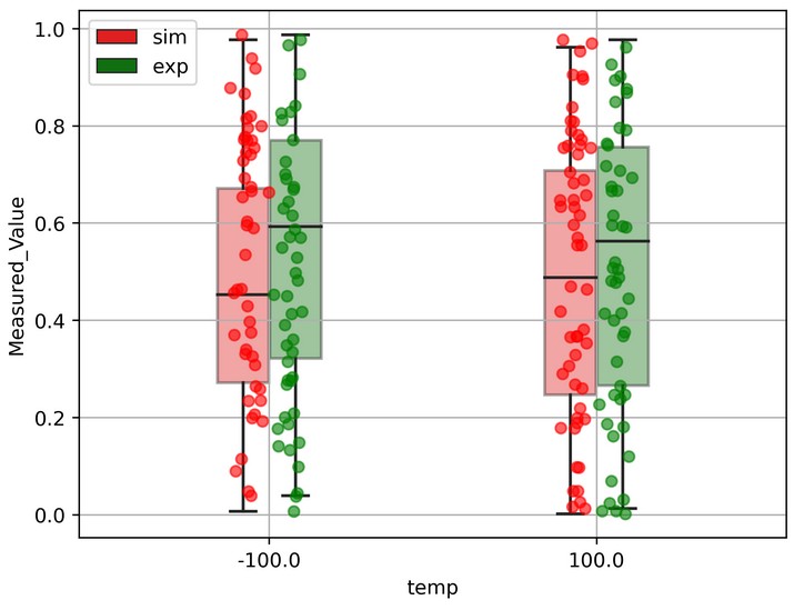
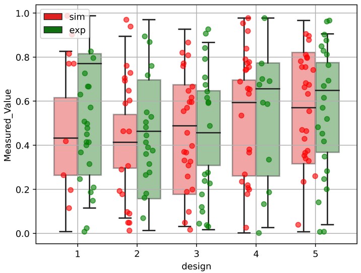
关键的一行是 (j - 0.5) * (box_width / 2.5)。这会把实际值(exp)放在一边,模拟值(sim)放在另一边,并居中于箱内。如果你想让点的分布更宽,可以使用2.0;如果想让它们更紧凑,可以使用3.0或 4.0。
由于你使用的是实际的box_width值,因此无论你有多少类别或设置了哪些宽度,都会生效。
你可以查看 [seaborn箱线图] 的文档 和 [numpy随机正态分布] 的文档,以获取更多细节。
站内所有文章版权归属LeftHeroAI导航站,无授权禁止任何主体转载、抄袭、复制内容,亦不得私自架设镜像站点。一经侵权,本站将通过法律途径追责。
相关文章








汇集全球数千款 AI 工具,每日持续更新,配套 AI 开发学习资源,轻松用 AI 提升工作效率。快捷键 Ctrl+D/⌘+D 一键收藏本站。