


如何用Seaborn或 matplotlib绘制这个图?
怎么用Seaborn或 matplotlib绘制这个图?一个关键要求是代码行数大约不能超过10行(这段代码是为了放进书里,读者不应需要具备matplotlib的博士级知识),并且图例应出现在图下方——似乎是个很简单的请求。
import polars as pl
from plotnine import ggplot, geom_line, theme, aes

plot_data = pl.from_repr("""
┌────────┬───────────────┬───────────┐
│ rel_td ┆ Earnings news ┆ aret_ew   │
│ ---    ┆ ---           ┆ ---       │
│ i32    ┆ str           ┆ f64       │
╞════════╪═══════════════╪═══════════╡
│ -11    ┆ Bad           ┆ -0.015094 │
│ -10    ┆ Bad           ┆ -0.032303 │
│ -9     ┆ Bad           ┆ -0.04892  │
│ -8     ┆ Bad           ┆ -0.071566 │
│ -7     ┆ Bad           ┆ -0.090458 │
│ -6     ┆ Bad           ┆ -0.104118 │
│ -5     ┆ Bad           ┆ -0.117682 │
│ -4     ┆ Bad           ┆ -0.139179 │
│ -3     ┆ Bad           ┆ -0.148933 │
│ -2     ┆ Bad           ┆ -0.158631 │
│ -1     ┆ Bad           ┆ -0.170862 │
│ 0      ┆ Bad           ┆ -0.170471 │
│ 1      ┆ Bad           ┆ -0.17924  │
│ 2      ┆ Bad           ┆ -0.189974 │
│ 3      ┆ Bad           ┆ -0.196842 │
│ 4      ┆ Bad           ┆ -0.195595 │
│ 5      ┆ Bad           ┆ -0.192569 │
│ 6      ┆ Bad           ┆ -0.189985 │
│ -11    ┆ Good          ┆ 0.012033  │
│ -10    ┆ Good          ┆ 0.031951  │
│ -9     ┆ Good          ┆ 0.049561  │
│ -8     ┆ Good          ┆ 0.063006  │
│ -7     ┆ Good          ┆ 0.081858  │
│ -6     ┆ Good          ┆ 0.092751  │
│ -5     ┆ Good          ┆ 0.104801  │
│ -4     ┆ Good          ┆ 0.114646  │
│ -3     ┆ Good          ┆ 0.122691  │
│ -2     ┆ Good          ┆ 0.142215  │
│ -1     ┆ Good          ┆ 0.149206  │
│ 0      ┆ Good          ┆ 0.164457  │
│ 1      ┆ Good          ┆ 0.17074   │
│ 2      ┆ Good          ┆ 0.173464  │
│ 3      ┆ Good          ┆ 0.181387  │
│ 4      ┆ Good          ┆ 0.187403  │
│ 5      ┆ Good          ┆ 0.193269  │
│ 6      ┆ Good          ┆ 0.195146  │
└────────┴───────────────┴───────────┘
""")

(
    ggplot(plot_data,
           aes("rel_td", "aret_ew", linetype="Earnings news"))
    + geom_line()
    + theme(legend_position="bottom")
)
我看不出用Seaborn或 matplotlib就能做到这一点的方法。也许plotnine比这些包更Pythonic(优雅、简单、易读)?
我用Seaborn的对象也能把图很容易地绘出,但随之而来的图例却变得异常难以定位和使用。
解决方案
我看不出用Seaborn或 matplotlib就能做到这一点的方法。也许plotnine比这些包更Pythonic(优雅、简单、易读)?
这里的主要麻烦在于将图例放在图外面,而matplotlib/seaborn并非真正在设计时就考虑到这种用法。你可以用Seaborn通过类似这样的调用把图例移到外面:
sns.move_legend(ax, "upper center", bbox_to_anchor=(0.5, -0.15))
这会把图例放在X 轴方向的中点(50%),并且在Y 轴下方的 -15% 位置。换句话说,取图的顶部到底部之间的距离,这个新图例就位于该距离下方的15% 的位置。"upper center" 参数指定的是相对于图例本身的锚点,而不是相对于图像,因此你是在指定一个点,然后让图例向下并向两边扩展。
(详见 How to put the legend outside the plot 的详细解释。可惜,要理解这件事确实需要一个matplotlib的博士级别知识。)
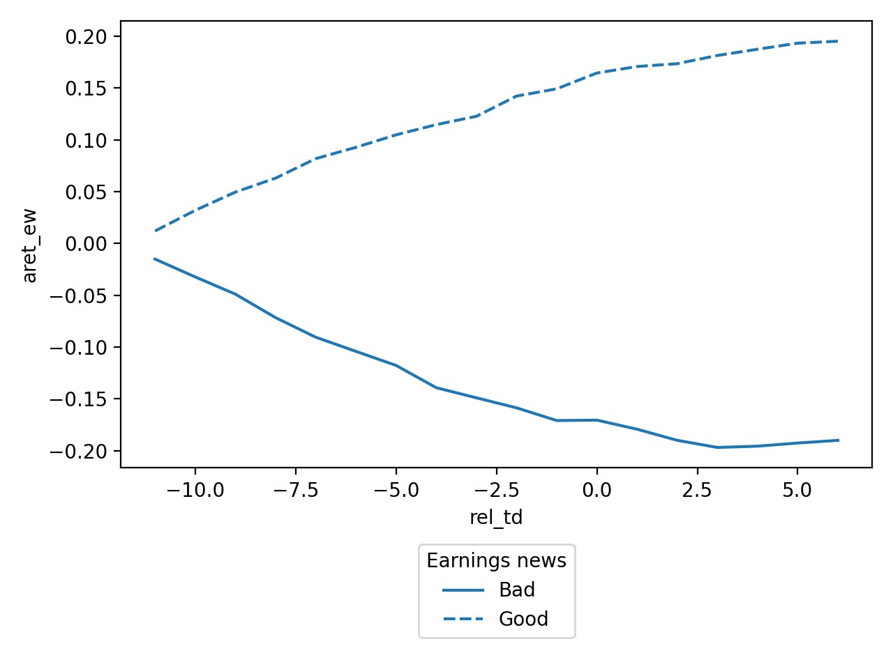
为了控制线型,可以使用 style='Earnings news' 参数将其分组在Earning news上,并用它来设置线型。
完整代码:
import seaborn as sns
import matplotlib.pyplot as plt

ax = sns.lineplot(x='rel_td', y='aret_ew', style='Earnings news', data=plot_data)
sns.move_legend(ax, "upper center", bbox_to_anchor=(0.5, -0.15))
plt.tight_layout()
输出:
站内所有文章版权归属LeftHeroAI导航站,无授权禁止任何主体转载、抄袭、复制内容,亦不得私自架设镜像站点。一经侵权,本站将通过法律途径追责。
相关文章






汇集全球数千款 AI 工具,每日持续更新,配套 AI 开发学习资源,轻松用 AI 提升工作效率。快捷键 Ctrl+D/⌘+D 一键收藏本站。