


如何制作一个带动画的L 形视图菜单?(自定义菜单思路/ SwiftUI)
Apple菜单和Sport App很酷,但我的想法当然比别人更酷。我正在尝试做出新东西!
以下是完整代码:
import SwiftUI

struct ContentView: View {

    @State private var isExpanded = false
    @State private var pillWidth: CGFloat = 0

    let height: CGFloat = 40

    var body: some View {

        ZStack(alignment: .topLeading) {

            VStack(alignment: .leading, spacing: 3) {

                // PILL
                HStack(spacing: 3) {

                    Button {
                        withAnimation(.spring(response: 0.35, dampingFraction: 0.85)) {
                            isExpanded.toggle()
                        }
                    } label: {

                        HStack(spacing: 3) {
                            Image(systemName: "person.crop.square.on.square.angled.fill")
                            Text("1 Sign")
                                .fontWeight(.regular)
                        }
                        .padding(.horizontal, 16)
                        .frame(height: height)
                        .background(
                            Color.gray.opacity(0.2)
                                .clipShape(
                                    CustomCorners(
                                        tl: height/2,
                                        tr: 2,
                                        bl: height/2,
                                        br: 2
                                    )
                                )
                        )
                    }

                    Image(systemName: "chevron.right")
                        .rotationEffect(.degrees(isExpanded ? 90 : 0))
                        .animation(.easeInOut(duration: 0.2), value: isExpanded)
                        .foregroundColor(.gray)
                        .frame(width: height, height: height)
                        .background(
                            Color.gray.opacity(0.2)
                                .clipShape(
                                    CustomCorners(
                                        tl: 2,
                                        tr: height/2,
                                        bl: 2,
                                        br: height/2
                                    )
                                )
                        )
                }
                .background(
                    GeometryReader { geo in
                        Color.clear
                            .onAppear {
                                pillWidth = geo.size.width
                            }
                    }
                )

                // DROPDOWN
                if isExpanded {

                    VStack(alignment: .leading, spacing: 15) {

                        row("2 Sign")
                        row("3 Sign")
                        row("4 Sign")

                    }
                    .padding(.vertical, 17)
                    .frame(width: pillWidth)
                    .background(
                        RoundedRectangle(cornerRadius: 28)
                            .fill(Color.gray.opacity(0.2))
                    )
                    .scaleEffect(y: isExpanded ? 1 : 0, anchor: .top)
                    .opacity(isExpanded ? 1 : 0)
                    .offset(y: isExpanded ? 0 : -10)
                    .animation(.spring(response: 0.35, dampingFraction: 0.85), value: isExpanded)
                }
            }
        }
        .padding(40)
    }
}

func row(_ title: String) -> some View {
    HStack {
        Text(title)
        Spacer()
        Image(systemName: "chevron.right")
    }
    .padding(.horizontal, 16)
    .frame(height: 28)
}


struct CustomCorners: Shape {
    var tl: CGFloat = 0
    var tr: CGFloat = 0
    var bl: CGFloat = 0
    var br: CGFloat = 0

    func path(in rect: CGRect) -> Path {
        let path = UIBezierPath()

        path.move(to: CGPoint(x: rect.minX + tl, y: rect.minY))
        path.addLine(to: CGPoint(x: rect.maxX - tr, y: rect.minY))
        path.addArc(withCenter: CGPoint(x: rect.maxX - tr, y: rect.minY + tr),
                    radius: tr, startAngle: .pi * 1.5, endAngle: 0, clockwise: true)

        path.addLine(to: CGPoint(x: rect.maxX, y: rect.maxY - br))
        path.addArc(withCenter: CGPoint(x: rect.maxX - br, y: rect.maxY - br),
                    radius: br, startAngle: 0, endAngle: .pi * 0.5, clockwise: true)

        path.addLine(to: CGPoint(x: rect.minX + bl, y: rect.maxY))
        path.addArc(withCenter: CGPoint(x: rect.minX + bl, y: rect.maxY - bl),
                    radius: bl, startAngle: .pi * 0.5, endAngle: .pi, clockwise: true)

        path.addLine(to: CGPoint(x: rect.minX, y: rect.minY + tl))
        path.addArc(withCenter: CGPoint(x: rect.minX + tl, y: rect.minY + tl),
                    radius: tl, startAngle: .pi, endAngle: .pi * 1.5, clockwise: true)

        return Path(path.cgPath)
    }
}


#Preview {
    ContentView()
}
结果:
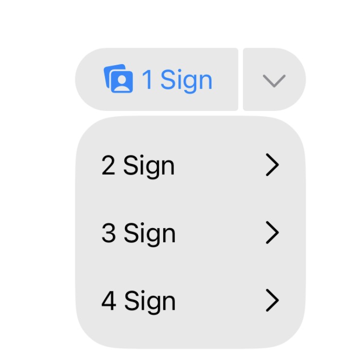
顺便说一下:我正在为我的应用SignDict制作一个菜单,因此需要一些点子……来实现带动画的L 形状……有什么想法吗?
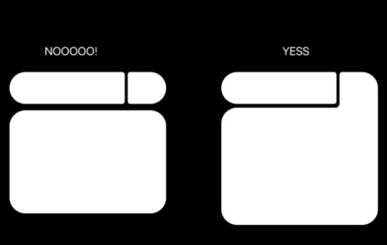
注:我也尝试把这个自定义菜单视图放到导航栏的按钮中,但在添加时也出现了一些问题,对我的英语语法若有瑕疵,敬请见谅!
解决方案
实现背景形状的一种方法是使用 UnevenRoundedRectangle 构建起来。当展开时,箭头后面的背景的右下角可以改变,从圆角变为尖角。其他细节:
- 你的自定义形状
CustomCorners可能并不需要,可以用UnevenRoundedRectangle代替。 - 下拉菜单与背景之间的间隙可以通过在箭头后面的形状上使用负内边距来填充。
- 在展开状态下,内部的角可以通过一个额外的“填充”形状来圆角。我对 Draw an arc without the chord 的回答展示了实现这一点的方法。
- 由于你在填充背景时使用了带有不透明度的灰色,需要小心确保各个形状不要重叠。否则,任何重叠处背景会变得更暗。
- 你之前是测量顶部
HStack的宽度,然后再将该宽度应用到下拉菜单上。一种更简单的做法是在HStack上添加底部内边距,然后在这个空间内将下拉菜单显示为覆盖层。如果你打算把组件显示在屏幕顶部,那么使用过多的内边距也没关系,因为空间不是问题。 - 用一点点动画来呈现下拉菜单的一种方式是使用
.mask。 - 如果你对整个组件也应用了
.animation修饰符,则不必使用withAnimation来切换标志位。两者可以省略其中一个。
以下是更新后的示例,演示其运行效果:
struct ContentView: View {
    let height: CGFloat = 40
    let maxDropdownHeight: CGFloat = 200
    let gapSize: CGFloat = 4

    @State private var isExpanded = false

    private var bgColor: Color {
        Color.gray.opacity(0.2)
    }

    var body: some View {
        ZStack(alignment: .topLeading) {
            VStack(alignment: .leading, spacing: gapSize) {

                // PILL
                HStack(spacing: gapSize) {
                    Button {
                        isExpanded.toggle()
                    } label: {
                        HStack(spacing: 3) {
                            Image(systemName: "person.crop.square.on.square.angled.fill")
                            Text("1 Sign")
                                .fontWeight(.regular)
                        }
                        .padding(.horizontal, 16)
                        .frame(height: height)
                        .background(
                            bgColor,
                            in: .rect(
                                topLeadingRadius: height / 2,
                                bottomLeadingRadius: height / 2,
                                bottomTrailingRadius: 2,
                                topTrailingRadius: 2
                            )
                        )
                    }
                    Image(systemName: "chevron.right")
                        .imageScale(.medium)
                        .rotationEffect(.degrees(isExpanded ? 90 : 0))
                        .animation(.easeInOut(duration: 0.2), value: isExpanded)
                        .foregroundColor(.gray)
                        .padding(10)
                        .frame(width: height, height: height)
                        .background(
                            UnevenRoundedRectangle(
                                topLeadingRadius: 2,
                                bottomLeadingRadius: isExpanded ? 0 : 2,
                                bottomTrailingRadius: isExpanded ? 0 : height / 2,
                                topTrailingRadius: height / 2
                            )
                            .fill(bgColor)
                            .padding(.bottom, isExpanded ? -gapSize : 0)
                        )
                        .background(alignment: .bottomLeading) {

                            // See https://stackoverflow.com/a/77150344/20386264
                            bgColor
                                .frame(width: gapSize, height: gapSize)
                                .overlay {
                                    Circle()
                                        .scaleEffect(2.0, anchor: .bottomTrailing)
                                        .blendMode(.destinationOut)
                                }
                                .compositingGroup()
                                .offset(x: -gapSize, y: gapSize)
                        }
                }
                .padding(.bottom, maxDropdownHeight)
                .overlay(alignment: .top) {

                    // DROPDOWN
                    if isExpanded {
                        VStack(alignment: .leading, spacing: 15) {
                            row("2 Sign")
                            row("3 Sign")
                            row("4 Sign")
                        }
                        .padding(.vertical, 17)
                        .background(
                            bgColor,
                            in: .rect(
                                topLeadingRadius: height / 2,
                                bottomLeadingRadius: height / 2,
                                bottomTrailingRadius: height / 2,
                                topTrailingRadius: 0
                            )
                        )
                        .padding(.top, height + gapSize)
                    }
                }
                .mask(alignment: .top) {
                    Color.black
                        .frame(
                            height: isExpanded ? height + maxDropdownHeight : height,
                            alignment: .top
                        )
                }
            }
            .animation(.spring(response: 0.35, dampingFraction: 0.85), value: isExpanded)
        }
        .padding(40)
    }

    private func row(_ title: String) -> some View {
        HStack {
            Text(title)
            Spacer()
            Image(systemName: "chevron.right")
        }
        .padding(.horizontal, 16)
        .padding(.vertical, 4)
    }
}
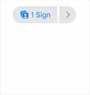
你也在问如何在导航栏中显示该组件。我认为由于高度的原因,无法将其作为真正的 ToolbarItem 使用。不过你可以考虑把它作为覆盖在页面内容之上的显示,进行 .topTrailing 对齐,或者作为 ZStack 的顶层。如果你需要帮助让这部分工作起来,我建议你再提出一个新问题。
站内所有文章版权归属LeftHeroAI导航站,无授权禁止任何主体转载、抄袭、复制内容,亦不得私自架设镜像站点。一经侵权,本站将通过法律途径追责。
相关文章






汇集全球数千款 AI 工具,每日持续更新,配套 AI 开发学习资源,轻松用 AI 提升工作效率。快捷键 Ctrl+D/⌘+D 一键收藏本站。