


Firefox在 position: sticky时会插入随机空白字符
我遇到了一个只在Firefox上才会出现的问题。
在我的页面上,有一个头部和一个产品列表。头部列表里有一些粘性组件,随着用户滚动浏览产品列表,它们会保持在视野内。
然而在向上滚动时,会出现大量额外的空白:
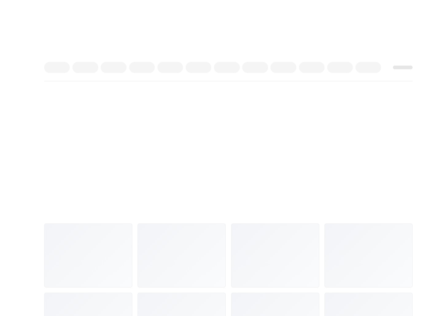
每当我检查该元素,或以某种方式使其失效(例如访问它的 clientTop 属性)时,空白又恢复到正常状态,符合我的预期:
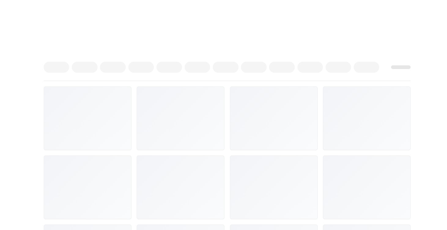
我尝试创建一个可复现的示例,但还差一点。
在现实使用中,这个问题不会重载页面,只需简单地向上/向下滚动即可发生。然而我也复现了一个看起来相同的情况,但其实是通过先向下滚动页面、重新加载,然后再向上滚动来触发的。(我希望这个问题有关系。)
<!doctype html>
<html lang="en">
<head>
  <meta charset="UTF-8" />
  <meta name="viewport" content="width=device-width, initial-scale=1.0" />
  <title>Sticky Layout</title>
  <style>
    * {
      box-sizing: border-box;
    }

    body {
      margin: 0;
      font-family: -apple-system, BlinkMacSystemFont, Segoe UI, Arial, sans-serif;
      background: #fff;
    }

    .shell {
      max-width: 1540px;
      margin: 0 auto;
      padding: 0 80px;
    }

    @media (max-width: 1199px) {
      .shell {
        padding: 0 30px;
      }
    }

    @media (max-width: 767px) {
      .shell {
        padding: 0 20px;
      }
    }

    .top-gap {
      height: 210px;
    }

    .layout {
      position: relative;
      margin-bottom: 40px;
    }

    filter-bar {
      display: contents;
    }


    .sticky-wrapper {
      display: contents;
    }

    .sticky-layer {
      display: contents;
    }

    .sticky-row {
      z-index: 9;
      float: left;
      background: #fff;
      display: block;
      position: sticky;
      top: -1px;
      width: calc(100% - 100px);
    }

    .pill-track {
      margin-left: -20px;
      margin-right: -20px;
      background: #fff;
    }

    @media (min-width: 768px) {
      .pill-track {
        margin-left: -30px;
        margin-right: -30px;
      }
    }

    .pill-row {
      -webkit-overflow-scrolling: touch;
      scrollbar-width: none;
      display: flex;
      flex-wrap: wrap;
      row-gap: 10px;
      overflow: auto;
      padding: 20px 0 20px 20px;
    }

    @media (pointer: coarse) {
      .pill-row {
        flex-wrap: nowrap;
      }
    }

    @media (min-width: 768px) {
      .pill-row {
        padding: 30px 0 30px 30px;
      }
    }

    .pill-row::-webkit-scrollbar {
      display: none;
    }

    .pill-slot {
      flex-shrink: 0;
      padding-right: 8px;
    }

    @media (min-width: 768px) {
      .pill-slot {
        padding-right: 10px;
      }
    }

    .pill-slot:last-child {
      padding-right: 20px;
    }

    @media (min-width: 768px) {
      .pill-slot:last-child {
        padding-right: 30px;
      }
    }

    .pill {
      width: 96px;
      height: 42px;
      border: 1px solid #f5f5f5;
      border-radius: 42px;
      background: #f5f5f5;
    }

    .sticky-info {
      z-index: 9;
      width: 100%;
      margin-bottom: 20px;
      background: #fff;
      width: 100px;
      height: 102px;
      margin-bottom: 0;
      margin-right: -1px;
      top: 0;
      background: #fff;
      display: flex;
      justify-content: flex-end;
      align-items: center;
      position: sticky;
    }


    .info-block {
      width: 74px;
      height: 14px;
      border-radius: 10px;
      background: crimson;
    }

    .sticky-border {
      --row-height: 0;
      z-index: 9;
      height: 1px;
      top: calc(var(--row-height) - 1px);
      background: #e6e6e6;
      position: sticky;
    }

    @media (max-width: 767px) {
      .sticky-border {
        width: calc(100% + 40px);
        margin-left: -20px;
      }
    }

    @media (min-width: 768px) {
      .sticky-border {
        width: 100%;
      }
    }

    .grid {
      clear: both;
      display: grid;
      grid-template-columns: repeat(2, minmax(0, 1fr));
      gap: 20px;
      padding-top: 20px;
    }

    @media (min-width: 900px) {
      .grid {
        grid-template-columns: repeat(4, minmax(0, 1fr));
      }
    }

    .box {
      min-height: 240px;
      border: 1px solid #ececec;
      border-radius: 8px;
      background: linear-gradient(135deg, #f2f4f7 0%, #fafbfc 100%);
    }
  </style>
</head>
<body>
  <div class="shell">
    <div class="top-gap"></div>

    <div class="layout">
      <filter-bar>
        <div class="sticky-wrapper">
          <div class="sticky-layer">
            <div class="sticky-row">
              <div class="pill-track">
                <div class="pill-row">
                  <div class="pill-slot"><button class="pill" type="button" aria-label="filter 1"></button></div>
                  <div class="pill-slot"><button class="pill" type="button" aria-label="filter 2"></button></div>
                  <div class="pill-slot"><button class="pill" type="button" aria-label="filter 3"></button></div>
                  <div class="pill-slot"><button class="pill" type="button" aria-label="filter 4"></button></div>
                  <div class="pill-slot"><button class="pill" type="button" aria-label="filter 5"></button></div>
                  <div class="pill-slot"><button class="pill" type="button" aria-label="filter 6"></button></div>
                  <div class="pill-slot"><button class="pill" type="button" aria-label="filter 7"></button></div>
                  <div class="pill-slot"><button class="pill" type="button" aria-label="filter 8"></button></div>
                  <div class="pill-slot"><button class="pill" type="button" aria-label="filter 9"></button></div>
                  <div class="pill-slot"><button class="pill" type="button" aria-label="filter 10"></button></div>
                  <div class="pill-slot"><button class="pill" type="button" aria-label="filter 11"></button></div>
                  <div class="pill-slot"><button class="pill" type="button" aria-label="filter 12"></button></div>
                </div>
              </div>
            </div>

            <div class="sticky-info">
              <div class="info-block"></div>
            </div>

            <div class="sticky-border"></div>
          </div>
        </div>
      </filter-bar>

      <div id="grid" class="grid"></div>
    </div>
  </div>

  <script>
    class FilterBar extends HTMLElement {
      connectedCallback() {
        const stickyRow = this.querySelector(".sticky-row");
        const stickyBorder = this.querySelector(".sticky-border");

        if (stickyRow === null || stickyBorder === null) {
          return;
        }

        this.observer = new ResizeObserver(() => {
          stickyBorder.style.setProperty("--row-height", `${stickyRow.clientHeight}px`);
        });

        this.observer.observe(stickyRow);
      }

      disconnectedCallback() {
        if (this.observer === undefined) {
          return;
        }

        this.observer.disconnect();
      }
    }

    customElements.define("filter-bar", FilterBar);

    const grid = document.querySelector("#grid");

    for (let i = 0; i < 96; i += 1) {
      const box = document.createElement("div");
      box.className = "box";
      grid.appendChild(box);
    }

  </script>
</body>
</html>
解决方案
我认为这个错误可能来自 position: sticky + float + display: contents 的组合。
尝试移除 float
将以下内容替换为:
.sticky-row {
  float: left;
}
为:
.sticky-row {
  display: block;
}
或者直接删除 float
同时移除:
.grid {
  clear: both;
}
因为它只因为 float 而存在。
这就足以修复空白问题。
站内所有文章版权归属LeftHeroAI导航站,无授权禁止任何主体转载、抄袭、复制内容,亦不得私自架设镜像站点。一经侵权,本站将通过法律途径追责。
相关文章






汇集全球数千款 AI 工具,每日持续更新,配套 AI 开发学习资源,轻松用 AI 提升工作效率。快捷键 Ctrl+D/⌘+D 一键收藏本站。