


如何在SwiftUI的 HStack中改变单个元素的垂直对齐?
我有如下代码。
struct ContentView: View {
    @State var textInput: String = "Testing"

    private let inputCornerRadius: CGFloat = 24

    var body: some View {
        HStack(alignment: .bottom, spacing: 8) {
            TextField("Chat", text: $textInput, axis: .vertical)
                .lineLimit(1...9)
                .textFieldStyle(.plain)

            Button(action: send) {
                Image(systemName: "paperplane.fill")
                    .foregroundStyle(.background)
                    .imageScale(.medium)
                    .padding(10)
                    .background(
                        Circle()
                            .fill(Color(.label))
                        )
            }
        }
        .padding(.vertical, 8)
        .padding(.leading, 10)
        .padding(.trailing, 6)
        .background(
            RoundedRectangle(cornerRadius: inputCornerRadius, style: .continuous)
                .fill(Color(.secondarySystemBackground))
        )
        .clipShape(RoundedRectangle(cornerRadius: inputCornerRadius, style: .continuous))
        .padding(.horizontal, 10)
    }

    private func send() {}
}
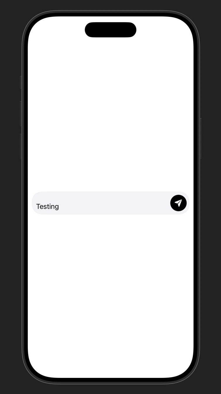
问题在于文本输入框对齐到底部。我想让它居中。这里有个棘手的部分,我希望发送按钮始终与底部对齐(如果只是单行就居中)。
如果把HStack的对齐改成 .center,单行文本时就能完全按我想要的方式工作,但一旦变成多行,发送按钮就会居中而不是向底部对齐。
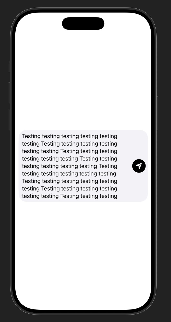
因此这是我的要求:
- 对于单行文本,文本输入框和发送按钮都垂直居中。
- 对于多行文本,发送按钮与灰色背景的底部对齐(外加内边距)。
我尝试过的做法:
- 将对齐设为
.center(如上所述,原因我已解释)。 - 将TextField包裹在另一个居中对齐的HStack中(父容器仍然是底部对齐)。这没有任何效果。
- 在TextField外再包一个VStack,顶部和底部各放一个Spacer。这导致整个视图的高度被拉伸以匹配父视图的高度(这是我不想要的)。
- 给按钮添加
.alignmentGuide(.bottom) { d in d[.bottom] },并把对齐设为.center。仍然无效,按钮仍然居中。
理想情况下我希望避免进行文本高度计算等等。感觉这应该是一个相对简单的UI,我在构建它时不应该过于复杂。
如何让按钮始终对齐到底部,而TextField仍保持居中?
解决方案
下面是一些可行的修复方法。
1.将 maxHeight: .infinity 应用于 Button,将 .fixedSize 应用于 HStack
一个 .frame 修饰符可以通过 maxHeight: .infinity 和 alignment: .bottom 应用于 Button。然后,.fixedSize(horizontal: false, vertical: true) 应用于 HStack。这可以阻止按钮占用多于实际需要的空间。
HStack(spacing: 8) { // default alignment
    TextField("Chat", text: $textInput, axis: .vertical)
        // ...

    Button(action: send) {
        // ...
    }
    .frame(maxHeight: .infinity, alignment: .bottom)
}
.fixedSize(horizontal: false, vertical: true)
// + padding and other modifiers
在这种特定情况下,这也许是最简单的解决方案。但是,修饰符 .fixedSize 有时会带来不良的副作用,尤其是在文本处理方面。因此在其他场景下,这种技术可能并不合适。
2.使用一个 .alignmentGuide
为了让对齐引导起作用,你需要知道文本或按钮的高度。由于文本高度是可变的,这种技术可能只有在按钮高度已知或可以猜到时才有用。然后将对齐引导应用到 HStack 中的另一个元素,也就是文本。
如果你必须猜测按钮的大小,那么在添加背景之前,最好给它一个 .frame,并配合 minWidth 和 minHeight。苹果的 按钮设计指南 建议最小尺寸为44点。
请注意,用于 .alignmentGuide 的对齐方式必须与用于 HStack 的 alignment 相匹配。由于对齐引导应用到文本而不是按钮,应该使用 .bottom。这对 HStack 中没有自有对齐引导的元素(也就是按钮)同样生效:
private let minButtonSize: CGFloat = 44
HStack(alignment: .bottom, spacing: 8) {
    TextField("Chat", text: $textInput, axis: .vertical)
        // + previous modifiers
        .alignmentGuide(.bottom) { dim in
            dim.height + max(0, (minButtonSize - dim.height) / 2)
        }

    Button(action: send) {
        Image(systemName: "paperplane.fill")
            // ...
            .frame(minWidth: minButtonSize, minHeight: minButtonSize)
            .background(Color(.label), in: .circle)
    }
}
// + padding and other modifiers
3.使用占位符来保留空间,然后将按钮作为覆盖层显示
如果你已经知道按钮的尺寸(参见要点2),也可以使用占位符为它保留空间。然后将实际按钮作为覆盖显示在 HStack 上,使用对齐 .bottomTrailing。
HStack(spacing: 8) { // default alignment
    TextField("Chat", text: $textInput, axis: .vertical)
        // ...

    // Placeholder
    Color.clear
        .frame(width: minButtonSize, height: minButtonSize)
}
.overlay(alignment: .bottomTrailing) {
    Button(action: send) {
        // ...
        .frame(minWidth: minButtonSize, minHeight: minButtonSize)
        .background(Color(.label), in: .circle)
    }
}
// + padding and other modifiers
或者,可以用 Button 的一个副本作为占位符。这同样可行,是确保尺寸正确的好方法,但你需要再采取一些额外措施:
- 确保对副本应用
.hidden()和.accessibilityHidden(true)以保持其隐藏状态 - 也应用
.disabled(true),以确保它不能获取焦点。
4.使用 .matchedGeometryEffect 来确定按钮的位置
另一种解决方法是使用 .matchedGeometryEffect。当你不知道按钮的大小且不想进行猜测时,这种技术就能工作。
- 符合几何的源可以是
HStack本身,在应用填充之前。 - 按钮通过
anchor: .bottomTrailing与源的位置进行匹配。
@Namespace private var ns
HStack(spacing: 8) { // default alignment
    TextField("Chat", text: $textInput, axis: .vertical)
        // ...

    Button(action: send) {
        // ...
    }
    .matchedGeometryEffect(
        id: 0,
        in: ns,
        properties: .position,
        anchor: .bottomTrailing,
        isSource: false
    )
}
.matchedGeometryEffect(
    id: 0,
    in: ns,
    anchor: .bottomTrailing,
    isSource: true
)
// + padding and other modifiers
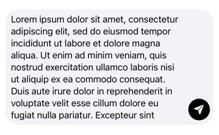
所有这些技巧都会得到类似的结果:

相关文章





