


如何通过炫酷的Liquid Glass动画来显示或隐藏iOS工具栏按钮?
我正在构建一个iOS 26+的 SwiftUI应用,特色是Liquid Glass与在特定场景中出现的条件按钮。
例如,当文本字段有文本时会出现的Trash工具栏按钮,但文本字段为空时会消失:
if !text.isEmpty {
    ToolbarItem(placement: .topBarTrailing) {
        Button { text = "" } label: { Image(systemName: "trash") }
    }
}
我希望工具栏按钮能够使用 Apple的新颖Liquid Glass blob morphing效果。
然而,上面的代码只是直接显示/隐藏工具栏按钮,没有像Apple视频中那样的明显“液态、流动、变形”动画。
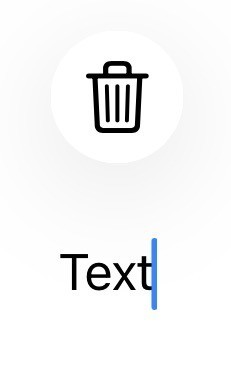
注:点击按钮 确实会带来一些Liquid Glass效果,但当按钮通过无关操作显示/隐藏时,它只是闪烁着出现又消失。
是否有办法使用原生、stock的 iOS动画来添加工具栏按钮,让其获得华丽的收缩、变形Liquid Glass外观和消失?
这里的问题 有gif展示在切换/添加按钮时简单动画和华丽的Liquid Glass动画,但并未展示整个按钮集合的显示/隐藏。
解决方案
当按钮作为工具栏项显示时,过渡和相关动画由原生工具栏控制,我认为你几乎无法改变动画效果。
- 过渡似乎是一个模糊效果。
- 重要的是包含一个
.animation修饰符,否则根本没有动画。不过,将动画风格改为类似.bouncy的东西也没有效果——看来动画风格是由原生工具栏控制的。
下面是一个独立示例,展示原生动画效果(这其实是对你在问题中展示内容的扩展版本):
struct ContentView: View {
    @State private var text = ""
    var body: some View {
        NavigationStack {
            VStack {
                TextField("Text", text: $text)
                    .textFieldStyle(.roundedBorder)
                    .toolbarVisibility(.visible, for: .automatic)
                    .padding()
                Spacer()
            }
            .toolbar {
                if !text.isEmpty {
                    ToolbarItem(placement: .topBarTrailing) {
                        Button("Delete", systemImage: "trash", role: .destructive) {
                            text = ""
                        }
                    }
                }
            }
            .animation(.default, value: text.isEmpty)
            .toolbarVisibility(.visible, for: .automatic)
        }
    }
}
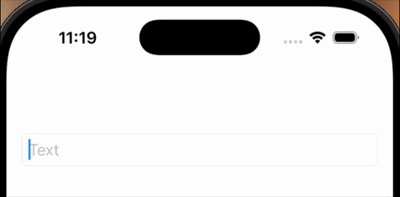
原生动画如果配合一个 ToolbarItemGroup 使用,再配合第二个状态变量用来改变组内显示的内容,可以变得更有趣:
- 组只有在文本不为空时才显示
- 初次显示时组显示一个
Spacer,随后将Spacer替换为按钮 - 切换可以使用
.task和withAnimation完成 - 我发现如果在切换前有一个短暂的睡眠(sleep)会更稳定
@State private var isButtonShowing = false
VStack {
    // ... as before
}
.toolbar {
    if !text.isEmpty {
        ToolbarItemGroup(placement: .topBarTrailing) {
            if isButtonShowing {
                Button("Delete", systemImage: "trash", role: .destructive) {
                    text = ""
                }
            } else {
                Spacer()
            }
        }
    }
}
.animation(.default, value: text.isEmpty)
.toolbarVisibility(.visible, for: .automatic)
.task(id: text.isEmpty) {
    try? await Task.sleep(for: .milliseconds(20))
    if !Task.isCancelled {
        withAnimation {
            isButtonShowing = !text.isEmpty
        }
    }
}
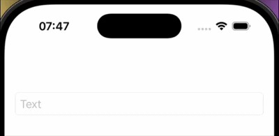
差异不大,但现在的动画多了一点弹跳感。
另一种显示按钮的方式是使用 .safeAreaBar 或 .overlay,而不是作为工具栏项。这样,你就能对过渡和动画的风格有更多控制。
为了让按钮看起来与工具栏按钮一致,建议使用自定义的 ButtonStyle。例如:
struct RoundGlassButton: ButtonStyle {
    func makeBody(configuration: Configuration) -> some View {
        configuration.label
            .font(.title2)
            .labelStyle(.iconOnly)
            .frame(minWidth: 44, minHeight: 44)
            .contentShape(.circle)
            .glassEffect(.regular.interactive(), in: .circle)
    }
}
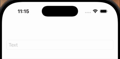
这就是带自定义样式的按钮如何再通过一个弹跳的动画显示的示例:
struct ContentView: View {
    @State private var text = ""
    var body: some View {
        NavigationStack {
            VStack {
                TextField("Text", text: $text)
                    .textFieldStyle(.roundedBorder)
                    .toolbarVisibility(.visible, for: .automatic)
                    .padding()
                Spacer()
            }
        }
        .safeAreaBar(edge: .top, alignment: .trailing) {
            if !text.isEmpty {
                Button("Delete", systemImage: "trash", role: .destructive) {
                    text = ""
                }
                .buttonStyle(RoundGlassButton())
                .padding(.horizontal, 16)
                .transition(.asymmetric(
                    insertion: .scale.animation(.bouncy(duration: 0.3, extraBounce: 0.3)),
                    removal: .scale.combined(with: .opacity).animation(.easeInOut(duration: 0.3))
                ))
            }
        }
    }
}
站内所有文章版权归属LeftHeroAI导航站,无授权禁止任何主体转载、抄袭、复制内容,亦不得私自架设镜像站点。一经侵权,本站将通过法律途径追责。
相关文章






汇集全球数千款 AI 工具,每日持续更新,配套 AI 开发学习资源,轻松用 AI 提升工作效率。快捷键 Ctrl+D/⌘+D 一键收藏本站。