


Expo 54 iOS 26液态玻璃风格的导航栏按钮偶发性延展
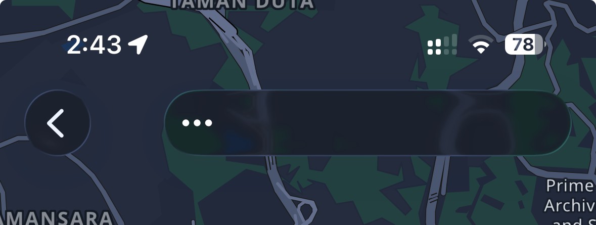
使用 Expo 54。在 iOS 26 时,右侧的自定义头部按钮会间歇性地自行延展。很难稳定复现,但此现象相当频繁。
HeaderButton.tsx
import { tokens } from '@/design';
import { color } from '@/design/colors';
import React from 'react';
import { AccessibilityRole, Platform, StyleProp, View, ViewStyle } from 'react-native';
import { BorderlessButton, RectButton } from 'react-native-gesture-handler';
import { Pressable } from './Pressable';
import { isLiquidGlassAvailable } from 'expo-glass-effect';

interface HeaderButtonProps {
  onPress?: () => void;
  children: React.ReactNode;
  testID?: string;
  accessibilityRole?: AccessibilityRole;
  accessibilityLabel?: string;
  disabled?: boolean;
  rippleShape?: 'circle' | 'rect';
  style?: StyleProp<ViewStyle>;
}

const InnerContent = ({ children }: { children: React.ReactNode }) => (
  <View style={{ flexDirection: 'row', alignItems: 'center', gap: tokens.spacing.xs }}>
    {children}
  </View>
);

export function HeaderButton({
  onPress,
  children,
  testID,
  accessibilityRole = 'button',
  accessibilityLabel,
  disabled = false,
  rippleShape = 'circle',
  style,
}: HeaderButtonProps) {
  if (Platform.OS === 'android') {
    if (rippleShape === 'rect') {
      return (
        <RectButton
          onPress={onPress}
          testID={testID}
          accessibilityRole={accessibilityRole}
          accessibilityLabel={accessibilityLabel}
          enabled={!disabled}
          rippleColor={color.androidHighlight}
          style={[
            {
              paddingHorizontal: 6,
              opacity: disabled ? 0.3 : 1,
              minWidth: 48,
              minHeight: 48,
              borderRadius: tokens.radius.full,
              justifyContent: 'center',
              alignItems: 'center',
            },
            style,
          ]}
        >
          <InnerContent>{children}</InnerContent>
        </RectButton>
      );
    }
    return (
      <BorderlessButton
        onPress={onPress}
        testID={testID}
        accessibilityRole={accessibilityRole}
        accessibilityLabel={accessibilityLabel}
        enabled={!disabled}
        rippleColor={color.androidHighlight}
        hitSlop={16}
        rippleRadius={20}
        style={[
          {
            paddingHorizontal: 0,
            opacity: disabled ? 0.3 : 1,
            justifyContent: 'center',
            alignItems: 'center',
          },
          style,
        ]}
      >
        <InnerContent>{children}</InnerContent>
      </BorderlessButton>
    );
  }

  return (
    <Pressable
      onPress={onPress}
      testID={testID}
      accessibilityRole={accessibilityRole}
      accessibilityLabel={accessibilityLabel}
      disabled={disabled}
      haptic
      hitSlop={8}
      style={[
        {
          paddingHorizontal: isLiquidGlassAvailable() ? 6 : undefined,
          opacity: disabled ? 0.3 : 1,
          justifyContent: 'center',
          alignItems: 'center',
        },
        style,
      ]}
    >
      <InnerContent>{children}</InnerContent>
    </Pressable>
  );
}
HeaderMenuButton.tsx
import { MenuAction, MenuView, NativeActionEvent } from '@react-native-menu/menu';
import { isLiquidGlassAvailable } from 'expo-glass-effect';
import React from 'react';
import { type AccessibilityRole, Platform, StyleSheet, View } from 'react-native';
import { HeaderButton } from './HeaderButton';

// Liquid Glass headers render icon-only actions with a noticeably smaller circular visual than the
// pre-iOS-26 header buttons. Matching that 36pt visual keeps the menu trigger aligned with the
// existing checkmark/save buttons while still constraining the native MenuView anchor.
const LIQUID_GLASS_HEADER_MENU_BUTTON_SIZE = 36;

type AccessibleMenuViewProps = React.ComponentProps<typeof MenuView> & {
  accessibilityLabel?: string;
  accessibilityRole?: AccessibilityRole;
};

// TODO: Remove this once @react-native-menu/menu exposes standard accessibility props in its TS types.
const AccessibleMenuView = MenuView as React.ComponentType<AccessibleMenuViewProps>;

interface HeaderMenuButtonProps {
  actions: MenuAction[];
  onPressAction: ({ nativeEvent }: NativeActionEvent) => void;
  children: React.ReactNode;
  testID?: string;
  accessibilityLabel: string;
}

export function HeaderMenuButton({
  actions,
  onPressAction,
  children,
  testID,
  accessibilityLabel,
}: HeaderMenuButtonProps) {
  const shouldUseConstrainedAnchor = Platform.OS === 'ios' && isLiquidGlassAvailable();

  return (
    <AccessibleMenuView
      accessibilityLabel={accessibilityLabel}
      accessibilityRole="button"
      testID={testID}
      actions={actions}
      onPressAction={onPressAction}
      shouldOpenOnLongPress={false}
      style={shouldUseConstrainedAnchor ? styles.menuAnchor : undefined}
    >
      <View
        pointerEvents="none"
        accessible={false}
        accessibilityElementsHidden
        importantForAccessibility="no-hide-descendants"
        style={shouldUseConstrainedAnchor ? styles.content : undefined}
      >
        <HeaderButton
          accessibilityLabel={accessibilityLabel}
          style={shouldUseConstrainedAnchor ? styles.visualButton : undefined}
        >
          {children}
        </HeaderButton>
      </View>
    </AccessibleMenuView>
  );
}

const styles = StyleSheet.create({
  menuAnchor: {
    width: LIQUID_GLASS_HEADER_MENU_BUTTON_SIZE,
    height: LIQUID_GLASS_HEADER_MENU_BUTTON_SIZE,
    minWidth: LIQUID_GLASS_HEADER_MENU_BUTTON_SIZE,
    minHeight: LIQUID_GLASS_HEADER_MENU_BUTTON_SIZE,
    flexGrow: 0,
    flexShrink: 0,
    justifyContent: 'center',
    alignItems: 'center',
  },
  content: {
    width: '100%',
    height: '100%',
    justifyContent: 'center',
    alignItems: 'center',
  },
  visualButton: {
    width: '100%',
    height: '100%',
    paddingHorizontal: 0,
  },
});
解决方案
尝试将水平内边距设置为3,看看是否能解决问题。
站内所有文章版权归属LeftHeroAI导航站,无授权禁止任何主体转载、抄袭、复制内容,亦不得私自架设镜像站点。一经侵权,本站将通过法律途径追责。
相关文章






汇集全球数千款 AI 工具,每日持续更新,配套 AI 开发学习资源,轻松用 AI 提升工作效率。快捷键 Ctrl+D/⌘+D 一键收藏本站。