


在CSS中从对象向外延伸的斜线
我正在为一个网站创建登录页,并从这个设计中获得灵感:
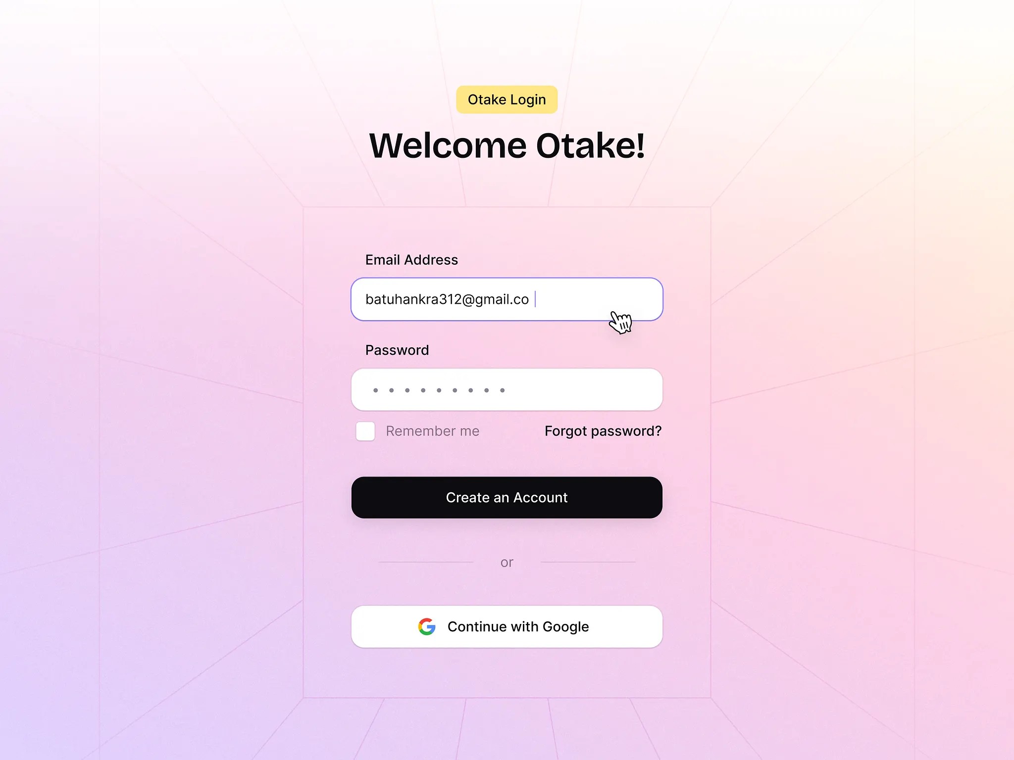
我想让从容器中伸出的斜线该如何实现?并且我还希望在用户调整窗口大小时,斜线能始终贴合容器。
我尝试创建一个 div 元素并像这样旋转它:
.slant_lines{
  height: 1px;
  background-color: rgb(101, 97, 97);
  transform: rotate(-45deg);
  position: sticky;
}
但它并未贴合到容器上,反而出现了滚动条。
解决方案
你可以使用 repeating-conic-gradient 来获得斜线图案。通过将透明间隙设为所需的值来控制线条密度,例如尝试
background:
  repeating-conic-gradient(
    from 15deg at 50% 50%,
    rgba(0, 0, 0, 0.06) 0deg 0.2deg,
    transparent 0.2deg 30deg
  );
把登录区域的 div 放在顶部,可以实现看起来像线条从容器发出的效果。
body {
  /* Some gradient fill */
  background: linear-gradient(135deg, #fffbeb 0%, #fae8ff 50%, #ffe4e6 100%);
}

.background-container {
  min-height: 100vh;
  min-width: 100vw;
  display: flex;
  justify-content: center;
  align-items: center;

  background:

    /* rays should originate in the center */
    repeating-conic-gradient(from 9deg at 50% 50%,

      /* a small sharp line */
      rgba(0, 0, 0, 0.06) 0deg 0.2deg,

      /* gap before the next line */
      transparent 0.2deg 18deg
    );

  position: relative;
}


.login-box {
  /* Some gradient fill */
  background: linear-gradient(45deg, #fffbeb 0%, #fae8ff 50%, #ffe4e6 100%);

  /* same subtle line as used for the rays */
  border: 1px solid rgba(0, 0, 0, 0.06);

  padding: 20px;
  width: 100%;
  max-width: 200px;
  box-shadow: 0 10px 30px rgba(0, 0, 0, 0.1);

  text-align: center;

  position: relative;
  z-index: 10;
}
<html>

<body>
  <div class="background-container">
    <div class="login-box">
      <h2>Some login form</h2>
    </div>
  </div>
</body>

</html>
站内所有文章版权归属LeftHeroAI导航站,无授权禁止任何主体转载、抄袭、复制内容,亦不得私自架设镜像站点。一经侵权,本站将通过法律途径追责。
相关文章






汇集全球数千款 AI 工具,每日持续更新,配套 AI 开发学习资源,轻松用 AI 提升工作效率。快捷键 Ctrl+D/⌘+D 一键收藏本站。