


在添加侧图时,如何画出弧形连线?
如标题所示,已经有很多包可以单独绘制主图的侧边面板,但这个曲线是如何绘制的呢(示例图片的右上角)?
当然,可以导出图像并使用PowerPoint等工具来实现这一点,这也是一种选择,尽管这并不算“优雅”的做法。
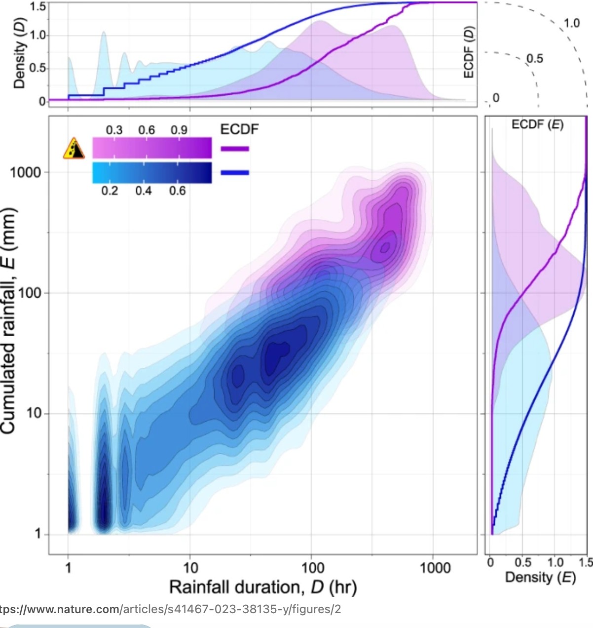
解决方案
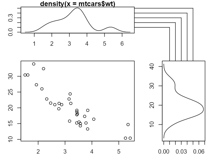
下面给出一种使用基础R 绘图函数的方法。
这里的关键在于,在创建每个图之后,我们会捕捉一些信息并将其转换为设备尺度上的坐标。然后最终的绘图(右上角)通过把这些保存的信息转换回用户坐标,并利用这些信息来绘图来实现。
dev.off()
par(mar = c(3, 3, 1, 1))

layout(matrix(c(2,1,4,3), nrow=2),
       width=c(2,1), heights=c(1,2))
plot(mpg ~ wt, data=mtcars)

# save top and right coordinates
p1x <- grconvertX(1, from='npc', to='ndc')
p1y <- grconvertY(1, from='npc', to='ndc')

d1 <- density(mtcars$wt)
plot(d1)

#  save y from this plot
p2y <- grconvertY(c(0.1, 0.2, 0.3, 0.4, 0.5), to='ndc')

d2 <- density(mtcars$mpg)
plot(d2$y, d2$x, type='l')

# save x from this plot

p3x <- grconvertX(c(0.01, 0.02, 0.03, 0.04, 0.05), to='ndc')

# create empty plot
plot.new()
par(xpd=NA)

# convert from ndc to current plot coords

p4l <- grconvertX(p1x, from='ndc')
p4b <- grconvertY(p1y, from='ndc')

p4x <- grconvertX(p3x, from='ndc')
p4y <- grconvertY(p2y, from='ndc')

# draw lines

segments(x0=p4l, y0=p4y, x1=p4x)
segments(x0=p4x, y0=p4y, y1=p4b)
我这里只是使用了直角,但你也可以使用 xspline 函数(或其他函数)将其转换为曲线。
站内所有文章版权归属LeftHeroAI导航站,无授权禁止任何主体转载、抄袭、复制内容,亦不得私自架设镜像站点。一经侵权,本站将通过法律途径追责。
相关文章






汇集全球数千款 AI 工具,每日持续更新,配套 AI 开发学习资源,轻松用 AI 提升工作效率。快捷键 Ctrl+D/⌘+D 一键收藏本站。