


在Python中拟合线性回归并计算评估指标
我有两组模型预测与观测数据序列。
我能够为这些序列绘制折线图。
我想对这两组数据进行线性回归拟合。
我还想把一些指标作为注释添加到图上。
我需要帮助配置拟合公式,目前它尚未被接受(报错),并且MAE(-18.1903) 和R^2(-6.4282) 的结果也不正确。
我还没能从类似的帖子中解决我的问题,请提供帮助。
Date,HumFc,HumOb
20260201, 74.5, 78.2
20260201, 74.5, 78.2
20260202, 71.4, 93.9
20260203, 60.1, 80.2
20260204, 67.9, 91.4
20260205, 71.4, 89.5
20260206, 62.9, 97.7
20260207, 64.5, 89.7
20260208, 76.1, 88.2
20260209, 75.8, 83.7
20260210, 73.8, 90.2
20260211, 65.4, 89.9
20260212, 50.4, 80.7
20260213, 60.8, 75.6
20260214, 65.0, 93.9
20260215, 64.3, 85.3
20260216, 69.1, 86.2
20260217, 74.0, 95.0
20260218, 81.8, 87.7
20260219, 71.6, 89.9
20260220, 65.9, 86.5
20260221, 52.9, 90.9
20260222, 86.2, 87.8
20260223, 75.4, 68.9
20260224, 80.2, 87.6
20260225, 70.4, 90.6
20260226, 70.4, 87.2
20260227, 74.8, 86.1
20260228, 65.2, 84.9
20260301, 65.6, 94.5
20260302, 71.9, 88.1
20260303, 68.4, 92.0
import pandas as pd
import numpy as np
from sklearn.linear_model import LinearRegression
from sklearn.metrics import mean_squared_error, mean_absolute_error, r2_score
import matplotlib.pyplot as plt
import matplotlib.dates as mdates
from datetime import datetime

df = pd.read_csv('/Hum_h5d_06.csv', skipinitialspace=True)
print(df.columns)
df['Date'] = pd.to_datetime(df['Date'].astype(str), format='%Y%m%d')
df['Date'] = pd.to_datetime(df['Date'], format="%b %d")
#quit()

#1. Create and fit the regression model:
model = LinearRegression()

#2. fit regression model
X = np.array(df['HumOb']).reshape((-1, 1))
Y = df['HumFc']
model.fit(X, Y)

#3. calculate metrics
RMSE = np.sqrt(((df['HumFc'] - df['HumOb'])**2).mean())
print(f"RMSE: {RMSE:.4f}")
MAE = mean_absolute_error(df['HumFc'], df['HumOb'])
print(f"MAE: {MAE:.4f}")
RSQ = r2_score(df['HumFc'], df['HumOb'])
print(f"RSQ: {RSQ:.4f}")
quit()

#4. Create plot and get the axes object
fig, ax = plt.subplots()
ax.plot(df['Date'], df['HumOb'])

date_format = mdates.DateFormatter('%b %d')

#5. Apply the formatter to the x-axis
ax.xaxis.set_major_formatter(date_format)

# Optional: automatically format and rotate the date labels for better visibility
fig.autofmt_xdate()

#6. make the plot
plt.plot(df['Date'], df['HumOb'], color='b', label='HumOb')
plt.plot(df['Date'], df['HumFc'], color='r', label='HumFc')
plt.title('5-Day Humidity Forecast and AWS Recorded Humidity')
plt.xlabel('Date_of_Forecast')
plt.ylabel('Humidity')
plt.legend(loc = "lower right", bbox_to_anchor=(1.01, 0.04), fontsize=10)
plt.grid(True)

#7. Annotation text
metrics_text = (
    f"RMSE: {RMSE:.3f}\n"
    f"MAE: {MAE:.3f}\n"
    f"RSQ: {RSQ:.3f}"
)

#8. Add the metrics as an annotation on the plot
plt.annotate(
    metrics_text,
    xy=(0.025, 0.065),  # Position (x, y) relative to plot axes (0,0 is bottom left, 1,1 is top right)
    xycoords='axes fraction',
    fontsize=8,
    bbox=dict(boxstyle="round,pad=0.5", fc="white", alpha=0.5)
)
plt.show()
解决方案
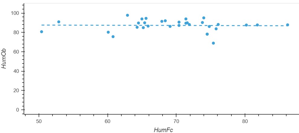
你可以用自变量HumFc创建一个占位数组。使用 np.linalg.lstsq() 计算每一列的斜率和截距,然后通过矩阵乘法将占位数组填充为拟合值。
我更倾向于使用NumPy进行数值运算,因为它的开销更小,并且更透明地显示正在执行的运算。不过,Scikit-learn的函数也更简单。若NumPy让你遇到困难,你可能想使用 sklearn.metrics 中的回归评估指标函数。
from io import StringIO
import hvplot.pandas  # noqa: F401
import numpy as np
import pandas as pd

# Data for the original dataframe
raw_data = """
    Date,HumFc,HumOb
    20260201, 74.5, 78.2
    20260201, 74.5, 78.2
    20260202, 71.4, 93.9
    20260203, 60.1, 80.2
    20260204, 67.9, 91.4
    20260205, 71.4, 89.5
    20260206, 62.9, 97.7
    20260207, 64.5, 89.7
    20260208, 76.1, 88.2
    20260209, 75.8, 83.7
    20260210, 73.8, 90.2
    20260211, 65.4, 89.9
    20260212, 50.4, 80.7
    20260213, 60.8, 75.6
    20260214, 65.0, 93.9
    20260215, 64.3, 85.3
    20260216, 69.1, 86.2
    20260217, 74.0, 95.0
    20260218, 81.8, 87.7
    20260219, 71.6, 89.9
    20260220, 65.9, 86.5
    20260221, 52.9, 90.9
    20260222, 86.2, 87.8
    20260223, 75.4, 68.9
    20260224, 80.2, 87.6
    20260225, 70.4, 90.6
    20260226, 70.4, 87.2
    20260227, 74.8, 86.1
    20260228, 65.2, 84.9
    20260301, 65.6, 94.5
    20260302, 71.9, 88.1
    20260303, 68.4, 92.0
"""


def reproduce_dataframe(raw_data: str) -> pd.DataFrame:
    df = pd.read_csv(
        StringIO(raw_data.strip()),
        skipinitialspace=True,
        parse_dates=["Date"],
    )
    df[["HumFc", "HumOb"]] = df[["HumFc", "HumOb"]].astype(float)
    return df


def add_fitted_values(df: pd.DataFrame) -> pd.DataFrame:
    result = df.copy()
    x = result["HumFc"].to_numpy()
    y = result["HumOb"].to_numpy()

    # Array of shape [length(df), 2] to accept fitted values for each x
    scaffold = np.column_stack([x, np.ones(len(x))])

    # Best-fit slope and intercept, found by least squares
    solution = np.linalg.lstsq(scaffold, y, rcond=None)[0]

    result["HumOb_Fitted"] = np.matmul(scaffold, solution)
    return result


# Plot
def plot_humidity(df_with_fit: pd.DataFrame):
    points_ = df_with_fit.hvplot.scatter(
        x="HumFc", y="HumOb", ylim=(0, 110), xlabel="HumFc", ylabel="HumOb"
    )
    lines_ = df_with_fit.sort_values("HumFc").hvplot.line(
        x="HumFc", y="HumOb_Fitted", ylim=(0, 110), line_dash="dashed"
    )
    return points_, lines_


df = reproduce_dataframe(raw_data)
df_with_fit = add_fitted_values(df).set_index("Date").sort_values("HumFc")

points_, lines_ = plot_humidity(df_with_fit)
points_ * lines_
站内所有文章版权归属LeftHeroAI导航站,无授权禁止任何主体转载、抄袭、复制内容,亦不得私自架设镜像站点。一经侵权,本站将通过法律途径追责。
相关文章






汇集全球数千款 AI 工具,每日持续更新,配套 AI 开发学习资源,轻松用 AI 提升工作效率。快捷键 Ctrl+D/⌘+D 一键收藏本站。