


通过代码创建的(Maui)UraniumUI TabItem不会继承TabView的 XAML样式覆盖
我在App.xaml里放了一段自定义代码,为我的TabView创建了一个覆盖。它是一个未被引用的硬编码样式实现,我以为它会扩展到内部的其他元素。
            <Color x:Key="TabViewBackgroundLight">lightGrey</Color>
            <Color x:Key="TabViewBackgroundDark">#1f1f1f</Color>

            <Style TargetType="Layout"
                   Class="TabView.Header"
                   ApplyToDerivedTypes="True"
                   x:Key="TabViewHeaderOverride"
                   >
                <Setter Property="BackgroundColor"
                        Value="{AppThemeBinding Light={StaticResource TabViewBackgroundLight}, Dark={StaticResource TabViewBackgroundDark}}"
                        />
            </Style>
            <Style TargetType="ContentView"
                   Class="TabView.Content"
                   >
                <Setter Property="BackgroundColor"
                        Value="{AppThemeBinding Light={StaticResource TabViewBackgroundLight}, Dark={StaticResource TabViewBackgroundDark}}"
                        />
            </Style>
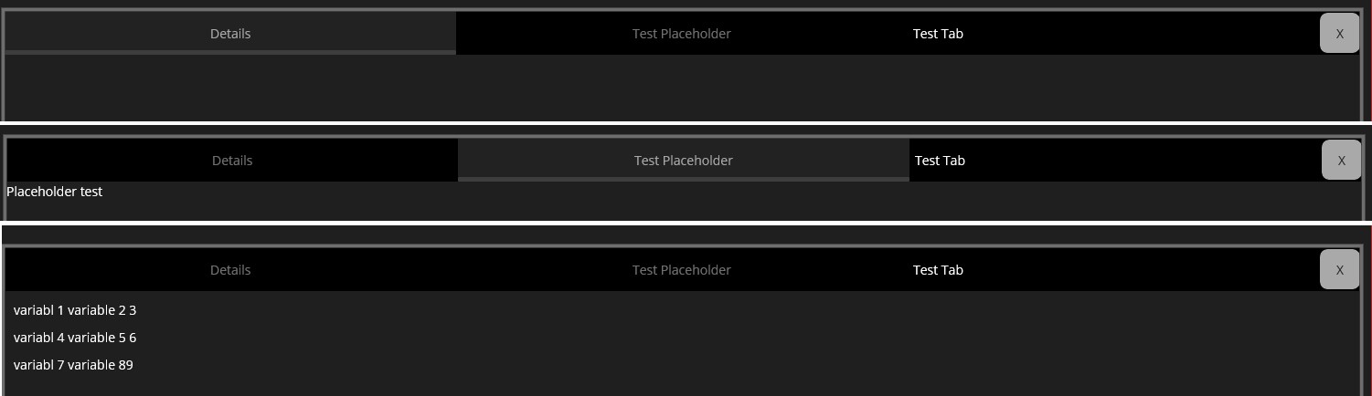
如果我在Xaml代码中写一个硬编码的选项卡,那么上述做法在切换选项卡时就能正确应用主题(也就是说,被选中的选项卡颜色比未被选中的要亮)。样式本身工作正常。但当我在通过codebehind(编程方式)添加新选项卡、为后续功能做准备时,选项卡样式似乎并未被应用。
class CreateDynamicTab(string tabName, UraniumUI.Material.Controls.TabView tabView)
{
    string tabHeaderName = tabName;
    UraniumUI.Material.Controls.TabView sourceTabView = tabView;

    public TabItem CreateNewTab()
    {
        var testList = new List<(string var1,string var2,int value)>();
        testList.Add(("variabl 1 ", "variable 2 ", 3));
        testList.Add(("variabl 4 ", "variable 5 ", 6));
        testList.Add(("variabl 7 ", "variable 8" , 9));


        var resultMessage = new VerticalStackLayout
        {
            Spacing = 10,
            Padding = 10
        };

        foreach (var item in testList)
        {
            resultMessage.Children.Add
                (
                new Label { Text = item.var1 + item.var2 + item.value }
                );
        }


        var newTab = new TabItem
        {
            Title = "2nd Tab",
            Content = resultMessage
        };

        newTab.HeaderTemplate = new DataTemplate(() =>
        {
            //Create main container for header elements of tab.
            var headerLayout = new Microsoft.Maui.Controls.Grid
            {
                ColumnDefinitions =
                {
                    new Microsoft.Maui.Controls.ColumnDefinition{ Width = new GridLength(1, GridUnitType.Star ) },
                    new Microsoft.Maui.Controls.ColumnDefinition { Width = GridLength.Auto}
                }
            };

            //Form the Text element displayed on tab (The Label)
            var titleLabel = new Label
            {
                VerticalOptions = LayoutOptions.Center,
                HorizontalOptions = LayoutOptions.Start,
                Padding = 5
            };

            titleLabel.Text = tabHeaderName;

            //Form the Button Element on the tab for closing itself.
            var closeButton = new Microsoft.Maui.Controls.Button
            {
                Text = "X",
                HeightRequest = 25,
                WidthRequest = 26,
                Padding=1,
                VerticalOptions = LayoutOptions.Center,
                HorizontalOptions = LayoutOptions.End
            };

            closeButton.Clicked += (s, e) =>
            {
                sourceTabView.Tabs.Remove(newTab);
            };

            //Add layout and button to the header element of the tab.
            headerLayout.Add(titleLabel);
            headerLayout.Add(closeButton);


            return headerLayout;
        });

        return newTab;
    }
}
这是从一个小函数中调用的,该函数创建一个选项卡,并将其添加到(唯一的)TabView:
        public void CreateNewTabViewElement()
        {
            var newTab = new CreateDynamicTab("Test Tab", TabViewElement);

            var createdTab = newTab .CreateNewTab();

            TabViewElement.Tabs.Add(createdTab );
        }
选项卡的其他方面都已正确形成,功能也都如预期,只有样式有问题。
以防万一、解答可能的问题,下面提供一些额外信息和一个问题的直观图示:
XAML TabView区段:
<Grid Grid.Row="1"
      Grid.Column="1"
      Grid.ColumnSpan="2"
      Padding="0,0,8,8"
      HorizontalOptions="Fill"
      VerticalOptions="Fill"
      Style="{StaticResource BackgroundThemeOverride}"
      >

    <Border StrokeThickness="4"
            StrokeShape="Rectangle"
            Style="{StaticResource BorderBevelThemeOverride}"
            >
        <material:TabView x:Name="TabViewElement"
                          HorizontalOptions="Fill"
            >
            <material:TabItem Title="Details"
                          >
<--- Rest is a Datagrid for the main tab with functionality and an extra blank tab made in similar manner called "Placeholder" -->
可视化:
解决方案
最终我在App.Xaml中添加了一组颜色,并先做了全局覆盖。
            <Color x:Key="TabSelectedLight">lightblue</Color>
            <Color x:Key="TabSelectedDark">red</Color>
            <Style x:Key="TabIsSelectedOveride" TargetType="Button">
                <Setter Property="BackgroundColor"
                        Value="{AppThemeBinding Light={StaticResource TabSelectedLight}, Dark={StaticResource TabSelectedDark}}"
                        />
            </Style>
接着我为Setter编写了一个自定义覆盖,使用上面的占位颜色,确保它被正确引用并使用。
newTab.HeaderTemplate = new DataTemplate(() => { .....

                //Style custom selection logic.
                Application.Current.Resources.TryGetValue("TabIsSelectedOveride", out var tabSelected);
                var selectedTrigger = new DataTrigger(typeof(Grid))
                {
                    Binding = new Binding("IsSelected"),
                    Value = true
                };
                selectedTrigger.Setters.Add(new Setter
                {
                    Property = VisualElement.StyleProperty,
                    Value = (Style)tabSelected
                });
                headerLayout.Triggers.Add( selectedTrigger );

            ....}
这会创建该选项卡,选中时会变成红色(符合深色主题)

站内所有文章版权归属LeftHeroAI导航站,无授权禁止任何主体转载、抄袭、复制内容,亦不得私自架设镜像站点。一经侵权,本站将通过法律途径追责。
相关文章






汇集全球数千款 AI 工具,每日持续更新,配套 AI 开发学习资源,轻松用 AI 提升工作效率。快捷键 Ctrl+D/⌘+D 一键收藏本站。