


在使用geom_point的 ggplot2图中绘制曲线
我正在研究一个精确率/召回率的图,并希望添加对应于不同F1值(0.1到 0.9)的曲线,正如一些工作中所看到的那样。
我已经生成了主图,但还不太清楚如何在绘图区添加随F1值逐步变化的线条。下面是我使用的代码:
library(ggplot2)
library(RColorBrewer)
library(elementalist)

scaleFUN <- function(x) ifelse(x!=0, sprintf("%.2f", x), 0)

ggplot(precision_recall) +
  geom_point(mapping=aes(x=precision, y=recall, shape=technology, color=approach, size=type), show.legend=T) +
  theme_bw() + scale_color_manual(values=brewer.pal(12, "Paired")[c(2,4)]) + scale_shape_manual(values=c(16, 18))  +
  guides(color=guide_legend(ncol=2, keywidth=1, position="inside", order=1, title.position='top', title.hjust=.5),
         shape=guide_legend(ncol=2, keywidth=1, position="inside", order=2, title.position='top', title.hjust=.5),
         size=guide_legend(ncol=2, keywidth=1, position="inside", order=3, title.position='top', title.hjust=.5)) +
  theme(legend.box.background=element_rect_round(color="black", fill="white", linetype="solid", radius=unit(1,"mm")),
        legend.background=element_rect(fill="transparent"), legend.position.inside=c(0.175,0.78), legend.box='vertical',
        aspect.ratio=1, panel.grid=element_blank(), plot.margin=unit(c(.2, .5, .2, .2), "cm"),
        panel.border = element_rect(colour="black", fill=NA, linewidth=1),
        legend.title=element_text(face='italic')) +
  coord_cartesian(xlim=c(0, 1), ylim=c(0, 1)) +
  scale_x_continuous(labels=scaleFUN) +
  scale_y_continuous(labels=scaleFUN)
以及一个关于数据的dput()。
precision_recall <- structure(list(precision = c(0.795764, 0.946995, 0.878681, 0.954913,
0.814081, 0.974009, 0.449633, 0.981827), recall = c(0.608545,
0.599937, 0.771026, 0.750453, 0.778621, 0.80045, 0.670769, 0.865383
), technology = c("Illumina", "Illumina", "PacBio", "PacBio",
"Illumina", "Illumina", "PacBio", "PacBio"), approach = c("linear",
"linear", "linear", "linear", "graph", "graph", "graph", "graph"
), type = structure(c(2L, 1L, 2L, 1L, 2L, 1L, 2L, 1L), levels = c("SNV",
"INDEL"), class = "factor")), row.names = c(NA, -8L), class = "data.frame")
这是预期的结果(我添加了几条F1曲线):
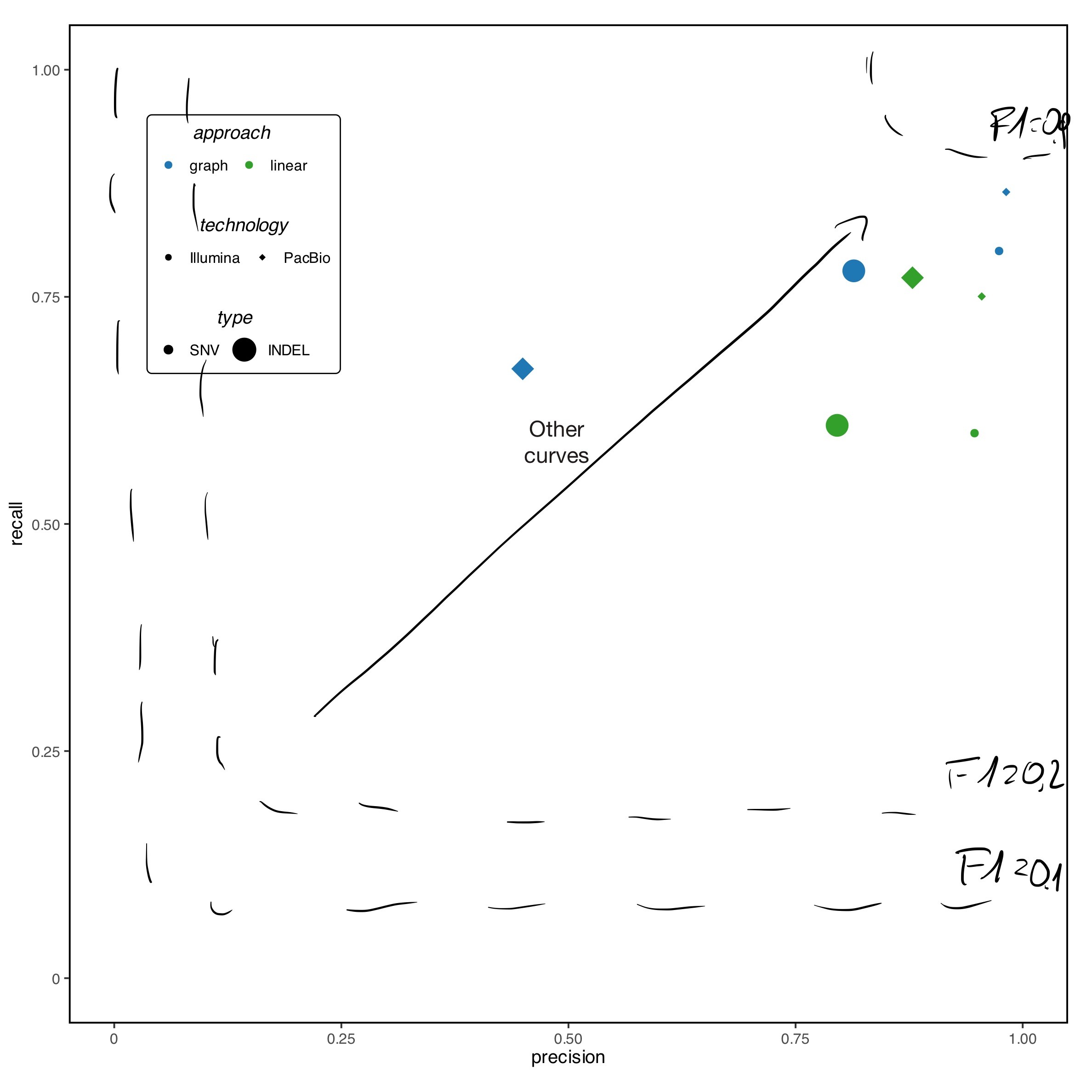
P. S.我尝试使用geom_curve(),但并未得到预期的结果……
解决方案
你可以使用geom_function来实现你想要的结果:
library(ggplot2)

fun_recall <- function(x, f1) {
  (f1 * x) / (2 * x - f1)
}

ggplot(precision_recall) +
  geom_point(mapping = aes(
    x = precision, y = recall, shape = technology,
    color = approach, size = type
  )) +
  lapply(
    seq(.1, .9, .2),
    \(x) {
      list(
        geom_function(
          fun = fun_recall,
          args = list(f1 = x),
          xlim = c(x / 2, 1)
        ),
        annotate(
          geom = "label",
          hjust = 1,
          x = 1,
          y = fun_recall(1, x),
          label = paste0("F1: ", x),
          linewidth = 0
        )
      )
    }
  ) +
  theme_bw() +
  scale_color_manual(values = brewer.pal(12, "Paired")[c(2, 4)]) +
  scale_shape_manual(values = c(16, 18)) +
  theme(
    aspect.ratio = 1,
    panel.grid = element_blank(),
    plot.margin = unit(c(.2, .5, .2, .2), "cm"),
    panel.border = element_rect(colour = "black", fill = NA, linewidth = 1),
    legend.title = element_text(face = "italic")
  ) +
  coord_cartesian(xlim = c(0, 1), ylim = c(0, 1))
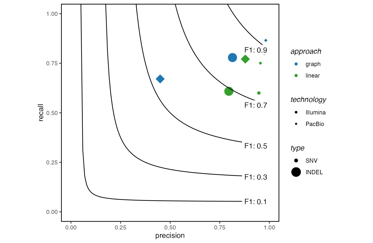
站内所有文章版权归属LeftHeroAI导航站,无授权禁止任何主体转载、抄袭、复制内容,亦不得私自架设镜像站点。一经侵权,本站将通过法律途径追责。
相关文章






汇集全球数千款 AI 工具,每日持续更新,配套 AI 开发学习资源,轻松用 AI 提升工作效率。快捷键 Ctrl+D/⌘+D 一键收藏本站。