


calplot的高度在两列布局中与Plotly图表的高度不一致
我正在用Streamlit构建一个带两列的仪表板:
- 左侧:Plotly饼图
- 右侧:使用calplot的日历热图
我的问题是无法让两个可视化具有相同的高度。即使在calplot设置了figsize,Matplotlib的图形在Streamlit中的高度也与Plotly图表在视觉上不匹配。
示例数据集:
data = [ ("2025-01-01", "restaurant"),
("2025-01-01", "fast-food"),
("2025-01-02", "restaurant"),
("2025-01-02", "boulangerie"),
("2025-01-03", "restaurant"),
("2025-01-03", "restaurant"),
("2025-01-04", "fast-food"),
("2025-01-04", "fast-food"),
("2025-01-05", "boulangerie"),
("2025-01-05", "restaurant"),
("2025-01-06", "restaurant"),
("2025-01-06", "fast-food"),
("2025-01-07", "restaurant"),
("2025-01-07", "boulangerie"),
("2025-01-08", "fast-food"),
("2025-01-08", "fast-food"),
("2025-01-09", "restaurant"),
("2025-01-09", "restaurant"),
("2025-01-10", "boulangerie"),
("2025-01-10", "fast-food"), ]
代码:
import streamlit as st
import pandas as pd
import plotly.express as px
import calplot
import matplotlib.pyplot as plt
from matplotlib.colors import ListedColormap

# -------------------------
# Sample dataset
# -------------------------

df = pd.DataFrame(data, columns=["jour", "type_repas"])
df["jour"] = pd.to_datetime(df["jour"])

st.subheader("Meal types")

col_left, col_right = st.columns([1, 2])

# -------------------------
# Left: Plotly pie chart
# -------------------------
with col_left:

    type_counts = df["type_repas"].value_counts()

    with st.container(border=True):

            fig_pie = px.pie(
                values=type_counts.values,
                names=type_counts.index,
                hole=0.5
            )

            fig_pie.update_traces(
                textinfo="percent",
                textfont_size=18,
                hovertemplate="<b>%{label}</b><br>%{value} repas<br>%{percent}"
            )

            fig_pie.update_layout(
                height=420,

                # fond transparent
                paper_bgcolor="rgba(0,0,0,0)",
                plot_bgcolor="rgba(0,0,0,0)",

                # réduire les marges
                margin=dict(t=20, b=60, l=10, r=10),

                # légende horizontale
                legend=dict(
                    orientation="h",
                    yanchor="top",
                    y=-0.15,
                    xanchor="center",
                    x=0.5
                )
)

            st.plotly_chart(fig_pie, use_container_width=True)

# -------------------------
# Right: Calplot heatmap
# -------------------------
with col_right:

    with st.container(border=True):

            st.subheader("Calendrier des types de repas")

            # -------------------------------------------------
            # Préparation des données
            # -------------------------------------------------

            df_jours = df.copy()

            df_jours["jour"] = pd.to_datetime(df_jours["jour"])

            # -------------------------------------------------
            # Sélection du type de repas
            # -------------------------------------------------

            type_selectionne = st.radio(
                "Choisir un type de repas",
                ["restaurant", "fast-food", "boulangerie"],
                horizontal=True
            )

            # -------------------------------------------------
            # Comptage par jour
            # -------------------------------------------------

            counts = (
                df_jours.groupby(df_jours["jour"].dt.date)["type_repas"]
                .apply(lambda x: (x == type_selectionne).sum())
            )

            counts.index = pd.to_datetime(counts.index)

            # -------------------------------------------------
            # Heatmap calendrier
            # -------------------------------------------------

            import calplot
            import matplotlib.pyplot as plt
            from matplotlib.colors import ListedColormap

            st.subheader(f"{type_selectionne} par jour")

            cmap = ListedColormap([
                "#00000000",  # transparent
                "#ffb74d",
                "#d32f2f"
            ])

            fig, ax = calplot.calplot(
                counts,
                cmap=cmap,
                colorbar=False,
                figsize=(14, 14),
                linewidth=3,
                vmin=0,
                vmax=2
            )

            # -------------------------------------------------
            # Fond transparent
            # -------------------------------------------------

            fig.patch.set_alpha(0)

            for a in fig.axes:
                a.set_facecolor("none")

            plt.tight_layout(pad=0.5)

            st.pyplot(fig, transparent=True)


st.divider()
尽管我设置了:
- fig_pie的高度设为420
- calplot(figsize=(14, 14))
这两个可视化在Streamlit中的可见高度仍然不同。
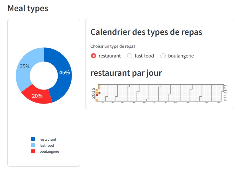
我尝试了:
- 改变figsize
- 使用tight_layout
- 使用fig.set_size_inches
- 移除Streamlit容器约束
- 禁用use_container_width
但日历地图的高度仍与Plotly不一致。
如何在Streamlit中正确同步Plotly图和calplot图形的高度?
解决方案
我不知道这是否正是你需要的,但 …
如果我为右侧容器添加 height=450 或 height="stretch"
with st.container(border=True, height=450):

# or

with st.container(border=True, height="stretch"):
那么我得到
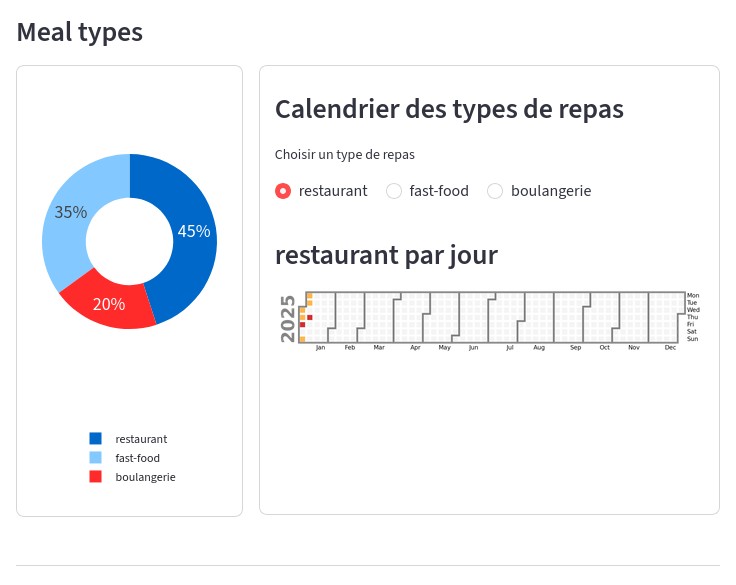
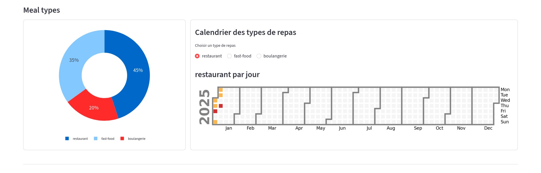
如果我增加更宽的布局
st.set_page_config(layout="wide")
那么图使用页面的全宽,日历中的单元格也会变大。
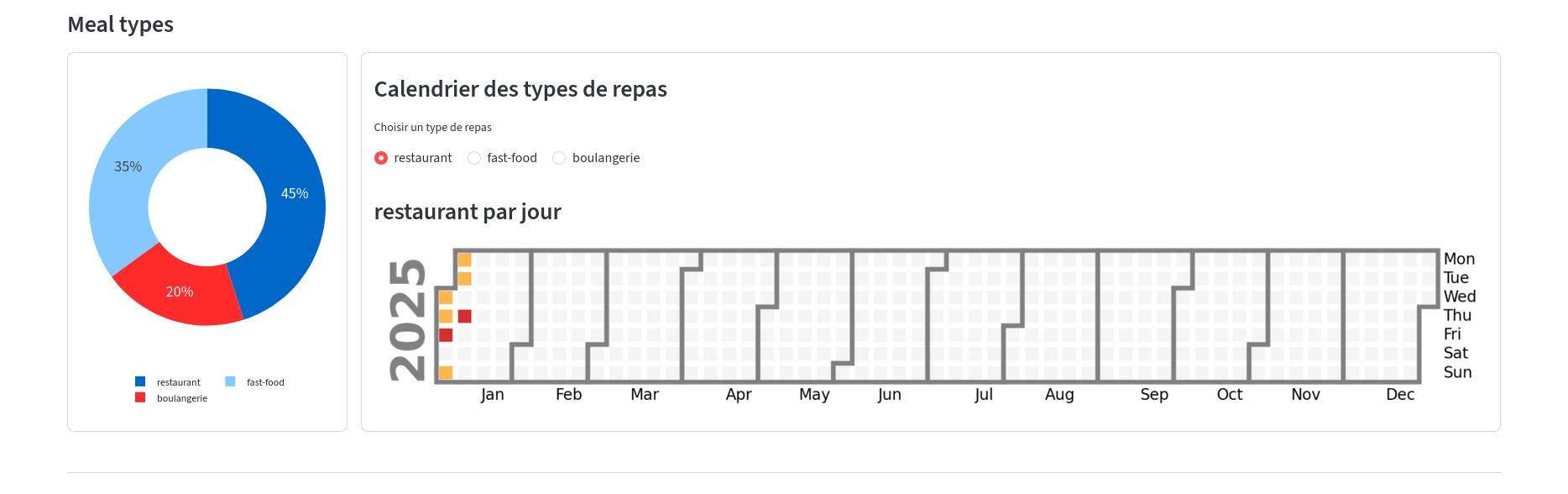
如果我为右边的绘图使用更多列
col_left, col_right = st.columns([1, 4])
那么它会在页面上占用更多空间。
站内所有文章版权归属LeftHeroAI导航站,无授权禁止任何主体转载、抄袭、复制内容,亦不得私自架设镜像站点。一经侵权,本站将通过法律途径追责。
相关文章






汇集全球数千款 AI 工具,每日持续更新,配套 AI 开发学习资源,轻松用 AI 提升工作效率。快捷键 Ctrl+D/⌘+D 一键收藏本站。