


LazyList中的animateItem() 阴影裁切与闪烁问题
我在我正在开发的应用中,懒加载列表中的卡片遇到了一个问题:
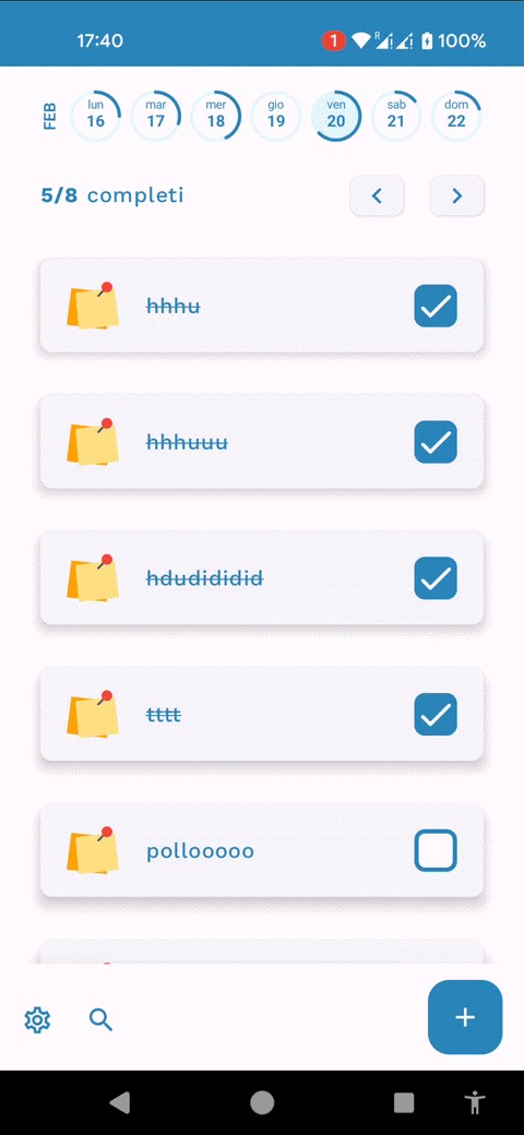
当懒加载列表重新加载项目时(因为我触发了一些MutableStateFlow的变化,导致列表中的项目发生变化),卡片阴影会出现奇怪的闪烁/裁切效果(通过 TaskCard.kt 中ElevatedCard的 elevation属性定义)。
这肯定与Box的修饰符中的animateItem() 有关,指令
Box(modifier = Modifier.animateItem())
位于 MainScreen.kt 内,因为如果我移除它,就不会再有闪烁。问题是我需要animateItem来实现滑动删除后从列表中移除卡片的删除动画(你可以在我的另一个 问题 中看到它)。
同时,animateItem在列表重新加载时也会给我带来奇怪的闪烁伪影,见附带的动图:
有没有解决办法?
我的应用中的代码如下:
MainScreen.kt
@Composable
fun MainScreen(
    tasksInWeek: TasksInPeriod,
    selectedWeek: DateInterval,
    selectedDate: LocalDate,
    onDateEvent: (DateEvent) -> Unit,
    onTaskEvent: (TaskEvent) -> Unit,
    navigateTo: (route: Destinations) -> Unit,
) {
    val locale = ConfigurationCompat.getLocales(LocalConfiguration.current).get(0)
    val dates = selectedWeek.getDatesBetween()

    Scaffold(
        content = { paddingValues ->

            Column(
                modifier = Modifier.padding(
                    start = Constants.screenPadding,
                    end = Constants.screenPadding,
                    top = paddingValues.calculateTopPadding() + 10.dp,
                    bottom = paddingValues.calculateBottomPadding()
                )
            ) {
                Row(
                    verticalAlignment = Alignment.CenterVertically,
                    horizontalArrangement = Arrangement.spacedBy(9.dp),
                    modifier = Modifier.weight(1f)
                ) {
                    Text(
                        text = SimpleDateFormat("MMM", locale)
                            .format(
                                Date.from(
                                    selectedDate.atStartOfDay(ZoneId.systemDefault()).toInstant()
                                )
                            )
                            .toString().uppercase(Locale.getDefault()),
                        fontWeight = FontWeight.SemiBold,
                        fontSize = 12.sp,
                        style = TextStyle(
                            platformStyle = PlatformTextStyle(
                                includeFontPadding = false
                            )
                        ),
                        modifier = Modifier.rotate(-90f)
                    )
                    for (date in dates)
                        CircularDayProgressBar(
                            0f,
                            day = date,
                            isSelectedDay = date == selectedDate,
                            isCurrentDay = date == LocalDate.now(),
                            strokeColor = MaterialTheme.colorScheme.primary,
                            backgroundColor = MaterialTheme.colorScheme.surface,
                            textColor = MaterialTheme.colorScheme.outline,
                            onClick = { onDateEvent(DateEvent.ChangeSelectedDate(date)) }
                        )
                }
                Spacer(modifier = Modifier.weight(0.1f))
                Row(
                    verticalAlignment = Alignment.CenterVertically,
                    modifier = Modifier.weight(1f)
                ) {
                    Text(
                        text = "1/10",
                        fontWeight = FontWeight.SemiBold,
                        fontSize = 16.sp,
                    )
                    Text(
                        text = stringResource(R.string.done_tasks),
                        fontWeight = FontWeight.Medium,
                        fontSize = 16.sp,
                    )
                    Spacer(modifier = Modifier.weight(1f))
                    Row(
                        verticalAlignment = Alignment.CenterVertically,
                        modifier = Modifier.width(100.dp)
                    ) {
                        ElevatedButton(
                            onClick = { onDateEvent(DateEvent.ChangeToPrevWeek) },
                            modifier = Modifier.size(width = 40.dp, height = 30.dp),
                            contentPadding = PaddingValues(0.dp), shape =
                            RoundedCornerShape(8.dp),
                            elevation = ButtonDefaults.buttonElevation(defaultElevation = 2.dp)
                        ) {
                            Icon(Icons.Filled.ChevronLeft, contentDescription = null)
                        }
                        Spacer(modifier = Modifier.weight(1f))
                        ElevatedButton(
                            onClick = { onDateEvent(DateEvent.ChangeToNextWeek) },
                            modifier = Modifier.size(width = 40.dp, height = 30.dp),
                            contentPadding = PaddingValues(0.dp),
                            shape = RoundedCornerShape(8.dp),
                            elevation = ButtonDefaults.buttonElevation(defaultElevation = 2.dp)
                        ) { Icon(Icons.Filled.ChevronRight, contentDescription = null) }
                    }
                }
                Spacer(modifier = Modifier.weight(0.2f))
                Box(
                    modifier = Modifier.weight(10f),
                    contentAlignment = Alignment.Center
                ) {
                    LazyColumn(
                        contentPadding = PaddingValues(bottom = 10.dp, top = 10.dp),
                        verticalArrangement = Arrangement.spacedBy(32.dp),
                        modifier = Modifier.fillMaxSize()
                    ) {
                        items(
                            items = tasksInWeek.getForDate(selectedDate),
                            key = { it.taskId.toString() + it.date.toString() }
                        ) { task ->
                            Box(modifier = Modifier.animateItem()) {
                                SwipeToDeleteContainer(
                                    item = task,
                                    onDelete = {
                                        onTaskEvent(TaskEvent.DeleteTask(task))
                                    }
                                ) {
                                    TaskCard(
                                        taskCardDto = task,
                                        onCheckedChange = { id, done ->
                                            onTaskEvent(
                                                TaskEvent.SetDone(
                                                    id,
                                                    done,
                                                    selectedDate
                                                )
                                            )
                                        }
                                    )
                                }
                            }
                        }
                    }
                }
            }
        },
        bottomBar = {
            BottomAppBar(
                modifier = Modifier.graphicsLayer { shadowElevation = 80f },
                containerColor = MaterialTheme.colorScheme.background,
                contentColor = MaterialTheme.colorScheme.outline,
                actions = {
                    IconButton(onClick = { /* do something */ }) {
                        Icon(
                            Icons.Outlined.Settings,
                            contentDescription = "description"
                        )
                    }
                    IconButton(onClick = { /* do something */ }) {
                        Icon(
                            Icons.Outlined.Search,
                            contentDescription = "description",
                        )
                    }
                },
                floatingActionButton = {
                    FloatingActionButton(
                        onClick = {
                            navigateTo(Destinations.CreateTask)
                        },
                        containerColor = MaterialTheme.colorScheme.primary,
                        contentColor = MaterialTheme.colorScheme.background,
                        elevation = FloatingActionButtonDefaults.bottomAppBarFabElevation()
                    ) {
                        Icon(Icons.Filled.Add, "description")
                    }
                }
            )
        }
    )
}
TaskCard.kt
@Composable
fun TaskCard(
    taskCardDto: TaskCardDto,
    onCheckedChange: (Long, Boolean) -> Unit
) {

    ElevatedCard(
        elevation = CardDefaults.cardElevation(
            defaultElevation = 6.dp
        ),
        modifier = Modifier
            .height(70.dp)
            .fillMaxWidth(),
        shape = Constants.cardShape
    ) {
        Row(
            modifier = Modifier
                .padding(vertical = 12.dp, horizontal = 20.dp)
                .fillMaxWidth()
                .fillMaxHeight(),
            verticalAlignment = Alignment.CenterVertically,
            horizontalArrangement = Arrangement.SpaceBetween
        ) {
            Image(
                painter = painterResource(id = R.drawable.postit),
                contentDescription = "default task icon",
                modifier = Modifier.weight(0.7f)
            )
            Text(
                text = taskCardDto.title,
                fontWeight = FontWeight.Medium,
                style = if (taskCardDto.done) {
                    LocalTextStyle.current.copy(textDecoration = TextDecoration.LineThrough)
                } else LocalTextStyle.current.copy(),
                modifier = Modifier
                    .weight(4f)
                    .padding(horizontal = 20.dp)
            )
            RoundedCornerCheckbox(
                isChecked = taskCardDto.done,
                onValueChange = { isChecked -> onCheckedChange(taskCardDto.taskId, isChecked) },
                checkedColor = MaterialTheme.colorScheme.primary,
                uncheckedColor = Color.White
            )
        }
    }
}
SwipeToDeleteContainer.kt
@Composable
fun <T> SwipeToDeleteContainer(
    item: T,
    onDelete: (T) -> Unit,
    content: @Composable (T) -> Unit
) {

    val state = rememberSwipeToDismissBoxState(
        initialValue = SwipeToDismissBoxValue.Settled,
        positionalThreshold = { distance -> distance * 0.5f })
    LaunchedEffect(state.currentValue) {
        if (state.currentValue == SwipeToDismissBoxValue.EndToStart) {
            onDelete(item)
        }
    }

    SwipeToDismissBox(
        state = state,
        backgroundContent = {
            DeleteBackground(swipeDismissState = state)
        },
        content = { content(item) },
        enableDismissFromEndToStart = true,
        enableDismissFromStartToEnd = false
    )
}


@Composable
private fun DeleteBackground(
    swipeDismissState: SwipeToDismissBoxState
) {
    val color = if (swipeDismissState.dismissDirection == SwipeToDismissBoxValue.EndToStart) {
        Color.Red
    } else Color.Transparent

    Box(
        modifier = Modifier
            .clip(Constants.cardShape)
            .background(color)
            .padding(16.dp)
            .fillMaxSize(),
        contentAlignment = Alignment.CenterEnd
    ) {
        Icon(
            imageVector = Icons.Default.Delete,
            contentDescription = null,
            tint = Color.White
        )
    }
}
解决方案
如果你只需要对【项的插入与删除】进行动画,并且不想在每次列表更新时都出现动画,可以禁用淡入淡出动画,只保留放置(位置)动画。
使用默认的Modifier.animateItem() 可能在与elevation/阴影组合时引发闪烁,因为淡入淡出动画会引入额外的图层变化。
相反,你可以这样做:
Modifier.animateItem(
    placementSpec = spring(
        stiffness = Spring.StiffnessMediumLow,
        visibilityThreshold = IntOffset.VisibilityThreshold,
    ),
    fadeInSpec = null,
    fadeOutSpec = null,
)
这种方法将动画限制在仅位置变化上,在使用带抬升效果的可组合项时,LazyList会更加稳定。
站内所有文章版权归属LeftHeroAI导航站,无授权禁止任何主体转载、抄袭、复制内容,亦不得私自架设镜像站点。一经侵权,本站将通过法律途径追责。
相关文章






汇集全球数千款 AI 工具,每日持续更新,配套 AI 开发学习资源,轻松用 AI 提升工作效率。快捷键 Ctrl+D/⌘+D 一键收藏本站。