


Flutter的界面与设计不一致:右上角的徽章没有正确贴在卡片边框上
这是我想要实现的目标:
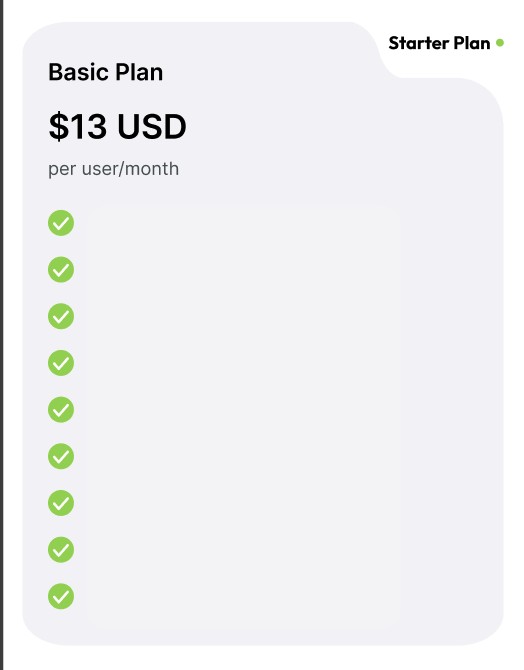
这张截图来自iPhone 15 Pro:
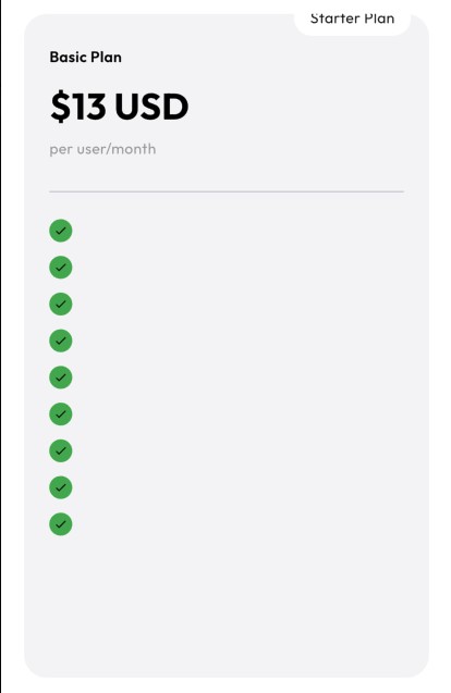
我在Flutter中尝试构建一个定价界面,但布局与设计不符——特别是右上角的徽标(“Starter Plan”)。
class _PricingScreenState extends State<PricingScreen> {
  final PageController _controller = PageController();
  int currentPage = 0;

  final List<PlanModel> plans = [
    PlanModel(
      title: "Basic Plan",
      price: "\$13 USD",
      subtitle: "per user/month",
      tag: "Starter Plan",
      buttonText: "Get Basic - \$13/month",
      features: [
        "",
        "",
        "",
        "",
        "",
        "",
        "",
        "",
        "",
      ],
      isPremium: false,
    ),
  ];

  @override
  Widget build(BuildContext context) {
    return Scaffold(
      backgroundColor: Colors.white,
      body: SafeArea(
        child: Column(
          children: [
            Padding(
              padding: const EdgeInsets.symmetric(horizontal: 20, vertical: 16),
              child: Row(
                mainAxisAlignment: MainAxisAlignment.spaceBetween,
                children: [
                  Text(
                    currentPage == 2 ? "Customize Plan" : "Choose Your Plan",
                    style: const TextStyle(
                      fontSize: 26,
                      fontWeight: FontWeight.w800,
                    ),
                  ),
                ],
              ),
            ),

            // PAGES
            Expanded(
              child: PageView.builder(
                controller: _controller,
                itemCount: plans.length,
                onPageChanged: (index) {
                  setState(() => currentPage = index);
                },
                itemBuilder: (context, index) {
                  return _PlanCard(plan: plans[index]);
                },
              ),
            ),
          ],
        ),
      ),
    );
  }
}

class _PlanCard extends StatelessWidget {
  final PlanModel plan;

  const _PlanCard({required this.plan});

  @override
  Widget build(BuildContext context) {
    final isPremium = plan.isPremium;
    final isCustom = plan.isCustom;

    return Padding(
      padding: const EdgeInsets.symmetric(horizontal: 20),
      child: Column(
        children: [

          Expanded(
            child: Stack(
              clipBehavior: Clip.none,
              children: [

                Container(
                  width: double.infinity,
                  decoration: BoxDecoration(
                    color: isPremium
                        ? const Color(0xFF4A90E2)
                        : const Color(0xFFF5F5F7),
                    borderRadius: BorderRadius.circular(20),
                  ),
                  padding: const EdgeInsets.fromLTRB(22, 28, 22, 22),
                  child: Column(
                    crossAxisAlignment: CrossAxisAlignment.start,
                    children: [

                      Text(
                        plan.title,
                        style: TextStyle(
                          color: isPremium ? Colors.white : Colors.black,
                          fontWeight: FontWeight.w600,
                        ),
                      ),

                      const SizedBox(height: 10),

                      if (!isCustom)
                        Text(
                          plan.price,
                          style: TextStyle(
                            fontSize: 34,
                            fontWeight: FontWeight.bold,
                            color:
                            isPremium ? Colors.white : Colors.black,
                          ),
                        ),

                      const SizedBox(height: 5),

                      Text(
                        plan.subtitle,
                        style: TextStyle(
                          color: isPremium
                              ? Colors.white70
                              : Colors.grey,
                        ),
                      ),

                      const SizedBox(height: 20),

                      if (!isCustom)
                        const Divider(),

                      const SizedBox(height: 10),

                      Expanded(
                        child: ListView.builder(
                          itemCount: plan.features.length,
                          itemBuilder: (_, i) => _FeatureRow(
                            text: plan.features[i],
                            isPremium: isPremium,
                            isCustom: isCustom,
                          ),
                        ),
                      ),
                    ],
                  ),
                ),

                // TAG BADGE
                Positioned(
                  top: -12,
                  right: 16,
                  child: Container(
                    padding: const EdgeInsets.symmetric(
                        horizontal: 14, vertical: 6),
                    decoration: BoxDecoration(
                      color: Colors.white,
                      borderRadius: BorderRadius.circular(30),
                    ),
                    child: Text(plan.tag),
                  ),
                )
              ],
            ),
          ),
        ],
      ),
    );
  }
}

class _FeatureRow extends StatelessWidget {
  final String text;
  final bool isPremium;
  final bool isCustom;

  const _FeatureRow({
    required this.text,
    this.isPremium = false,
    this.isCustom = false,
  });

  @override
  Widget build(BuildContext context) {
    return Padding(
      padding: const EdgeInsets.symmetric(vertical: 6),
      child: Row(
        children: [
          CircleAvatar(
            radius: 10,
            backgroundColor:
            isPremium || isCustom ? Colors.yellow : Colors.green,
            child: Icon(
              Icons.check,
              size: 12,
              color: Colors.black,
            ),
          ),
          const SizedBox(width: 10),
          Expanded(
            child: Text(
              text,
              style: TextStyle(
                color: isPremium ? Colors.white : Colors.black,
              ),
            ),
          ),
        ],
      ),
    );
  }
}
如何让徽标看起来贴在卡片角落而不是漂浮在上方?
我应该用ClipPath / CustomPainter吗?
在Flutter中实现这种连接式UI形状的最佳做法是什么?
解决方案
你可以使用 OutlinedBorder,在Material小部件上实现形状,然后再用Stack小部件来放置标题;更好的选择是SingleChildRenderWidget。
但我建议你多了解Flutter中的贝塞尔曲线和路径;
如果你关注以下要点,其中紫色点是控制点,橙色点用于路径;-)
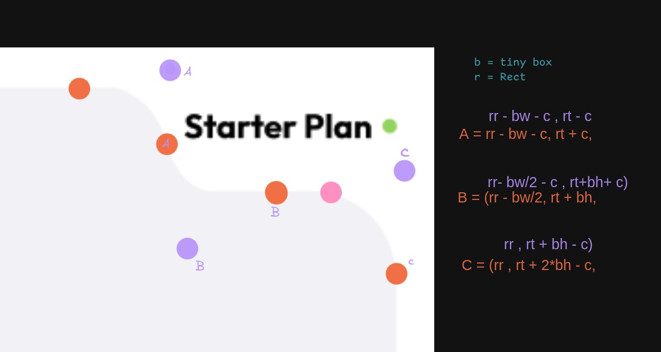
对于代码
class CardShape extends OutlinedBorder {
  const CardShape([this.pointySize = const Size(150, 75)]);
  final Size pointySize;

  @override
  OutlinedBorder copyWith({BorderSide? side}) => this;

  @override
  ui.Path getInnerPath(ui.Rect rect, {ui.TextDirection? textDirection}) =>
      getOuterPath(rect, textDirection: textDirection);

  @override
  ui.Path getOuterPath(ui.Rect rect, {ui.TextDirection? textDirection}) {
    return buildCardPath(rect, textDirection: textDirection);
  }

  /// all logic here
  ui.Path buildCardPath(ui.Rect rect, {ui.TextDirection? textDirection}) {
    final r = rect; // don't name like this this. it is for me
    final b = pointySize;

    final c = b.height * .3;
    final path = Path();
    path
      ..lineTo(r.width - b.width - c, r.top) // start
      ..quadraticBezierTo(//A
        rect.right - pointySize.width + c, rect.top,
        rect.right - pointySize.width + c * 1.25, rect.top + c * 2,
      )
      ..quadraticBezierTo(//B
        rect.right - pointySize.width + c * 1.5, rect.top + pointySize.height,
        rect.right - pointySize.width / 2, rect.top + pointySize.height,
      )
      ..lineTo(
        rect.right - pointySize.width / 2 + c,
        rect.top + pointySize.height
      )
      ..quadraticBezierTo(//C
        rect.right,rect.top + pointySize.height,
        rect.right,rect.top + 2 * pointySize.height - c,
      )
      ..lineTo(rect.width, rect.height)
      ..lineTo(rect.left, rect.height)
      ..lineTo(rect.left, rect.top)
      ..close();

    final joinPath = Path.combine(
      PathOperation.intersect,
      path,
      Path()..addRRect(RRect.fromRectAndRadius(rect, Radius.circular(24))),
    );

    return joinPath;
  }

  @override
  void paint(
    ui.Canvas canvas,
    ui.Rect rect, {
    ui.TextDirection? textDirection,
  }) {
    // canvas.drawPath(
    //   buildCardPath(rect, textDirection: textDirection),
    //   Paint()..color = Colors.red,
    // );
  }

  @override
  ShapeBorder scale(double t) => this;
}
并使用
child: Stack(
  children: [
    Positioned.fill(
      child: Material(
        shape: CardShape(Size(200, 75)),
        color: Colors.primaries[index],
        elevation: 3,
        child: Center(
          child: Text(
            "👍 $index",
            style: TextTheme.of(context).displayMedium,
          ),
        ),
      ),
    ),

    Positioned(
      right: 0,
      top: 0,
      child: SizedBox.fromSize(
        // match the shape: CardShape(Size(200, 75)),
        size: Size(200, 75),

        //  align the way u want. padding etc
        child: Center(child: Text("Your title $index")),
      ),
    ),
  ],
),
接着调整这些点,并查看 CustomMultiChildLayout 的相关用法。
站内所有文章版权归属LeftHeroAI导航站,无授权禁止任何主体转载、抄袭、复制内容,亦不得私自架设镜像站点。一经侵权,本站将通过法律途径追责。
相关文章






汇集全球数千款 AI 工具,每日持续更新,配套 AI 开发学习资源,轻松用 AI 提升工作效率。快捷键 Ctrl+D/⌘+D 一键收藏本站。