


另一个元素的悬停会影响到不相关的元素
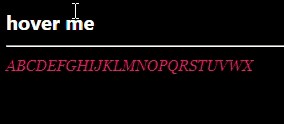
当把鼠标悬停在顶部导航链接上时,顶端的下划线效果会通过过渡进行动画。在那段短短的0.2秒过渡期间,卡片底部角落的粉色文本“ABC”似乎会暂时减弱字重。如果我移除卡片类的box-shadow,视觉错位就会消失。
这在Chrome和 Edge中会出现,但在Firefox中不会。所以我在想这可能是某种Chromium渲染bug。
虽然不算致命,但这是一个不想要的副作用。有人有见解或解决办法吗?
edit: 该视觉错误在本页的代码预览中很明显,但嵌入查看时并不会发生。所以为了保险起见,这里放一个fiddle: https://jsfiddle.net/yjf80Lrv/
body {
  background-image: linear-gradient(black, black);
  background-attachment: fixed;
  color: white;
}

b {
  position: relative;
}

b::after {
  content: "";
  position: absolute;
  left: 50%;
  bottom: 0;
  transform: translateX(-50%) scaleX(0);
  transform-origin: center;
  width: 100%;
  height: 2px;
  background-color: mark;
  transition: transform 1s ease;
}

b:is(:hover,:focus)::after {
  transform: translateX(-50%) scaleX(1);
}

i {
  position: absolute;
  color: #dd225f;
  /* just to make it more apparent: */
  font-family: serif;
  font-size: 12px;
}
<b tabindex="0">hover me</b>
<hr>
<i>ABCDEFGHIJKLMNOPQRSTUVWX</i>
解决方案
给受影响的元素添加 will-change:transform 可以修复文本的“位移”问题。但这基本上会关闭子像素AA,使文本看起来像那样变细。下面的修复来自Copilot,scaleX() 是根本原因。它强制GPU提升,从而强制文本重新栅格化,改变抗锯齿,导致文本显得更轻。将动画从使用transform改为width,浏览器就不再需要提升图层,文本就会保持原样。
我也不打算假装完全理解其中原理,但它确实起作用了。不得不承认,AI确实给了个赞
body {
  background-image: linear-gradient(black, black);
  background-attachment: fixed;
  color: white;
}

b {
  position: relative;
}

b::after {
  content: "";
  position: absolute;
  left: 50%;
  bottom: 0;
  transform: translateX(-50%);
  transform-origin: center;
  width: 0%;
  height: 2px;
  background-color: mark;
  transition: width 1s ease;
}

b:is(:hover,:focus)::after {
  width:100%;
}

i {
  position: absolute;
  color: #dd225f;
  /* just to make it more apparent: */
  font-family: serif;
  font-size: 12px;
}
<b tabindex="0">hover me</b>
<hr>
<i>ABCDEFGHIJKLMNOPQRSTUVWX</i>
站内所有文章版权归属LeftHeroAI导航站,无授权禁止任何主体转载、抄袭、复制内容,亦不得私自架设镜像站点。一经侵权,本站将通过法律途径追责。
相关文章






汇集全球数千款 AI 工具,每日持续更新,配套 AI 开发学习资源,轻松用 AI 提升工作效率。快捷键 Ctrl+D/⌘+D 一键收藏本站。