


把SVG从文件内联后,如何实现粒状效果?
我有一个SVG文件
<svg viewBox="0 0 200 200" xmlns='http://www.w3.org/2000/svg'>
  <filter id='noiseFilter'>
    <feTurbulence
      type='fractalNoise'
      baseFrequency='0.65'
      numOctaves='3'
      stitchTiles='stitch' />
  </filter>

  <rect width='100%' height='100%' filter='url(#noiseFilter)' />
</svg>
它被用作CSS的背景
.noise {
  height: 100%;
  background: linear-gradient(90deg, black, transparent),
  url(noise.svg);
  filter: contrast(170%) brightness(500%);
}
这给了我想要的颗粒感效果(来自这个教程):
(来自本教程)
但我需要能够用JS编辑这个SVG;如果它只是一个文件,由于CORS的原因,我就没法编辑。
因此我尝试了几种把SVG直接嵌入HTML的方法,以便我可以编辑它;然而效果就丢失了。
<!DOCTYPE html>
<html lang="en">

<head>
  <title>NoiseTest</title>
  <meta charset="utf-8">

</head>

<body>
  <!--https://css-tricks.com/grainy-gradients/-->
  <style>
    body {
      display: flex;
      align-items: center;
      justify-content: center;
      flex-direction: column;
      gap: 10px;
      height: 100vh;
      margin: 0;
      background-color: powderblue;
    }

    section {
      position: relative;
      width: 300px;
      height: 300px;
      box-shadow: rgb(50 50 93 / 20%) 0px 30px 60px -12px, rgb(0 0 0 / 28%) 0px 18px 36px -18px;
    }


    .noise {
      height: 100%;
      background: linear-gradient(90deg, black, transparent),
        url(noise.svg);
      filter: contrast(170%) brightness(500%);
    }

    /* Chrome-specific */
    @media all and (-webkit-min-device-pixel-ratio:0) and (min-resolution: .001dpcm) {
      .noise {
        filter: contrast(290%) brightness(500%);
      }
    }

    .isolate {
      isolation: isolate;
      position: relative;
      width: 100%;
      height: 100%;
    }


    /*Test - SVG in div*/
    .bg {
      height: 100%;
      background: linear-gradient(90deg, black, transparent);
    }

    .svg-bg {
      position: absolute;
      inset: 0;
      mix-blend-mode: multiply;
      filter: brightness(500%);
    }

    /*Test - SVG as filter*/
    .bg1 {
      height: 100%;
      background: linear-gradient(90deg, black, transparent);
      filter: url(#noiseFilter1);
    }
  </style>


  <section>
    <div class="isolate">
      <div class="noise"></div>
    </div>
  </section>

  <!--in div test-->
  <section>
    <div class="isolate">

      <svg class="svg-bg" viewBox="0 0 200 200" xmlns='http://www.w3.org/2000/svg'>
      <filter id='noiseFilter'>
        <feTurbulence type='fractalNoise' baseFrequency='0.65' numOctaves='3' stitchTiles='stitch' />
      </filter>

      <rect width='100%' height='100%' filter='url(#noiseFilter)' />
    </svg>

      <div class="bg"></div>
    </div>
  </section>

  <!--as filter test-->
  <section>
    <div class="isolate">
      <div class="bg1"></div>
    </div>
  </section>

  <svg style="display:none" xmlns='http://www.w3.org/2000/svg'>
  <filter id='noiseFilter1'>
    <feTurbulence type='fractalNoise' baseFrequency='0.65' numOctaves='3' stitchTiles='stitch' />
    <feColorMatrix type="saturate" values="10"/>
    <feBlend in="SourceGraphic" mode="multiply"/>
  </filter>
</svg>

  <script>

  </script>
</body>

</html>
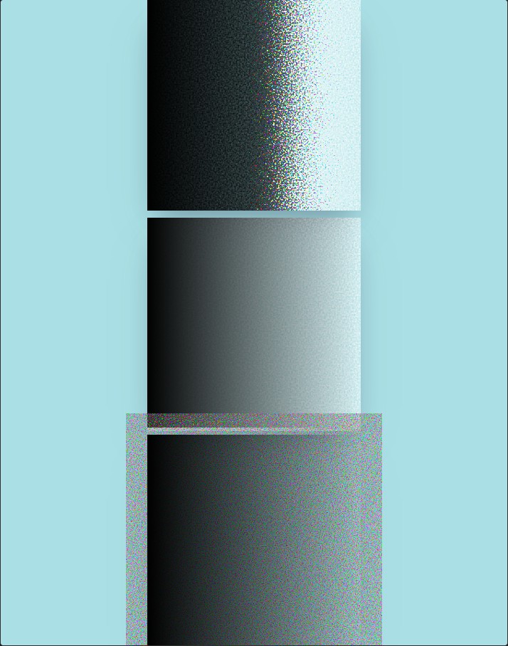
顶部区域是目标,另外两个是我目前能实现的结果。
那么,如何使用一个可以用JS编辑的SVG来实现这个效果?
解决方案
我不确定上面的解决方案是不是最清晰、最友好(尤其是在日后可能通过JS来控制它的能力方面)。下载一串字符,例如使用正则表达式,替换诸如turbulence的部分,然后把它注入回样式中,接着对整张图片进行解析。
<!DOCTYPE html>
<html lang="pl">
<head>
  <style>
    body {
      display: flex;
      flex-direction: column;
      justify-content: center;
      align-items: center;
      height: 100vh;
      background-color: powderblue;
      gap: 20px;
      margin: 0;
    }

    .noise-container {
      position: relative;
      width: 300px;
      height: 300px;
      filter: contrast(170%) brightness(500%);
      box-shadow: 0 10px 30px rgba(0,0,0,0.1);
    }

    .noise-svg {
      position: absolute;
      width: 100%;
      height: 100%;
    }

    .gradient-overlay {
      position: absolute;
      inset: 0;
      background: linear-gradient(90deg, black, transparent);
    }

    .controls {
      background: white;
      padding: 15px;
      border-radius: 8px;
      font-family: sans-serif;
      box-shadow: 0 4px 10px rgba(0,0,0,0.1);
    }
  </style>
</head>
<body>

  <div class="noise-container">
    <svg class="noise-svg">
      <filter id='noiseFilter'>
        <feTurbulence
          id="turbulence"
          type='fractalNoise'
          baseFrequency='0.65'
          numOctaves='3' />
      </filter>
      <rect width='100%' height='100%' filter='url(#noiseFilter)' />
    </svg>
    <div class="gradient-overlay"></div>
  </div>

  <div class="controls">
    <label for="freq">Noise density: </label>
    <input type="range" id="freq" min="0.01" max="0.99" step="0.01" value="0.65">
    <span id="valDisplay">0.65</span>
  </div>

  <script>
    const turb = document.getElementById('turbulence');
    const slider = document.getElementById('freq');
    const display = document.getElementById('valDisplay');

    slider.addEventListener('input', (e) => {
      const newValue = e.target.value;
      turb.setAttribute('baseFrequency', newValue);
      display.innerText = newValue;
    });
  </script>

</body>
</html>
站内所有文章版权归属LeftHeroAI导航站,无授权禁止任何主体转载、抄袭、复制内容,亦不得私自架设镜像站点。一经侵权,本站将通过法律途径追责。
相关文章






汇集全球数千款 AI 工具,每日持续更新,配套 AI 开发学习资源,轻松用 AI 提升工作效率。快捷键 Ctrl+D/⌘+D 一键收藏本站。