


在直方图上用清晰的柱状条来可视化数据?
我正在做一个直方图,所有柱子都彼此重叠在一起。即使把柱子的透明度调低,仍然看起来一团糟。我在想如果把柱子的填充设为透明、边框颜色对不同的数据集使用不同的颜色,应该会更容易看清楚吗?
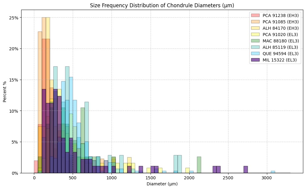
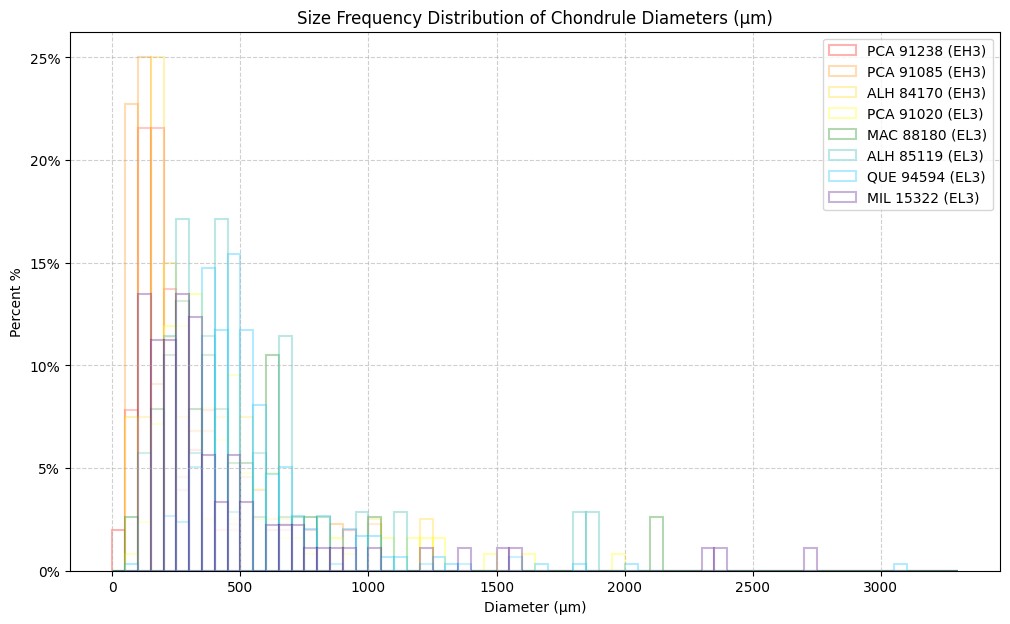
但我只能弄清楚把整体透明度设为0(这也包括边框颜色,所以根本看不到柱子),或者把填充改为白色(这仍然让后面堆叠的颜色难以看清——见附件)。
我该如何实现这种带彩色轮廓的透明柱子?这真的就是展示这种效果的最佳方式吗?
import numpy as np
import matplotlib.pyplot as plt
import matplotlib.ticker as mtick
import seaborn as sns
import pandas as pd

# import excel file
excel_file_path = '/content/Chondrule Sizes (comparison).xlsx'

# read excel file
df_excel = pd.read_excel(excel_file_path, sheet_name='All Diameters (raw)')

# select data
data_for_plot_8 = df_excel['MIL 15322 (EL3)']
data_for_plot_7 = df_excel['QUE 94594 (EL3)']
data_for_plot_6 = df_excel['ALH 85119 (EL3)']
data_for_plot_5 = df_excel['MAC 88180 (EL3)']
data_for_plot_4 = df_excel['PCA 91020 (EL3)']
data_for_plot_3 = df_excel['ALH 84170 (EH3)']
data_for_plot_2 = df_excel['PCA 91085 (EH3)']
data_for_plot_1 = df_excel['PCA 91238 (EH3)']


# create plot
plt.figure(figsize=(12, 7))
bins = np.linspace(0, 3300, 67)


# plot histograms - probability density
plt.hist(data_for_plot_1, bins, alpha=0.3,label='PCA 91238 (EH3)', linewidth=1.5, color='white', edgecolor='red', density=True)
plt.hist(data_for_plot_2, bins, alpha=0.3,label='PCA 91085 (EH3)', linewidth=1.5, color='white',edgecolor='darkorange', density=True)
plt.hist(data_for_plot_3, bins, alpha=0.3,label='ALH 84170 (EH3)', linewidth=1.5, color='white',edgecolor='gold', density=True)
plt.hist(data_for_plot_4, bins, alpha=0.3,label='PCA 91020 (EL3)', linewidth=1.5, color='white',edgecolor='yellow', density=True)
plt.hist(data_for_plot_5, bins, alpha=0.3,label='MAC 88180 (EL3)', linewidth=1.5, color='white',edgecolor='green', density=True)
Data with colored bars (original)plt.hist(data_for_plot_6, bins, alpha=0.3,label='ALH 85119 (EL3)', linewidth=1.5, color='white',edgecolor='lightseagreen', density=True)
plt.hist(data_for_plot_7, bins, alpha=0.3,label='QUE 94594 (EL3)', linewidth=1.5, color='white',edgecolor='deepskyblue', density=True)
plt.hist(data_for_plot_8, bins, alpha=0.3,label='MIL 15322 (EL3)', linewidth=1.5, color='white',edgecolor='indigo', density=True)

# change y-axis to percent instead of probability density
bin_width = bins[1] - bins[0]
def to_percent(y, position):
  return f"{y * bin_width * 100:.0f}%"
plt.gca().yaxis.set_major_formatter(mtick.FuncFormatter(to_percent))

# plot format
plt.legend(loc='upper right')
plt.xlabel('Diameter (µm)')
plt.ylabel('Percent %')
plt.title('Size Frequency Distribution of Chondrule Diameters (µm)')
plt.grid(True, linestyle='--', alpha=0.6)
plt.show()
彩色柱子(原始):
白色柱子,轮廓为彩色:
解决方案
我经常会遇到这种情况,通常会直接用numpy把直方图画成曲线:
Toy setup:
import numpy as np
import matplotlib.pyplot as plt


n_sets = 7
n_samples = 10**4

scales = np.linspace(0.8, 1.2, n_sets)
data = np.random.rand(n_sets, n_samples)**scales[:,None]

bins = np.linspace(0,1,10)
带有 plt.hist 的混乱直方图:
plt.figure(1).clf()
for d in data:
    plt.hist(d, bins, alpha=0.3)
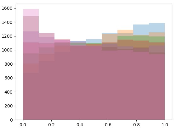
现在使用 np.histogram 和常规的 plt.plot:
plt.figure(2).clf()
for d in data:
    counts, bins = np.histogram(d, bins)
    plt.plot(bins[:-1], counts)
plt.ylim(0, plt.ylim()[1])
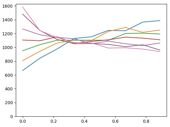
(如果你需要让人信服 plt.hist 和 np.histogram 确实计算出相同的结果,可以通过把 plt.plot(bins_for_plot, counts) 替换为 plt.bar(bins_for_plot, counts, bar_width, alpha=0.3) 和 bar_width = bins_for_plot[1] - bins_for_plot[0] 来获得完全相同的结果,或者你可以直接检查 all(all(x == y) for x,y in zip(plt.hist(d, bins), np.histogram(d, bins))) 是否相同)
备选方案
这确实是一团糟,你选择寻找替代方案是对的。
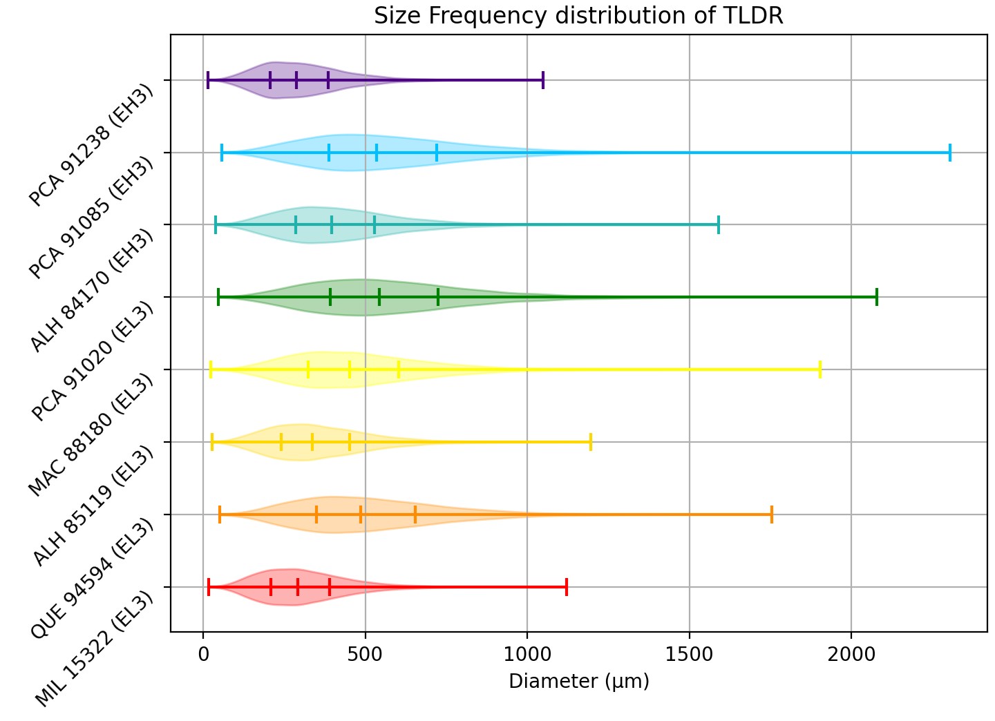
我的想法是使用 violinplot,它们非常适合同时显示多种分布——这正是你现在在做的事情。问题在于这类图并不会显示每个区间,但我认为你很少真正需要这些信息。
下面给出一个非常简单的示例。它很容易进行自定义,但在matplotlib的常规绘图自定义方式上并不完全适用,参阅这个链接了解自定义方法。
import matplotlib.pyplot as plt
import numpy as np
import itertools

# Generate random data for ploting
rng = np.random.default_rng()
names = (
    'MIL 15322 (EL3)',
    'QUE 94594 (EL3)',
    'ALH 85119 (EL3)',
    'MAC 88180 (EL3)',
    'PCA 91020 (EL3)',
    'ALH 84170 (EH3)',
    'PCA 91085 (EH3)',
    'PCA 91238 (EH3)',
)
N = 10_000
data = [
    rng.uniform(30, 60) * rng.chisquare(10, size=N) for name in names
]

# Display
colors = ('red', 'darkorange', 'gold', 'yellow', 'green', 'lightseagreen', 'deepskyblue', 'indigo')

plt.close('all')
plt.title('Size Frequency distribution of TLDR')

# Create violin plot
# /!\ don't use option vert=False, use orientation='horizontal' instead.
# /!\ I use it because I have an older version of matplotlib installed.
quantiles = [0.25, 0.5, 0.75]
parts = plt.violinplot(data, quantiles=[quantiles for name in names], vert=False)

# Color the bodies
for body, color in zip(parts['bodies'], colors, strict=True):
    body.set_color(color)

# Color the bars
for lines in (
    parts['cmaxes'],
    parts['cmins'],
    parts['cbars'],
):
    lines.set_colors(colors)

# Special case: the quantile bars need to be dealt with on their own
parts['cquantiles'].set_colors(
    list(itertools.chain.from_iterable([[c] * len(quantiles) for c in colors]))
)

# Pretty ticks
plt.yticks(list(range(1, len(names)+1)), names, rotation=45, va='top')
plt.xlabel('Diameter (µm)')

plt.grid()
plt.tight_layout()
plt.show()
输出:
相关文章