


在ggplot中绘制带有多个图例的大型热图
我需要做一个大型热图(列数超过10~15列),并包含多种图例(不同单位、数据类型等)。下面我用Palmer penguins数据集来演示我当前的做法。本质上是用geom_tile绘制单独的热图条带,然后再用patchwork将它们拼接在一起。这通常需要在Inkscape或 Affinity中大量编辑.svg,因此我在寻求简化这一过程的方法,尽量让成品接近最终期望的样子(末尾附有对照图)。
# set up
library(tidyverse)
library(patchwork)
library(palmerpenguins)
# Format
penguins_formatted <- penguins %>%
  group_by(species, sex) %>%
  summarise(MEAN_BILL_LENGTH = mean(bill_length_mm),
            MEAN_BILL_DEPTH = mean(bill_depth_mm),
            MEAN_FLIPPER_LENGTH = mean(flipper_length_mm),
            MEAN_MASS = mean(body_mass_g)) %>%
  drop_na() %>%
  rownames_to_column(var = "uniqueID")
# Four ggplots
spp <- penguins_formatted %>%
  ggplot(aes(x = 1, y = uniqueID, fill = species)) +
  geom_tile(stat = "identity", color = "black") +
  scale_x_discrete(position = "top") +
  coord_fixed(ratio = 1) +
  theme_void() +
  theme(axis.text.y = element_blank(),
        axis.text.x = element_blank(),
        axis.title = element_blank(),
        legend.position = "left",
        panel.border = element_rect(fill = NA, linewidth = 0.8),
        panel.background = element_rect(colour=NA, fill = "transparent"),
        plot.background = element_rect(colour=NA, fill = "transparent"),
        plot.margin = margin(0,0,0,0,"cm"),
        panel.spacing = unit(0, "cm"),
        legend.title = element_blank())

sex <- penguins_formatted %>%
  ggplot(aes(x = 1, y = uniqueID, fill = sex)) +
  geom_tile(stat = "identity", color = "black") +
  scale_fill_manual(values = c("white", "black")) +
  scale_x_discrete(position = "top") +
  coord_fixed(ratio = 1) +
  theme_void() +
  theme(axis.text.y = element_blank(),
        axis.text.x = element_blank(),
        axis.title = element_blank(),
        legend.position = "left",
        panel.border = element_rect(fill = NA, linewidth = 0.8),
        panel.background = element_rect(colour=NA, fill = "transparent"),
        plot.background = element_rect(colour=NA, fill = "transparent"),
        plot.margin = margin(0,0,0,0,"cm"),
        panel.spacing = unit(0, "cm"),
        legend.title = element_blank())

length <- penguins_formatted %>%
  ggplot(aes(x = 1, y = uniqueID, fill = MEAN_BILL_LENGTH)) +
  geom_tile(stat = "identity", color = "black") +
  scale_fill_fermenter(type = "seq", palette = 2, direction = 1) +
  scale_x_discrete(position = "top") +
  coord_fixed(ratio = 1) +
  theme_void() +
  theme(axis.text.y = element_blank(),
        axis.text.x = element_blank(),
        axis.title = element_blank(),
        legend.position = "left",
        panel.border = element_rect(fill = NA, linewidth = 0.8),
        panel.background = element_rect(colour=NA, fill = "transparent"),
        plot.background = element_rect(colour=NA, fill = "transparent"),
        plot.margin = margin(0,0,0,0,"cm"),
        panel.spacing = unit(0, "cm"),
        legend.title = element_blank())

flipper <- penguins_formatted %>%
  ggplot(aes(x = 1, y = uniqueID, fill = MEAN_FLIPPER_LENGTH)) +
  geom_tile(stat = "identity", color = "black") +
  scale_fill_fermenter(type = "seq", palette = 3, direction = 1) +
  scale_x_discrete(position = "top") +
  coord_fixed(ratio = 1) +
  theme_void() +
  theme(axis.text.y = element_blank(),
        axis.text.x = element_blank(),
        axis.title = element_blank(),
        legend.position = "left",
        panel.border = element_rect(fill = NA, linewidth = 0.8),
        panel.background = element_rect(colour=NA, fill = "transparent"),
        plot.background = element_rect(colour=NA, fill = "transparent"),
        plot.margin = margin(0,0,0,0,"cm"),
        panel.spacing = unit(0, "cm"),
        legend.title = element_blank()) +
labs(x = "Flipper length")
# Patch together in 1 row

spp + sex + length + flipper + patchwork::plot_layout(nrow = 1, guides = "collect")

# Edit in si=vg editor
# ggsave("penguin_example.svg", width = 8, height = 8, device = "svg", limitsize = FALSE)
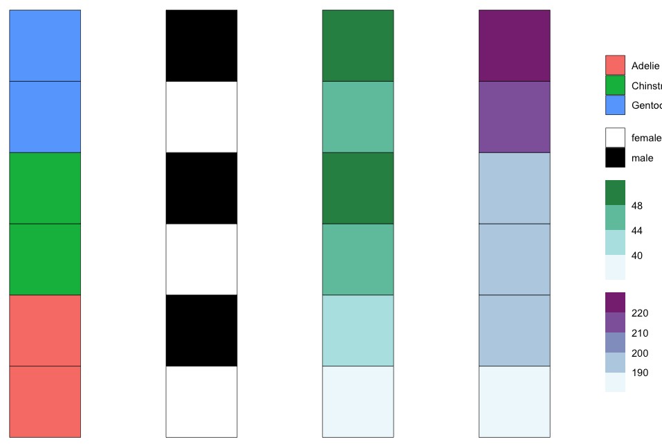
我得到的结果:
理想效果:
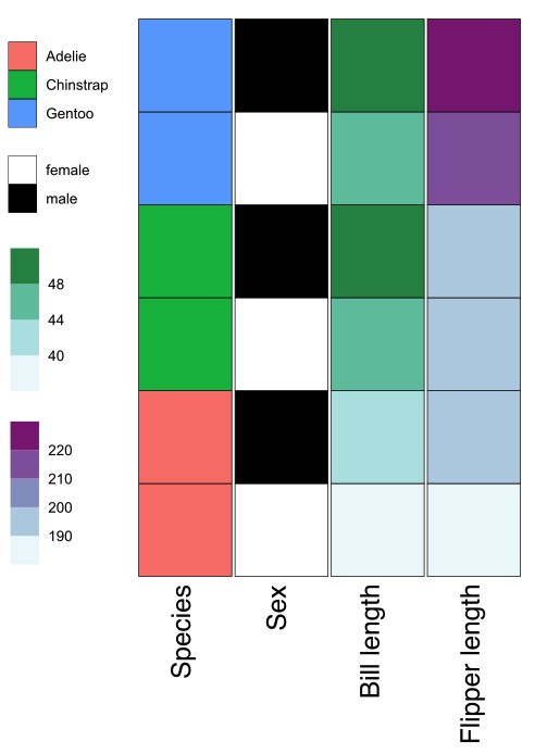
请注意,我实际的数据在列和行类型上要复杂得多。但这对于尝试调整 theme()and patchwork 选项以尽量让它们靠近,是一个很好的示例。
谢谢!
解决方案
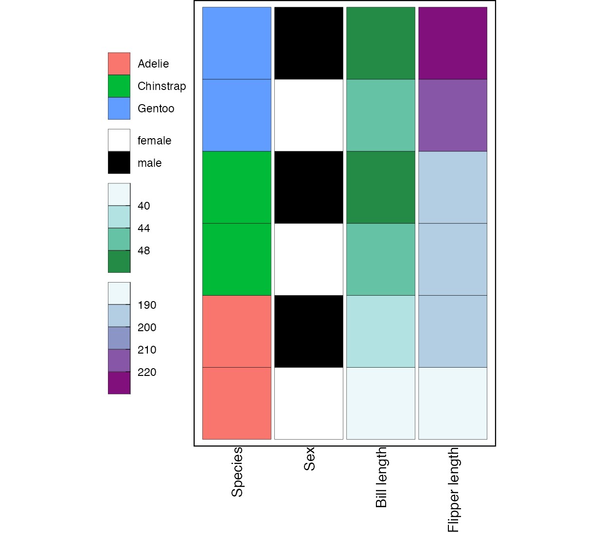
与其使用 patchwork,另一种方法是使用 ggnewscale 包将你想要的结果作为一个图表来创建,在这里 ggnewscale 允许你把多个变量映射到同一个美学上,并为每个变量包含一个图例。
首先,我创建两个命名列表:一个用于映射到 fill 的变量,另一个用于填充比例尺。其次,我使用 purrr::imap 遍历第一个列表,为每个变量添加一个 geom_tile 及相应的填充比例尺。
library(tidyverse)
library(palmerpenguins)

var_fill <- list(
  "Species" = "species",
  "Sex" = "sex",
  "Bill length" = "MEAN_BILL_LENGTH",
  "Flipper length" = "MEAN_FLIPPER_LENGTH"
)

scale_fill <- list(
  scale_fill_hue(guide = guide_legend(order = 1)),
  scale_fill_manual(
    values = c("white", "black"),
    guide = guide_legend(order = 2)
  ),
  scale_fill_fermenter(
    type = "seq", palette = 2, direction = 1,
    guide = guide_bins(order = 3)
  ),
  scale_fill_fermenter(
    type = "seq", palette = 3, direction = 1,
    guide = guide_bins(order = 4)
  )
)
names(scale_fill) <- names(var_fill)
var_levels <- names(var_fill)

ggplot(penguins_formatted, aes(y = uniqueID)) +
  purrr::imap(
    var_fill, \(x, y) {
      list(
        geom_tile(
          aes(
            x = y,
            fill = .data[[x]]
          ),
          color = "black",
          width = .95
        ),
        scale_fill[[y]],
        ggnewscale::new_scale_fill()
      )
    }
  ) +
  scale_x_discrete(
    limits = var_levels
  ) +
  coord_fixed(ratio = 1) +
  theme_void() +
  theme(
    axis.text.y = element_blank(),
    axis.text.x = element_text(
      angle = 90,
      hjust = 1
    ),
    axis.title = element_blank(),
    legend.position = "left",
    panel.border = element_rect(fill = NA, linewidth = 0.8),
    panel.background = element_rect(colour = NA, fill = "transparent"),
    plot.background = element_rect(colour = NA, fill = "transparent"),
    plot.margin = margin(0, 0, 0, 0, "cm"),
    panel.spacing = unit(0, "cm"),
    legend.title = element_blank()
  )
站内所有文章版权归属LeftHeroAI导航站,无授权禁止任何主体转载、抄袭、复制内容,亦不得私自架设镜像站点。一经侵权,本站将通过法律途径追责。
相关文章






汇集全球数千款 AI 工具,每日持续更新,配套 AI 开发学习资源,轻松用 AI 提升工作效率。快捷键 Ctrl+D/⌘+D 一键收藏本站。