


在Python中如何可视化一个密集但存在缺口且带有尖峰的时间序列?
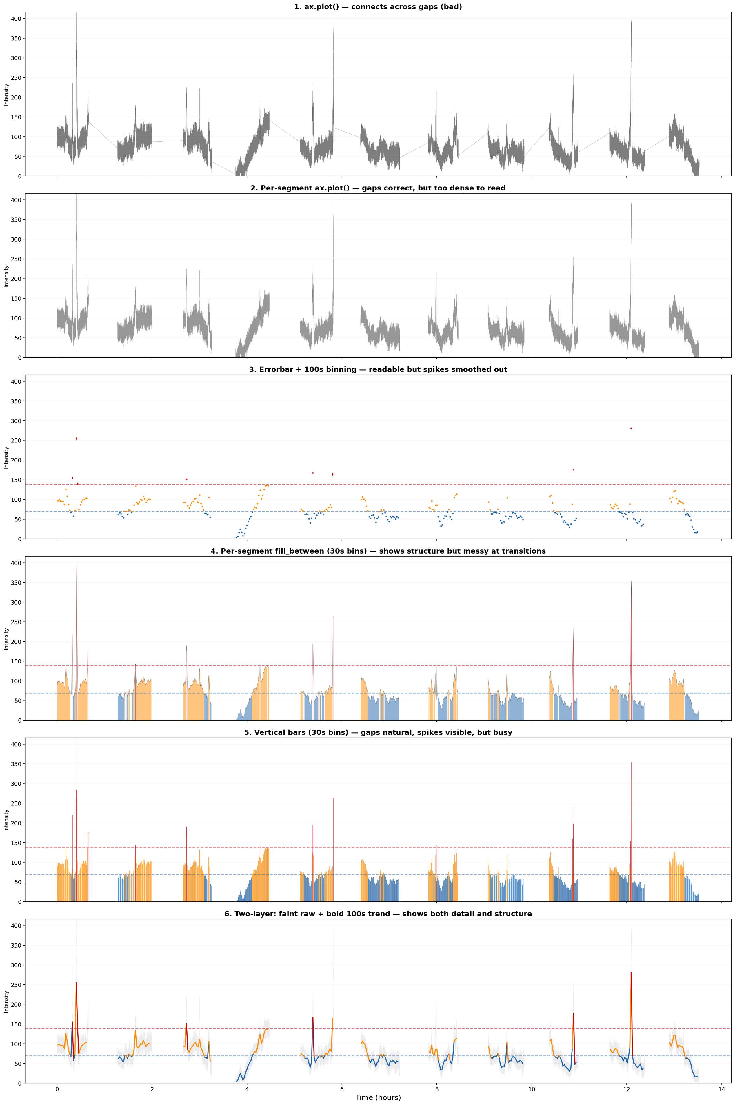
我有一个传感器时间序列,具有以下特征:
- 约250,000个数据点,在高采样率下,覆盖约12小时
- 约11个连续片段,之间有 30-40分钟的间隙(传感器周期性离线)
- 信号的中位数约为70,但存在 尖锐的峰值达到500以上
- 我需要 按强度对点进行颜色编码(低于中位数、1-2倍中位数、高于2倍中位数)并显示阈值线
下面是一个最小可复现实例,用于生成类似数据:
"""
Minimal reproducible example: visualizing a dense, gappy time series with spikes.
Shows 6 different approaches for comparison.
"""
import numpy as np
import matplotlib
matplotlib.use('Agg')
import matplotlib.pyplot as plt

np.random.seed(42)

# Simulate a gappy sensor time series:
# ~12 hours of recording split into ~11 segments
# with ~30-40 min gaps (sensor offline periodically)

segments = []
t_start = 0
for i in range(11):
    duration = np.random.uniform(2000, 3000)
    n_points = int(duration / 0.1)
    t = np.linspace(t_start, t_start + duration, n_points)

    base = 70 + 20 * np.sin(2 * np.pi * t / 5000)
    noise = np.cumsum(np.random.randn(n_points)) * 0.3
    noise -= np.mean(noise)
    rate = base + noise + np.random.poisson(base) - base

    n_spikes = np.random.poisson(3)
    for _ in range(n_spikes):
        spike_pos = np.random.randint(0, n_points)
        spike_amp = np.random.exponential(100)
        spike_width = np.random.uniform(5, 50)
        spike = spike_amp * np.exp(-0.5 * ((t - t[spike_pos]) / spike_width) ** 2)
        rate += spike

    rate = np.maximum(rate, 0)
    segments.append((t / 3600, rate))  # store in hours

    gap = np.random.uniform(1800, 2400)
    t_start += duration + gap

# Thresholds for color-coding
all_rates = np.concatenate([s[1] for s in segments])
med = np.median(all_rates[all_rates > 0])
thresh1 = med
thresh2 = med * 2

print(f"Total points: {len(all_rates)}")
print(f"Segments: {len(segments)}")
print(f"Median: {med:.1f}, 2x median: {thresh2:.1f}, Max: {np.max(all_rates):.1f}")


def color_for_rate(r, t1=thresh1, t2=thresh2):
    return np.where(r < t1, '#2166ac', np.where(r < t2, '#ff8c00', '#cc0000'))


def bin_segment(t, r, bin_width_hrs=100/3600):
    """Bin a single continuous segment."""
    if len(t) < 2:
        return np.array([]), np.array([]), np.array([])
    t_bins, r_bins, e_bins = [], [], []
    t_min, t_max = t[0], t[-1]
    edges = np.arange(t_min, t_max, bin_width_hrs)
    for j in range(len(edges) - 1):
        mask = (t >= edges[j]) & (t < edges[j+1])
        if np.sum(mask) > 0:
            t_bins.append(np.mean(t[mask]))
            r_bins.append(np.mean(r[mask]))
            e_bins.append(np.std(r[mask]) / np.sqrt(np.sum(mask)))
    return np.array(t_bins), np.array(r_bins), np.array(e_bins)


# =====================================================================
# 6 visualization approaches
# =====================================================================
fig, axes = plt.subplots(6, 1, figsize=(20, 30), sharex=True)

# --- 1. Naive ax.plot (BAD: connects across gaps) ---
ax = axes[0]
t_all = np.concatenate([s[0] for s in segments])
r_all = np.concatenate([s[1] for s in segments])
ax.plot(t_all, r_all, 'k-', linewidth=0.3, alpha=0.5)
ax.set_ylabel("Intensity")
ax.set_title("1. ax.plot() — connects across gaps (bad)", fontsize=14, fontweight='bold')
ax.set_ylim(0, thresh2 * 3)

# --- 2. Per-segment line plot (fixes gaps, but dense) ---
ax = axes[1]
for t_seg, r_seg in segments:
    ax.plot(t_seg, r_seg, 'k-', linewidth=0.2, alpha=0.4)
ax.set_ylabel("Intensity")
ax.set_title("2. Per-segment ax.plot() — gaps correct, but too dense to read", fontsize=14, fontweight='bold')
ax.set_ylim(0, thresh2 * 3)

# --- 3. Errorbar points with 100s binning ---
ax = axes[2]
for t_seg, r_seg in segments:
    tb, rb, eb = bin_segment(t_seg, r_seg)
    if len(tb) > 0:
        colors = color_for_rate(rb)
        for c in ['#2166ac', '#ff8c00', '#cc0000']:
            mask = colors == c
            if np.any(mask):
                ax.errorbar(tb[mask], rb[mask], yerr=eb[mask], fmt='.', color=c,
                           markersize=4, elinewidth=0.5, capsize=0)
ax.axhline(thresh1, color='#2166ac', ls='--', lw=1.5, alpha=0.5)
ax.axhline(thresh2, color='#cc0000', ls='--', lw=1.5, alpha=0.5)
ax.set_ylabel("Intensity")
ax.set_title("3. Errorbar + 100s binning — readable but spikes smoothed out", fontsize=14, fontweight='bold')
ax.set_ylim(0, thresh2 * 3)

# --- 4. Per-segment colored fill_between ---
ax = axes[3]
for t_seg, r_seg in segments:
    tb, rb, _ = bin_segment(t_seg, r_seg, bin_width_hrs=30/3600)
    if len(tb) < 2:
        continue
    ax.fill_between(tb, 0, rb, where=rb < thresh1, color='#2166ac', alpha=0.5, linewidth=0)
    ax.fill_between(tb, 0, rb, where=(rb >= thresh1) & (rb < thresh2), color='#ff8c00', alpha=0.5, linewidth=0)
    ax.fill_between(tb, 0, rb, where=rb >= thresh2, color='#cc0000', alpha=0.6, linewidth=0)
    ax.plot(tb, rb, 'k-', linewidth=0.4, alpha=0.5)
ax.axhline(thresh1, color='#2166ac', ls='--', lw=1.5, alpha=0.5)
ax.axhline(thresh2, color='#cc0000', ls='--', lw=1.5, alpha=0.5)
ax.set_ylabel("Intensity")
ax.set_title("4. Per-segment fill_between (30s bins) — shows structure but messy at transitions", fontsize=14, fontweight='bold')
ax.set_ylim(0, thresh2 * 3)

# --- 5. Vertical bars (stem plot) per segment ---
ax = axes[4]
for t_seg, r_seg in segments:
    tb, rb, _ = bin_segment(t_seg, r_seg, bin_width_hrs=30/3600)
    if len(tb) == 0:
        continue
    colors = color_for_rate(rb)
    bar_width = 30 / 3600 * 0.9
    ax.bar(tb, rb, width=bar_width, color=colors, linewidth=0, alpha=0.7)
ax.axhline(thresh1, color='#2166ac', ls='--', lw=1.5, alpha=0.5)
ax.axhline(thresh2, color='#cc0000', ls='--', lw=1.5, alpha=0.5)
ax.set_ylabel("Intensity")
ax.set_title("5. Vertical bars (30s bins) — gaps natural, spikes visible, but busy", fontsize=14, fontweight='bold')
ax.set_ylim(0, thresh2 * 3)

# --- 6. Two-layer: faint raw + bold smoothed ---
ax = axes[5]
for t_seg, r_seg in segments:
    # Faint raw data (thin line, very transparent)
    ax.plot(t_seg, r_seg, color='gray', linewidth=0.1, alpha=0.15, rasterized=True)
    # Bold 100s binned overlay
    tb, rb, _ = bin_segment(t_seg, r_seg)
    if len(tb) > 1:
        colors = color_for_rate(rb)
        for j in range(len(tb) - 1):
            ax.plot([tb[j], tb[j+1]], [rb[j], rb[j+1]],
                    color=colors[j], linewidth=2, solid_capstyle='round')
ax.axhline(thresh1, color='#2166ac', ls='--', lw=1.5, alpha=0.5)
ax.axhline(thresh2, color='#cc0000', ls='--', lw=1.5, alpha=0.5)
ax.set_ylabel("Intensity")
ax.set_title("6. Two-layer: faint raw + bold 100s trend — shows both detail and structure", fontsize=14, fontweight='bold')
ax.set_ylim(0, thresh2 * 3)

axes[-1].set_xlabel("Time (hours)", fontsize=14)

for ax in axes:
    ax.tick_params(labelsize=11)
    ax.grid(axis='y', alpha=0.1)

plt.tight_layout()
fig.savefig("example.png", dpi=150, bbox_inches='tight', facecolor='white')
plt.close()
print("Saved: example.png")
我尝试过:
ax.plot()—— 会把跨越空隙的点连接成很长的对角线,效果很糟糕。ax.scatter()配合 LTTB 下采样 —— 点太小难以看清,或者太大重叠。空隙模糊不清。ax.errorbar(fmt='.'),每段用100秒分箱 —— 虽然最接近我想要的效果,但看起来有些杂乱。分箱掩盖了峰值结构。- 用彩色
fill_between配合where=—— 在颜色过渡处产生伪影。
我想要的效果:
- 间隙应清晰地显示为空白区域(不互相连接)
- 峰值应在视觉上突出(不会被分箱平均掉)
- 整体趋势应一目了然
- 按强度水平的颜色编码应清晰
- 适合用于出版图(干净、不过于拥挤)
该图为横向宽屏格式,大约4400像素,覆盖约11段。
对于这类数据,哪种可视化方法最合适? 欢迎使用任意Python库——matplotlib、plotly、bokeh、seaborn,或是其它完全不同的方案。也欢迎非标准的方法(热力条、密度图、按段的分段式步进图等)。
解决方案
你可以使用 broken axis 通过 matplotlib 来实现。实现并不完全简单,尤其是在需要多次中断坐标轴时。我还添加了一个多色线条图(见 这个示例),以突出阈值。
import numpy as np
import matplotlib
import matplotlib.pyplot as plt
from matplotlib.collections import LineCollection
import itertools as itt

np.random.seed(42)

# Simulate a gappy sensor time series:
# ~12 hours of recording split into ~11 segments
# with ~30-40 min gaps (sensor offline periodically)

segments = []
t_start = 0
for i in range(11):
    duration = np.random.uniform(2000, 3000)
    n_points = int(duration / 0.1)
    t = np.linspace(t_start, t_start + duration, n_points)

    base = 70 + 20 * np.sin(2 * np.pi * t / 5000)
    noise = np.cumsum(np.random.randn(n_points)) * 0.3
    noise -= np.mean(noise)
    rate = base + noise + np.random.poisson(base) - base

    n_spikes = np.random.poisson(3)
    for _ in range(n_spikes):
        spike_pos = np.random.randint(0, n_points)
        spike_amp = np.random.exponential(100)
        spike_width = np.random.uniform(5, 50)
        spike = spike_amp * np.exp(-0.5 * ((t - t[spike_pos]) / spike_width) ** 2)
        rate += spike

    rate = np.maximum(rate, 0)
    segments.append((t / 3600, rate))  # store in hours

    gap = np.random.uniform(1800, 2400)
    t_start += duration + gap

# Thresholds for color-coding
all_rates = np.concatenate([s[1] for s in segments])
med = np.median(all_rates[all_rates > 0])
thresh1 = med
thresh2 = med * 2

print(f"Total points: {len(all_rates)}")
print(f"Segments: {len(segments)}")
print(f"Median: {med:.1f}, 2x median: {thresh2:.1f}, Max: {np.max(all_rates):.1f}")


def color_for_rate(r, t1=thresh1, t2=thresh2):
    return list(np.where(r < t1, '#2166ac', np.where(r < t2, '#ff8c00', '#cc0000')).astype(str))


def bin_segment(t, r, bin_width_hrs=100/3600):
    """Bin a single continuous segment."""
    if len(t) < 2:
        return np.array([]), np.array([]), np.array([])
    t_bins, r_bins, e_bins = [], [], []
    t_min, t_max = t[0], t[-1]
    edges = np.arange(t_min, t_max, bin_width_hrs)
    for j in range(len(edges) - 1):
        mask = (t >= edges[j]) & (t < edges[j+1])
        if np.sum(mask) > 0:
            t_bins.append(np.mean(t[mask]))
            r_bins.append(np.mean(r[mask]))
            e_bins.append(np.std(r[mask]) / np.sqrt(np.sum(mask)))
    return np.array(t_bins), np.array(r_bins), np.array(e_bins)

def colored_line(x, y, c, ax, **lc_kwargs):
    """
    Plot a line with a color specified along the line by a third value.

    It does this by creating a collection of line segments. Each line segment is
    made up of two straight lines each connecting the current (x, y) point to the
    midpoints of the lines connecting the current point with its two neighbors.
    This creates a smooth line with no gaps between the line segments.

    Parameters
    ----------
    x, y : array-like
        The horizontal and vertical coordinates of the data points.
    c : array-like
        The color values, which should be the same size as x and y.
    ax : Axes
        Axis object on which to plot the colored line.
    **lc_kwargs
        Any additional arguments to pass to matplotlib.collections.LineCollection
        constructor. This should not include the array keyword argument because
        that is set to the color argument. If provided, it will be overridden.

    Returns
    -------
    matplotlib.collections.LineCollection
        The generated line collection representing the colored line.
    """
    if "array" in lc_kwargs:
        warnings.warn('The provided "array" keyword argument will be overridden')

    # Default the capstyle to butt so that the line segments smoothly line up
    default_kwargs = {"capstyle": "butt"}
    default_kwargs.update(lc_kwargs)

    # Compute the midpoints of the line segments. Include the first and last points
    # twice so we don't need any special syntax later to handle them.
    x = np.asarray(x)
    y = np.asarray(y)
    x_midpts = np.hstack((x[0], 0.5 * (x[1:] + x[:-1]), x[-1]))
    y_midpts = np.hstack((y[0], 0.5 * (y[1:] + y[:-1]), y[-1]))

    # Determine the start, middle, and end coordinate pair of each line segment.
    # Use the reshape to add an extra dimension so each pair of points is in its
    # own list. Then concatenate them to create:
    # [
    #   [(x1_start, y1_start), (x1_mid, y1_mid), (x1_end, y1_end)],
    #   [(x2_start, y2_start), (x2_mid, y2_mid), (x2_end, y2_end)],
    #   ...
    # ]
    coord_start = np.column_stack((x_midpts[:-1], y_midpts[:-1]))[:, np.newaxis, :]
    coord_mid = np.column_stack((x, y))[:, np.newaxis, :]
    coord_end = np.column_stack((x_midpts[1:], y_midpts[1:]))[:, np.newaxis, :]
    segments = np.concatenate((coord_start, coord_mid, coord_end), axis=1)

    lc = LineCollection(segments, colors=c, **default_kwargs)

    return ax.add_collection(lc)

# =====================================================================
# 6 visualization approaches
# =====================================================================
fig, axes = plt.subplots(1, len(segments), sharey=True, figsize=(20, 3))
fig.subplots_adjust(wspace=0.1)

for ax, segment in zip(axes.flat, segments):
    # Display lines
    colored_line(segment[0], segment[1], color_for_rate(segment[1]), ax)

    # Set axis limits manually
    ax.set_xlim(segment[0][0], segment[0][-1])
    ax.set_ylim(bottom=0, top=500)

    # Remove ticks that are too close to one of the breaks
    ax.set_xticks(
        [val for val in ax.get_xticks()
        if (segment[0][0] + 0.05 < val < segment[0][-1] - 0.05)]
    )

    # Thresh lines
    ax.axhline(y=thresh1, color='#ff8c00', linestyle='--', lw=0.5)
    ax.axhline(y=thresh2, color='#cc0000', linestyle='--', lw=0.5)

# Remove unused spines and ticks
for ax_left, ax_right in itt.pairwise(axes.flat):
    ax_left.spines.right.set_visible(False)
    ax_right.spines.left.set_visible(False)

    ax_left.tick_params(right=False)
    ax_right.tick_params(left=False)

axes[0].yaxis.tick_left()
axes[-1].yaxis.tick_right()

# Create break lines
d = 2  # proportion of vertical to horizontal extent of the slanted line
kwargs = dict(
    marker=[(-1, -d), (1, d)],
    markersize=12,
    linestyle="none", color='k', mec='k', mew=1, clip_on=False
)

for ax_left, ax_right in itt.pairwise(axes.flat):
    ax_left.plot([1, 1], [0, 1], transform=ax_left.transAxes, **kwargs)
    ax_right.plot([0, 0], [0, 1], transform=ax_right.transAxes, **kwargs)

fig.savefig('example.png')
输出:

编辑:我研究了一下分箱,但我认为这对你的使用场景并不是一个好主意,因为它可能会抹去较小的峰值。我认为原始数据可能是最好的选择。
站内所有文章版权归属LeftHeroAI导航站,无授权禁止任何主体转载、抄袭、复制内容,亦不得私自架设镜像站点。一经侵权,本站将通过法律途径追责。
相关文章






汇集全球数千款 AI 工具,每日持续更新,配套 AI 开发学习资源,轻松用 AI 提升工作效率。快捷键 Ctrl+D/⌘+D 一键收藏本站。