


如何在Python中绘制PCoA的椭圆体?
我有一组生物样本,分为三种类型(1、2、3)。我已经基于样本中若干基因的相对丰度,利用Bray-Curtis距离绘制了一个PCoA(主坐标分析)分析结果。
我使用了这个脚本:
import numpy as np
import pandas as pd
from scipy.spatial import distance
from skbio.stats.ordination import pcoa, pca
import matplotlib.pyplot as plt
import seaborn as sns
df = pd.read_excel("relative_abundances.xlsx")
dfnumpy = df.to_numpy()
dfdistances=distance.pdist(dfnumpy, 'braycurtis') #bray-curtis distance matrix
pcoa_results = pcoa(dfdistances, dimensions=2) #pcoa analysis
coordinates = pcoa_results.samples #pcoa analysis coordinates
df_pcoa = coordinates[["PC1", "PC2"]]

indexdf = pd.read_excel("index.xlsx") #Assigns each sample a type
df_merged = pd.concat([df_pcoa.reset_index(drop=True), indexdf.reset_index(drop=True)], axis=1) #joins coordinates df with the index

sns.scatterplot(data=df_merged,x="PC1",y="PC2",hue="Type") #plots the PCoA
plt.title("Figure 1: Scatter Plot",
          fontsize=16)
plt.xlabel('PcoA 1',
           fontsize=16)
plt.ylabel('PcoA 2',
           fontsize=16)
plt.show(block=True)
我使用的数据: relative_abundances.csv index.csv
我得到的图: PcoA plot produced by the question code
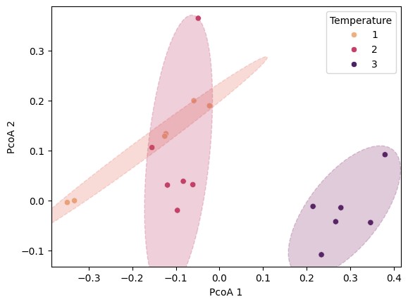
问题在于我想绘制三个置信椭圆,每种样本类型一个,类似于:
在Python方面,我唯一能找到的是这个 matplotlib 文档,但我无法将这段代码与我的散点图整合。我也看到有些人说无法在Python中完成这类分析,建议改用来自R 的 ggplot2。
解决方案
可以将文档中的 confidence_ellipse 函数改造成满足你的需要的版本。你需要做的两个主要步骤是:从 sns.scatterplot 调用中返回matplotlib的 Axes对象,以便将其传递给 confidence_ellipse,并从你的 DataFrame 中提取每种类型的x、y值。在下面的示例中,我创建了一些伪数据以大致匹配你的情况,并对 confidence_ellipse 做了一个修改版本,使其接收 DataFrame 并提取给定类型类别的相关信息。创建散点图后,我对每种类型进行循环并绘制置信椭圆。你可以调整椭圆的颜色、大小和样式。
import numpy as np
import pandas as pd
import seaborn as sns

from matplotlib.patches import Ellipse
import matplotlib.transforms as transforms


def confidence_ellipse(df, ax, type, xname, yname, typename, n_std=3.0, facecolor='none', **kwargs):
    """
    Create a plot of the covariance confidence ellipse (based on code from https://matplotlib.org/stable/gallery/statistics/confidence_ellipse.html)

    Parameters
    ----------
    df :
        Input data as a pandas DataFrame.

    ax : matplotlib.axes.Axes
        The Axes object to draw the ellipse into.

    type : int, float
        The category value from the DataFrame that you want to show.

    xname : str
        The name of x-axis variable.

    yname : str
        The name of the y-axis variable.

    typename: str
        The name of the type variable.

    n_std : float
        The number of standard deviations to determine the ellipse's radiuses.

    **kwargs
        Forwarded to `~matplotlib.patches.Ellipse`

    Returns
    -------
    matplotlib.patches.Ellipse
    """

    xy = df[df[typename] == type][[xname, yname]]
    x = xy[xname]
    y = xy[yname]

    if x.size != y.size:
        raise ValueError("x and y must be the same size")

    cov = np.cov(x, y)
    pearson = cov[0, 1]/np.sqrt(cov[0, 0] * cov[1, 1])
    # Using a special case to obtain the eigenvalues of this
    # two-dimensional dataset.
    ell_radius_x = np.sqrt(1 + pearson)
    ell_radius_y = np.sqrt(1 - pearson)
    ellipse = Ellipse((0, 0), width=ell_radius_x * 2, height=ell_radius_y * 2,
                      facecolor=facecolor, **kwargs)

    # Calculating the standard deviation of x from
    # the squareroot of the variance and multiplying
    # with the given number of standard deviations.
    scale_x = np.sqrt(cov[0, 0]) * n_std
    mean_x = np.mean(x)

    # calculating the standard deviation of y ...
    scale_y = np.sqrt(cov[1, 1]) * n_std
    mean_y = np.mean(y)

    transf = transforms.Affine2D() \
        .rotate_deg(45) \
        .scale(scale_x, scale_y) \
        .translate(mean_x, mean_y)

    ellipse.set_transform(transf + ax.transData)
    return ax.add_patch(ellipse)

nsamps = 6
type1_samples = np.random.multivariate_normal([-0.1, 0.1], cov=[[0.015, 0.007], [0.007, 0.015]], size=nsamps)
type2_samples = np.random.multivariate_normal([-0.15, 0.05], cov=[[0.005, 0.003], [0.003, 0.016]], size=nsamps)
type3_samples = np.random.multivariate_normal([0.3, -0.05], cov=[[0.009, 0.008], [0.008, 0.03]], size=nsamps)

data = {
    "PcoA 1": np.concat((type1_samples[:, 0], type2_samples[:, 0], type3_samples[:, 0])),
    "PcoA 2": np.concat((type1_samples[:, 1], type2_samples[:, 1], type3_samples[:, 1])),
    "Temperature": ([1] * nsamps) + ([2] * nsamps) + ([3] * nsamps),
}

df = pd.DataFrame(data)

# notes:
#  - I've explicitly specified the colour palette for the points so can get matching colours
#    for the confidence ellipses
#  - I return the matplotlib Axes object that seaborn creates
ax = sns.scatterplot(data=df, x="PcoA 1", y="PcoA 2", hue="Temperature", palette="flare")

# get the colours for each type
colours = sns.color_palette("flare", n_colors=3)

# plot the ellipses
for i, temp in enumerate([1, 2, 3]):
    confidence_ellipse(
        df,
        ax,
        temp,
        xname="PcoA 1",
        yname="PcoA 2",
        typename="Temperature",
        n_std=2,  # change this to set the size of the ellipses
        facecolor=colours[i],
        edgecolor=colours[i],
        ls="--",
        alpha=0.25,
    )
站内所有文章版权归属LeftHeroAI导航站,无授权禁止任何主体转载、抄袭、复制内容,亦不得私自架设镜像站点。一经侵权,本站将通过法律途径追责。
相关文章







汇集全球数千款 AI 工具,每日持续更新,配套 AI 开发学习资源,轻松用 AI 提升工作效率。快捷键 Ctrl+D/⌘+D 一键收藏本站。