


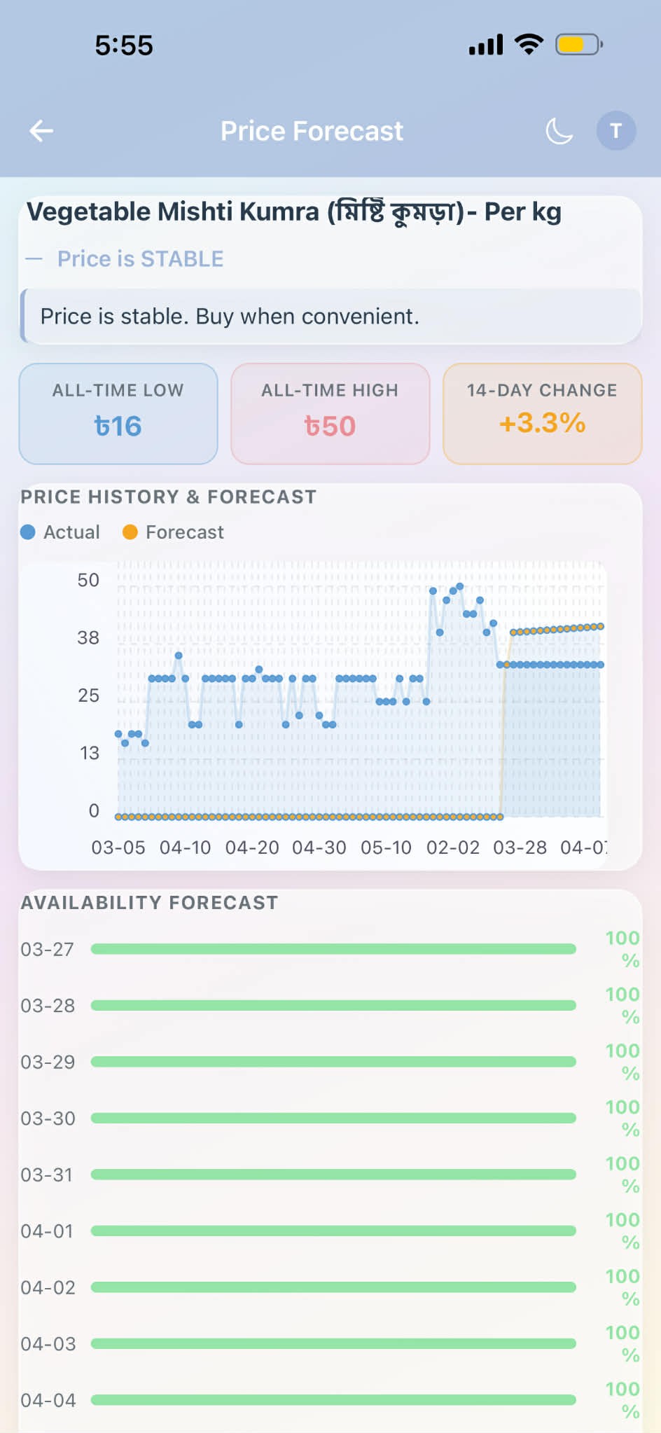
如何在React Native中,在同一条分类坐标轴上,将历史数据和预测数据渲染为两段独立的折线,并且不出现伪造的零值或空值尾部?
我正在用React Native构建一个价格预测屏幕。
我有:
- 最近约30个日期的历史价格数据
- 未来14天的预测价格
我想把它们放在同一个图表上,呈现为:
- 一条历史线
- 一条预测线
- 两条线在最近的历史点 / 第一个预测点处相交
图表的行为应当是这样的:
- 历史仅在自己的日期区间内渲染
- 预测仅在自己的日期区间内渲染
- 每段前后不出现伪尾巴
- x轴应为类别型 / 按点的顺序等距分布,而不是按真实时间戳的间距
我不想要真实时间戳间距的原因是历史跨越数月,而预测只有14天,因此使用实际日期间距会把预测挤到图表的最右边。
示例形状:
- history: 29 May, 2 Jun, 15 Jun, ... 26 Mar
- forecast: 27 Mar, 28 Mar, ... 9 Apr
因此在视觉上我想要一个单一的有序日期轴,但两段分属两条独立的线段。
我尝试使用诸如react-native-chart-kit之类的库,但它们期望数据集在同一x 轴长度上对齐。为了解决这个问题,我尝试填充无效区域:
- 0会在0 处绘制一条伪造的平坦线!固定值时看起来是这样的
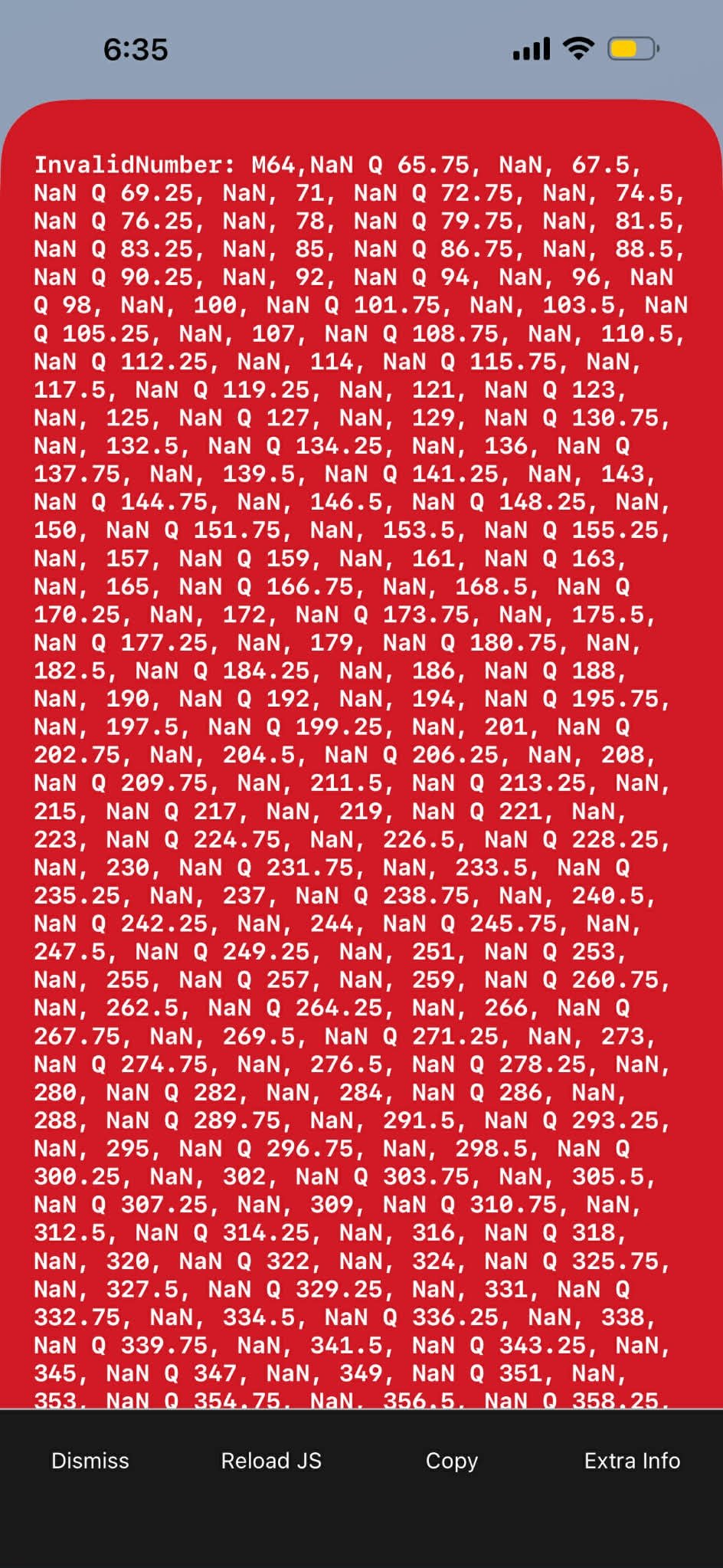
- NaN会崩溃SVG / 路径生成!在我不想要数值的位置使用null时崩溃
- null在贝塞尔模式下仍然无法给出干净的分割
在重现代码片段下,请注意以下行为:
- 将paddingMode设置为 'zero' 时,图表会在0 处绘制伪造的平坦线
- 将paddingMode设置为 'nan' 时,iOS会因InvalidNumber / SVG路径错误而崩溃
- 将paddingMode设置为 'null' 时,贝塞尔模式仍无法在历史与预测之间产生干净的分割
期望的结果:两条独立的线段在边界处相交,没有伪尾巴,且日期以类别形式均匀分布。
下面是用来重现问题的最小代码片段:
import React from 'react';
import { Dimensions, SafeAreaView, View, Text } from 'react-native';
import { LineChart } from 'react-native-chart-kit';

const screenWidth = Dimensions.get('window').width;

// Change this to test the failure modes:
// 'zero' => fake flat line at 0
// 'null' => bezier still doesn't give a clean split
// 'nan'  => crashes SVG/path generation on iOS
const paddingMode: 'zero' | 'null' | 'nan' = 'zero';

const history = {
  '2026-02-27': 20,
  '2026-02-28': 30,
  '2026-03-01': 25,
  '2026-03-02': 30,
  '2026-03-03': 25,
  '2026-03-04': 26,
  '2026-03-10': 40,
  '2026-03-17': 48,
  '2026-03-20': 38,
  '2026-03-24': 47,
  '2026-03-25': 44,
  '2026-03-26': 34,
};

const forecast = {
  '2026-03-27': 36,
  '2026-03-28': 36.5,
  '2026-03-29': 37,
  '2026-03-30': 37.2,
  '2026-03-31': 37.5,
  '2026-04-01': 38,
  '2026-04-02': 38.2,
  '2026-04-03': 38.5,
  '2026-04-04': 38.8,
  '2026-04-05': 39,
  '2026-04-06': 39.2,
  '2026-04-07': 39.4,
  '2026-04-08': 39.6,
  '2026-04-09': 40,
};

function padValue() {
  if (paddingMode === 'zero') return 0;
  if (paddingMode === 'null') return null;
  return Number.NaN;
}

export default function App() {
  const historyDates = Object.keys(history).sort();
  const forecastDates = Object.keys(forecast).sort();

  // One merged x-axis for both datasets
  const allDates = [...new Set([...historyDates, ...forecastDates])].sort();

  const labels = allDates.map((d, i) => {
    if (i === 0 || i === allDates.length - 1 || i === Math.floor(allDates.length / 2)) {
      return d.slice(5);
    }
    return '';
  });

  const historySeries = allDates.map((date) =>
    Object.prototype.hasOwnProperty.call(history, date)
      ? history[date as keyof typeof history]
      : padValue()
  );

  const forecastSeries = allDates.map((date) =>
    Object.prototype.hasOwnProperty.call(forecast, date)
      ? forecast[date as keyof typeof forecast]
      : padValue()
  );

  return (
    <SafeAreaView style={{ flex: 1, backgroundColor: '#fff', justifyContent: 'center' }}>
      <View style={{ padding: 16 }}>
        <Text style={{ fontSize: 18, fontWeight: '700', marginBottom: 8 }}>
          History + Forecast repro
        </Text>

        <Text style={{ marginBottom: 16 }}>
          paddingMode = {paddingMode}
        </Text>

        <LineChart
          data={{
            labels,
            datasets: [
              {
                data: historySeries as number[],
                color: (opacity = 1) => `rgba(54, 162, 235, ${opacity})`,
                strokeWidth: 3,
              },
              {
                data: forecastSeries as number[],
                color: (opacity = 1) => `rgba(255, 159, 64, ${opacity})`,
                strokeWidth: 3,
              },
            ],
            legend: ['Actual', 'Forecast'],
          }}
          width={screenWidth - 32}
          height={260}
          bezier
          fromZero={false}
          withInnerLines
          withOuterLines={false}
          chartConfig={{
            backgroundGradientFrom: '#ffffff',
            backgroundGradientTo: '#ffffff',
            decimalPlaces: 0,
            color: (opacity = 1) => `rgba(0, 0, 0, ${opacity})`,
            labelColor: () => '#444',
            propsForDots: {
              r: '3',
              strokeWidth: '1',
            },
            propsForBackgroundLines: {
              stroke: '#ddd',
              strokeDasharray: '4',
            },
          }}
          style={{ borderRadius: 12 }}
        />
      </View>
    </SafeAreaView>
  );
}
在React Native中正确的渲染方式是什么?
更具体地说:
- 是否存在一个图表库,能够在一个共享的类别轴上支持两条独立的线段,而不需要填充虚假数值?
- 如果使用react-native-chart-kit,是否有一个干净的变通方法?
- 是否更好的做法是使用其他图表库,例如victory-native、react-native-svg-charts,或改用自定义的react-native-svg实现?
我主要在寻找一个解决方案,使得:
- 两条数据系列共用同一个可视坐标轴
- 点按顺序等距分布,而非真实日期区间
- 历史和预测在连接边界处保持视觉上的分离
解决方案
我在react-native-chart-kit中没有找到一个干净的变通办法。最终我选择自己用react-native-svg渲染图表,并把两条数据视为在一个共享的类别X 轴上的两条独立路径。
这是我使用的组件:
import React from 'react';
import { View } from 'react-native';
import Svg, { Circle, Line, Path, Text as SvgText } from 'react-native-svg';

type Point = {
  date: string;
  value: number;
};

type Props = {
  width: number;
  height?: number;
  historyPoints: Point[];
  forecastPoints: Point[];
};

const PADDING = { top: 12, right: 12, bottom: 28, left: 44 };
const MONTHS = ['Jan', 'Feb', 'Mar', 'Apr', 'May', 'Jun', 'Jul', 'Aug', 'Sep', 'Oct', 'Nov', 'Dec'];

function formatShortDate(date: string) {
  const [, month, day] = date.split('-');
  return `${Number(day)} ${MONTHS[Number(month) - 1]}`;
}

function buildPath(points: { x: number; y: number }[]) {
  return points.map((p, i) => `${i === 0 ? 'M' : 'L'}${p.x},${p.y}`).join(' ');
}

export function ForecastPriceChart({
  width,
  height = 200,
  historyPoints,
  forecastPoints,
}: Props) {
  const allPoints = [...historyPoints, ...forecastPoints].filter(
    (p) => Number.isFinite(p.value) && p.value > 0
  );

  if (allPoints.length < 2) return null;

  const allDates = [...new Set(allPoints.map((p) => p.date))].sort();
  const dateIndexMap = new Map(allDates.map((date, index) => [date, index]));
  const maxIndex = Math.max(1, allDates.length - 1);

  const values = allPoints.map((p) => p.value);
  const rawMin = Math.min(...values);
  const rawMax = Math.max(...values);
  const pad = rawMax === rawMin ? 1 : (rawMax - rawMin) * 0.12;
  const minValue = Math.max(0, rawMin - pad);
  const maxValue = rawMax + pad;
  const valueSpan = Math.max(1, maxValue - minValue);

  const plotWidth = width - PADDING.left - PADDING.right;
  const plotHeight = height - PADDING.top - PADDING.bottom;

  // Categorical x-axis: evenly spaced by point order, not actual timestamp distance
  const xForDate = (date: string) =>
    PADDING.left + ((dateIndexMap.get(date) ?? 0) / maxIndex) * plotWidth;

  const yForValue = (value: number) =>
    PADDING.top + ((maxValue - value) / valueSpan) * plotHeight;

  const historyPathPoints = historyPoints.map((p) => ({
    x: xForDate(p.date),
    y: yForValue(p.value),
  }));

  // Bridge forecast from the last actual point
  const forecastSource =
    historyPoints.length > 0 && forecastPoints.length > 0
      ? [historyPoints[historyPoints.length - 1], ...forecastPoints]
      : forecastPoints;

  const forecastPathPoints = forecastSource.map((p) => ({
    x: xForDate(p.date),
    y: yForValue(p.value),
  }));

  const yTicks = Array.from({ length: 5 }, (_, i) => {
    const ratio = i / 4;
    const value = maxValue - ratio * valueSpan;
    return {
      y: PADDING.top + ratio * plotHeight,
      label: `৳${Math.round(value)}`,
    };
  });

  const xLabelIndices =
    allDates.length <= 5
      ? allDates.map((_, i) => i)
      : [...new Set(Array.from({ length: 5 }, (_, i) => Math.round((i * (allDates.length - 1)) / 4)))];

  return (
    <View>
      <Svg width={width} height={height}>
        {yTicks.map((tick, i) => (
          <React.Fragment key={i}>
            <Line
              x1={PADDING.left}
              y1={tick.y}
              x2={width - PADDING.right}
              y2={tick.y}
              stroke="#ddd"
              strokeDasharray="4 4"
            />
            <SvgText x={PADDING.left - 6} y={tick.y + 4} fontSize="11" fill="#666" textAnchor="end">
              {tick.label}
            </SvgText>
          </React.Fragment>
        ))}

        {xLabelIndices.map((index) => {
          const date = allDates[index];
          return (
            <SvgText
              key={date}
              x={xForDate(date)}
              y={height - 8}
              fontSize="10"
              fill="#666"
              textAnchor={index === 0 ? 'start' : index === allDates.length - 1 ? 'end' : 'middle'}
            >
              {formatShortDate(date)}
            </SvgText>
          );
        })}

        {historyPathPoints.length > 1 && (
          <Path
            d={buildPath(historyPathPoints)}
            fill="none"
            stroke="#5b9bd5"
            strokeWidth={2.5}
            strokeLinecap="round"
            strokeLinejoin="round"
          />
        )}

        {forecastPathPoints.length > 1 && (
          <Path
            d={buildPath(forecastPathPoints)}
            fill="none"
            stroke="#f5a623"
            strokeWidth={2.5}
            strokeDasharray="6 4"
            strokeLinecap="round"
            strokeLinejoin="round"
          />
        )}

        {historyPathPoints.length > 0 && (
          <Circle
            cx={historyPathPoints[historyPathPoints.length - 1].x}
            cy={historyPathPoints[historyPathPoints.length - 1].y}
            r={3}
            fill="#5b9bd5"
          />
        )}

        {forecastPathPoints.length > 1 && (
          <Circle
            cx={forecastPathPoints[forecastPathPoints.length - 1].x}
            cy={forecastPathPoints[forecastPathPoints.length - 1].y}
            r={3}
            fill="#f5a623"
          />
        )}
      </Svg>
    </View>
  );
}
用法:
<ForecastPriceChart
  width={screenWidth - 32}
  historyPoints={[
    { date: '2026-03-20', value: 25 },
    { date: '2026-03-21', value: 28 },
    { date: '2026-03-22', value: 26 },
    { date: '2026-03-23', value: 30 },
  ]}
  forecastPoints={[
    { date: '2026-03-24', value: 31 },
    { date: '2026-03-25', value: 32 },
    { date: '2026-03-26', value: 33 },
    { date: '2026-03-27', value: 34 },
  ]}
/>
站内所有文章版权归属LeftHeroAI导航站,无授权禁止任何主体转载、抄袭、复制内容,亦不得私自架设镜像站点。一经侵权,本站将通过法律途径追责。
相关文章






汇集全球数千款 AI 工具,每日持续更新,配套 AI 开发学习资源,轻松用 AI 提升工作效率。快捷键 Ctrl+D/⌘+D 一键收藏本站。