


工具栏按钮的图标要么在工具栏中正确显示,要么在溢出菜单中正确显示,但两者不能同时正确显示
我的应用程序有一个工具栏,里面有若干按钮。
在横屏模式下,所有按钮都会显示,但在竖屏模式下,一些按钮会显示在溢出菜单中。
我现在可以使用以下按钮:
Button {
    // action
} label: {
    Image(imageName)
        .resizable()
        .scaledToFit()
        .frame(width: toolbarButtonImageSize, height: toolbarButtonImageSize)
}
随后,图像在工具栏中按正确的大小显示,但在溢出菜单中不会显示,因为它没有文本标签。
或者,我可以使用以下按钮:
Button {
    // action
} label: {
    Label(title: {
        Text("Button label")
    }, icon: {
        Image(imageName)
            .resizable()
            .scaledToFit()
            .frame(width: toolbarButtonImageSize, height: toolbarButtonImageSize)
    })
}
.labelStyle(.iconOnly)
该按钮在溢出菜单中以正确大小的图标显示,并带有文本标签。
然而,在工具栏中它显示为未缩放的图像。
如何配置按钮,使其在工具栏和溢出菜单中都能正确显示?
解决方案
看起来这里发生的情况是,原生工具栏根据按钮是在工具栏中显示,还是在溢出菜单中显示,使用不同的按钮样式。
如果你应用了你自己的按钮样式,它会覆盖在工具栏中使用的按钮样式。然而,溢出菜单所使用的按钮样式并不会被自定义样式覆盖。难得的是,这一点还挺方便的!
因此,如果能找到一种让溢出菜单正常工作的方法,同样也可以用自定义 ButtonStyle 来让常规工具栏也能正常工作。
- 就像你在第二个片段中展示的,使用
init(title:icon:)创建Label,对溢出菜单是可行的。 - 当使用这个标签初始化器时,事实证明如果使用一个仅显示标签的自定义按钮样式,图像就能正常显示,根本不需要额外的样式。
- 自定义按钮样式只需要隐藏标签中的标题部分。这可以通过将
.iconOnly应用为LabelStyle来实现。
因此,自定义的 ButtonStyle 可以像下面这样简单:
struct IconOnlyButtonStyle: ButtonStyle {
    func makeBody(configuration: Configuration) -> some View {
        configuration.label
            .labelStyle(.iconOnly)
    }
}
为了方便起见,你也可能想定义一个 ButtonStyle 扩展:
extension ButtonStyle where Self == IconOnlyButtonStyle {
    static var iconOnly: Self { Self() }
}
要使用,按钮的 Label 应该像之前那样,使用带有 title 和 icon 的初始化器来创建。然后将 .iconOnly 作为按钮的样式应用。
下面是如何将问题中的片段进行调整的示例:
Button {} label: {
    Label {
        Text("Custom")
    } icon: {
        Image(.image1)
            .resizable()
            .scaledToFit()
            .frame(maxWidth: toolbarButtonImageSize, maxHeight: toolbarButtonImageSize)
    }
}
.buttonStyle(.iconOnly)
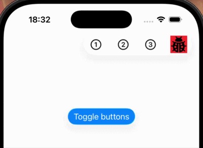
下面是一个完整的示例,展示它的全部工作情况:
struct ContentView: View {
    let toolbarButtonImageSize: CGFloat = 44
    @State private var withLotsOfToolbarButtons = false

    var body: some View {
        NavigationStack {
            Button("Toggle buttons") {
                withAnimation {
                    withLotsOfToolbarButtons.toggle()
                }
            }
            .buttonStyle(.glassProminent)
            .padding(.top, 100)
            .frame(maxHeight: .infinity, alignment: .top)
            .toolbar {
                ToolbarItemGroup {
                    Button("One", systemImage: "1.circle") {}
                    Button("Two", systemImage: "2.circle") {}
                    Button("Three", systemImage: "3.circle") {}
                    if withLotsOfToolbarButtons {
                        Button("Four", systemImage: "4.circle") {}
                        Button("Five", systemImage: "5.circle") {}
                        Button("Six", systemImage: "6.circle") {}
                        Button("Seven", systemImage: "7.circle") {}
                    }
                    Button {} label: {
                        Label {
                            Text("Custom")
                        } icon: {
                            Image(.image1)
                                .resizable()
                                .scaledToFit()
                                .frame(maxWidth: toolbarButtonImageSize, maxHeight: toolbarButtonImageSize)
                        }
                    }
                    .buttonStyle(.iconOnly)
                }
            }
        }
    }
}
站内所有文章版权归属LeftHeroAI导航站,无授权禁止任何主体转载、抄袭、复制内容,亦不得私自架设镜像站点。一经侵权,本站将通过法律途径追责。
相关文章






汇集全球数千款 AI 工具,每日持续更新,配套 AI 开发学习资源,轻松用 AI 提升工作效率。快捷键 Ctrl+D/⌘+D 一键收藏本站。