


如何在不使用表单的情况下获得表单选择器的样式?
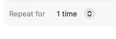
表单选择器(无按钮,右对齐)。

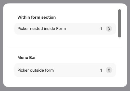
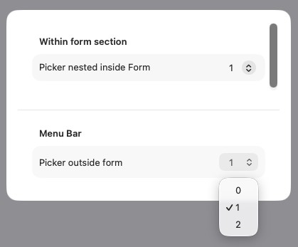
表单外部,选择器.menu样式向左对齐,宽度扩展到菜单中内容最宽处,并以按钮圆角作为选择容器。
是否有可能在不使用表单将其嵌套进来而获得类似于表单选择器的样式?
原因:表单并不适合高度敏感的内容,只有当整个视图都被表单填满时才最合适。
*转载。抱歉没有提供可重现的代码。
import SwiftUI

struct Question: View {
    @Binding var selection: Int

    var body: some View {
        VStack (alignment: .center, spacing: 24) {
            Form {
                Section ("Within form section") {
                    Picker("Picker nested inside Form", selection: $selection) {
                        ForEach(0..<3) { i in
                            Text(i.description)
                        }
                    }
                }
            }
            .formStyle(.grouped)
            .frame(height: 100) // Form takes whole space on default. To restrain — a frame is needed.

            Divider()

            VStack (alignment: .leading, spacing: 10) {
                Text("Menu Bar")
                    .fontWeight(.semibold)
                    .padding(.leading, 10)

                VStack (spacing: 10) {
                    HStack {
                        Text("Picker outside form")
                        Spacer()
                        Picker("", selection: $selection) {
                            ForEach(0..<3) { i in
                                Text(i.description)
                            }
                        }
                        .pickerStyle(.menu)
                    }
                }
                .padding(10)
                .background(.secondary.opacity(0.06))
                .clipShape(.rect(cornerRadius: 12))
            }
            .padding(20)
        }
        .padding()
        .background(.white)
        .clipShape(.rect(cornerRadius: 16))
    }
}

#Preview {
    Question(selection: .constant(1))
        .frame(width: 400, height: 300)
        .padding(40)
        .background(.gray)
}
解决方案
除了极少数的差异外,下面的方法很可能是最接近在表单中呈现原生 Picker 外观的实现。
这种方法将 Picker 包裹在 Menu 中,并为菜单标签提供自定义的 LabelStyle,以实现悬停效果、样式、图标定位和整体布局。
需要注意的差异如下:
- 打开时,
Menu位于标签下方,与Picker显示覆盖在标签之上的方式不同。 - 在菜单中进行选择时,感觉比在
Picker中进行选择时稍微不那么灵敏。
以下是完整代码,代码注释中有更多细节:
import SwiftUI

struct PickerQuestionView: View {

    //Parameters
    @Binding var selection: Int

    //Body
    var body: some View {
        VStack (alignment: .center, spacing: 24) {
            Form {
                Section ("Within form section") {
                    Picker("Picker nested inside Form", selection: $selection) {
                        ForEach(0..<3) { i in
                            Text(i.description)
                        }
                    }
                }
            }
            .formStyle(.grouped)
            .frame(height: 100) // Form takes whole space on default. To restrain — a frame is needed.

            Divider()

            VStack (alignment: .leading, spacing: 10) {
                Text("Menu Bar")
                    .fontWeight(.semibold)
                    .padding(.leading, 10)

                VStack (spacing: 10) {
                    LabeledContent {
                        Menu {
                            Picker("", selection: $selection) {
                                ForEach(0..<3) { i in
                                    Text(i.description)
                                }
                            }
                            .labelsHidden()
                            .pickerStyle(.inline) // Must be .inline to not show as a submenu
                        } label: {
                            Label {
                                Text("\(selection)")
                            } icon: {
                                Image(systemName: "chevron.up.chevron.down")
                            }
                            .labelStyle(CustomMenuLabelStyle()) //Styles the up/down chevron icon to be to the right of the value label and provides hover effect
                        }
                        .buttonStyle(.plain) // Removes the default styling of the Picker
                        .frame(maxWidth: .infinity, alignment: .trailing) // Pushes the Picker to the right (and the label to the left)
                    } label: {
                        Text("Picker outside form") //The Menu label replaces what would otherwise be the Picker label in a Form
                    }
                }
                .padding(10)
                .background(Color(.quaternarySystemFill))
                .clipShape(.rect(cornerRadius: 12))
            }
            .padding(.horizontal, 20)
        }
        .padding()
        .padding(.bottom)
        .background(.white)
        .clipShape(.rect(cornerRadius: 16))
    }
}

struct CustomMenuLabelStyle: LabelStyle {

    //Parameters
    var spacing: CGFloat = 12

    //Local state
    @State private var isHovered: Bool = false

    //Constants
    private let hoverColor: Color = Color.secondary.opacity(0.15)

    //Body
    func makeBody(configuration: Configuration) -> some View {
        HStack(spacing: spacing) {
            configuration.title
                .padding(.leading, 12)

            configuration.icon
                .fontWeight(.medium)
                .imageScale(.small)
                .padding(.vertical, 4)
                .padding(.horizontal, 6)
                .background(isHovered ? Color.clear : hoverColor, in: .capsule)
        }
        .padding(2)
        .background(
            RoundedRectangle(cornerRadius: 8)
                .fill(isHovered ? hoverColor : Color.clear)
        )
        .onHover { hovering in
            isHovered = hovering
        }
    }
}


#Preview {
    @Previewable @State var selection: Int = 1
    PickerQuestionView(selection: $selection)
        .frame(width: 400, height: 600)
        .padding(40)
        .background(.gray)
}
站内所有文章版权归属LeftHeroAI导航站,无授权禁止任何主体转载、抄袭、复制内容,亦不得私自架设镜像站点。一经侵权,本站将通过法律途径追责。
相关文章






汇集全球数千款 AI 工具,每日持续更新,配套 AI 开发学习资源,轻松用 AI 提升工作效率。快捷键 Ctrl+D/⌘+D 一键收藏本站。